About
Robbe has a bachelor's degrees in interior design (Thomas More, 2021), graphic design (Sint Lucas Antwerpen, 2024) and a master's degree in visual arts (Sint Lucas Antwerpen, 2025). He has a strong interest in typography, type design and furniture design.
Contact
Email: robbe.oyen@gmail.com
InstagramA MetaFont tool
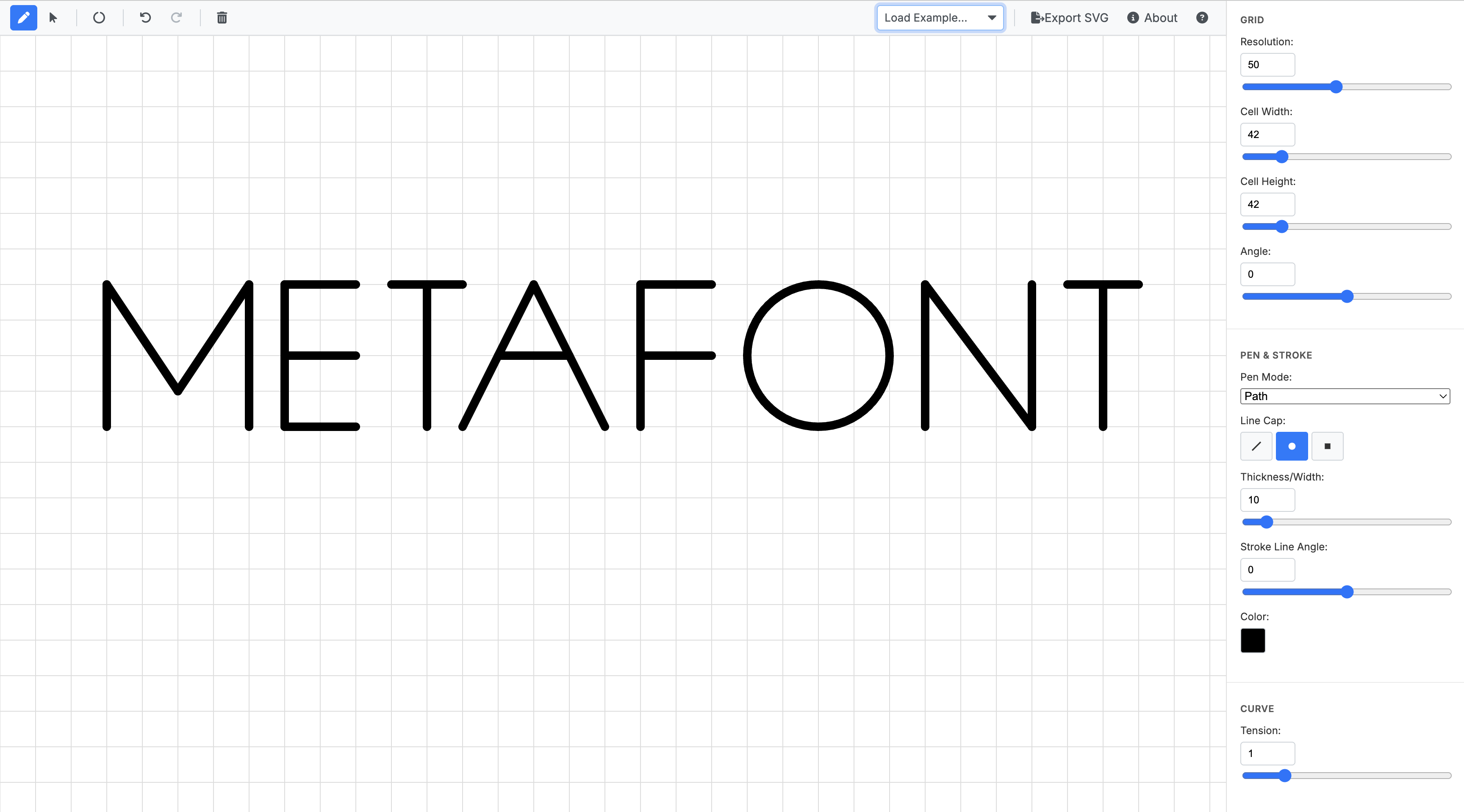
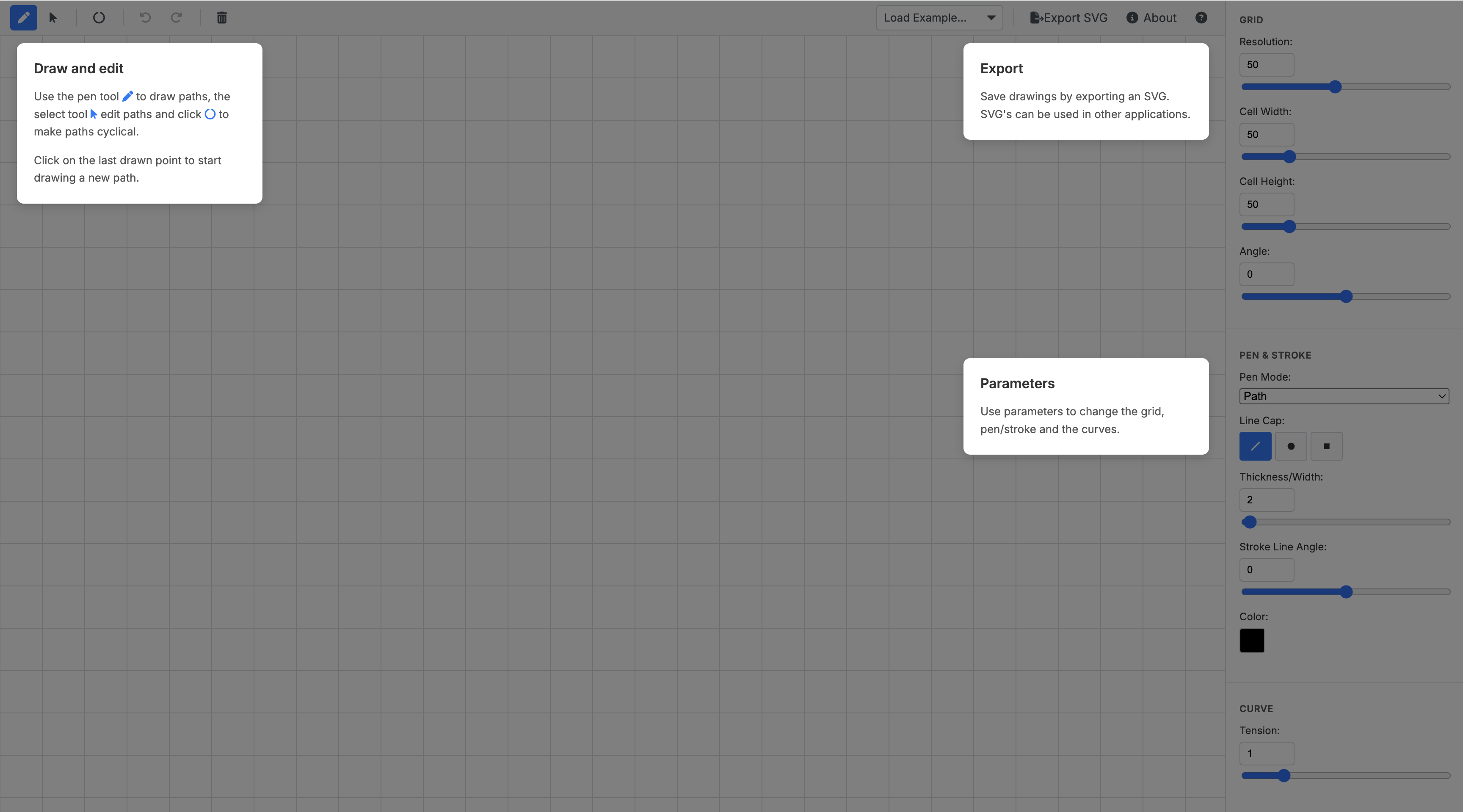
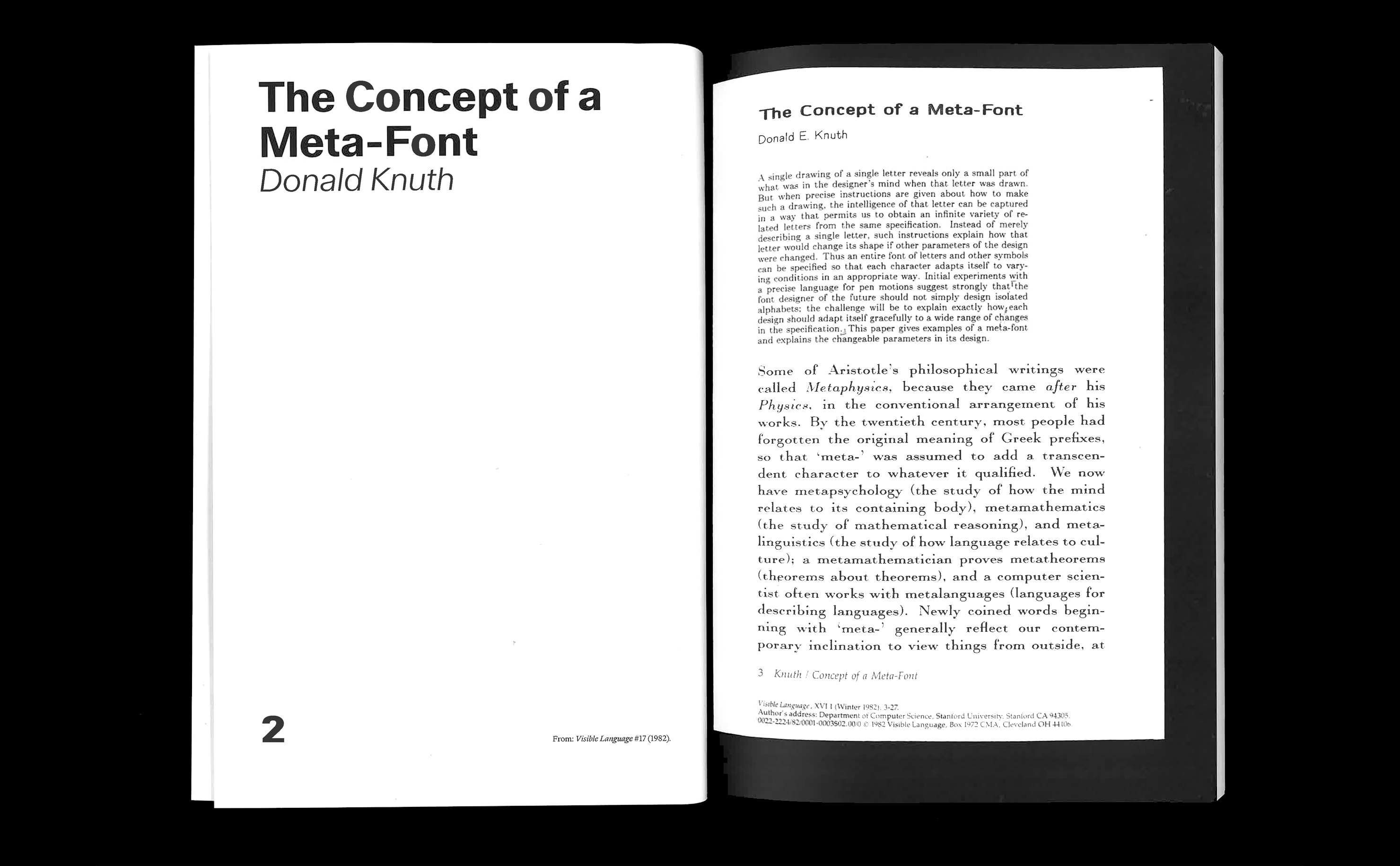
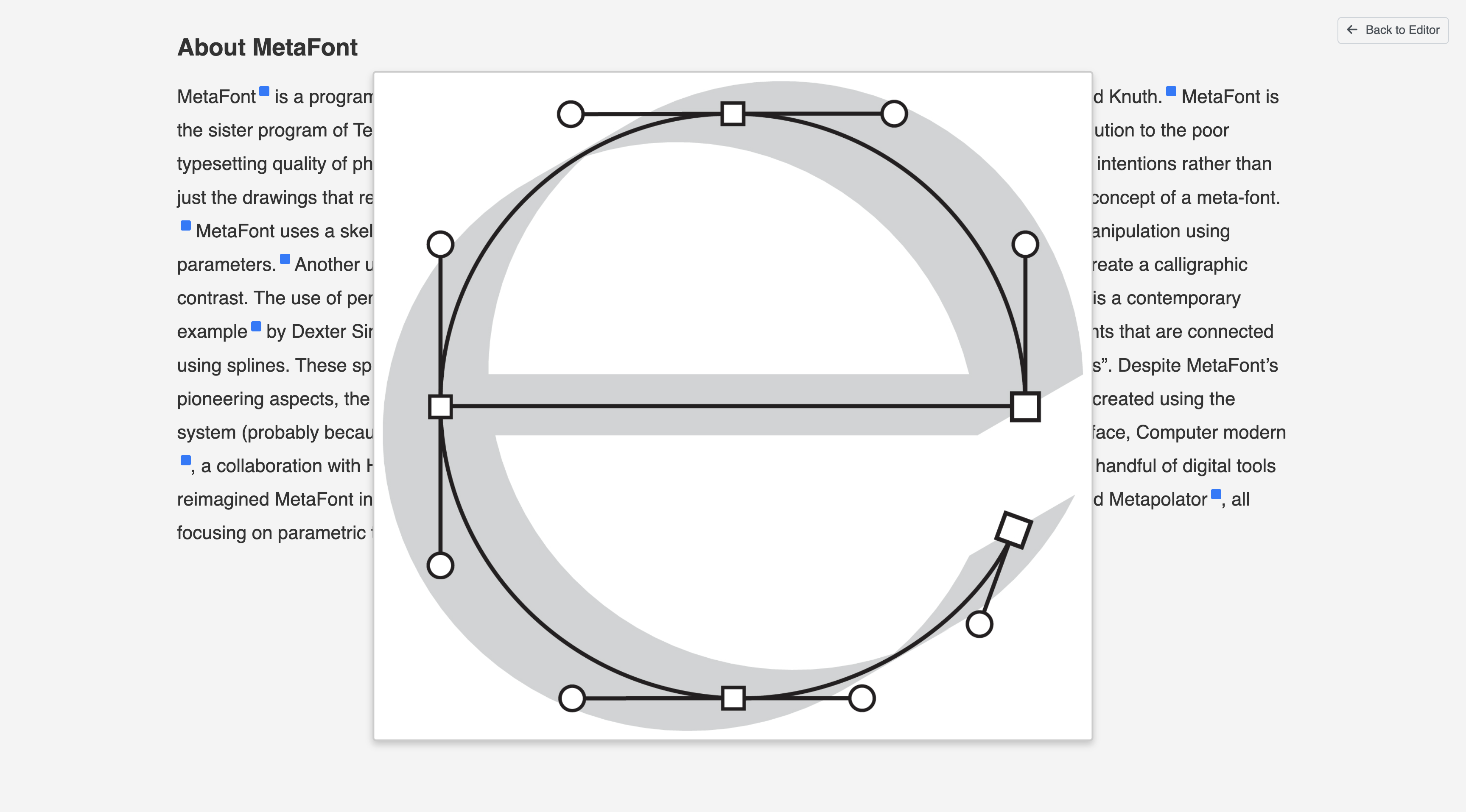
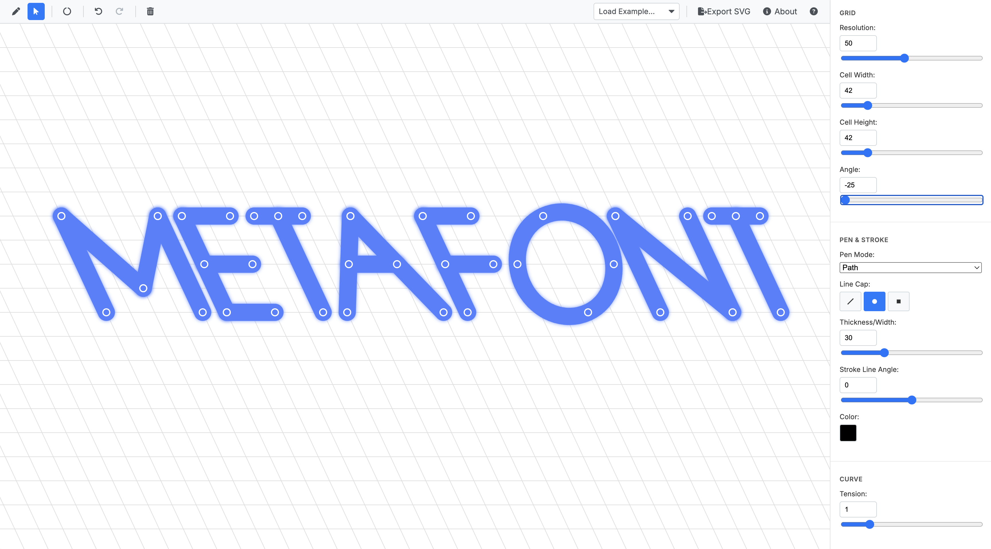
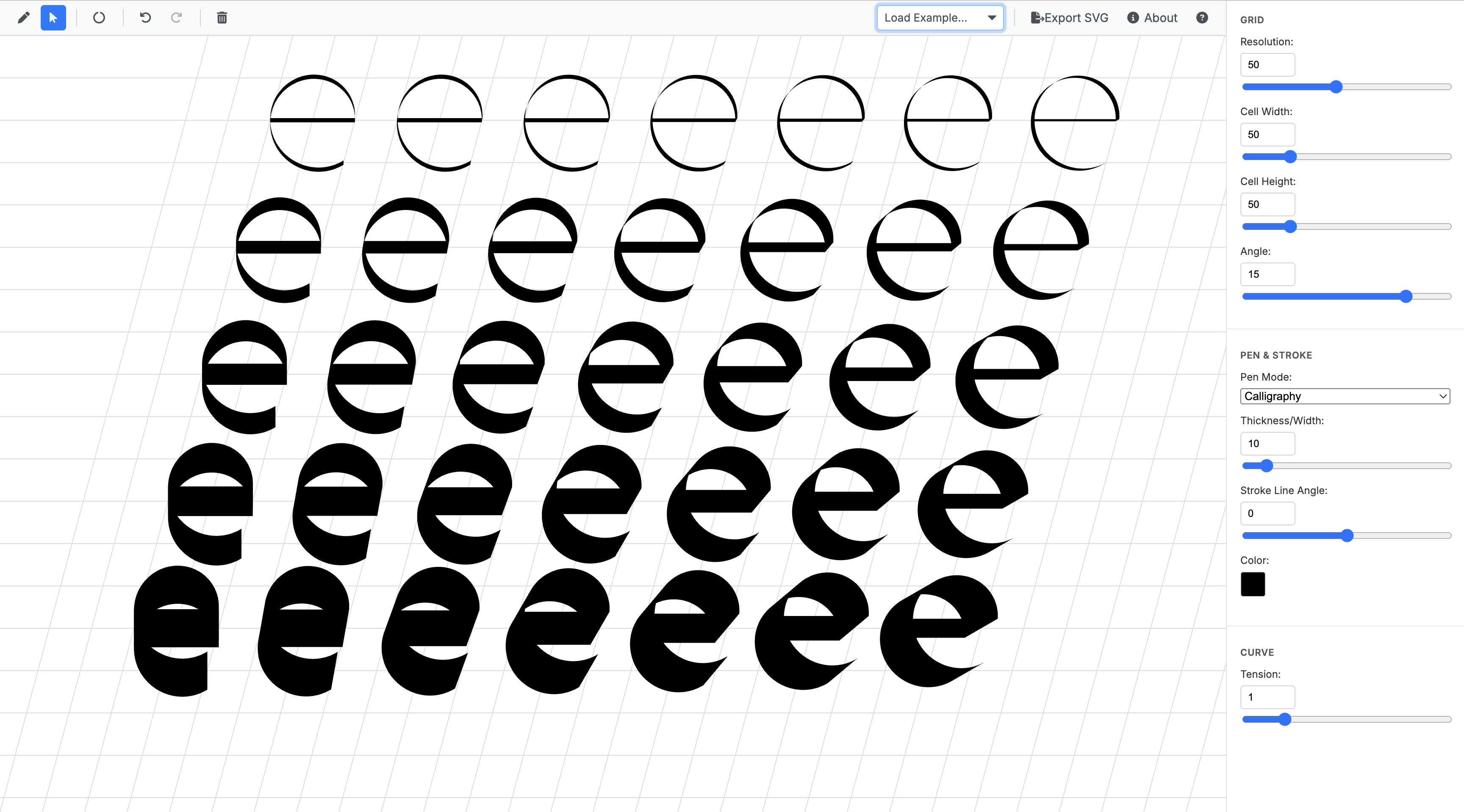
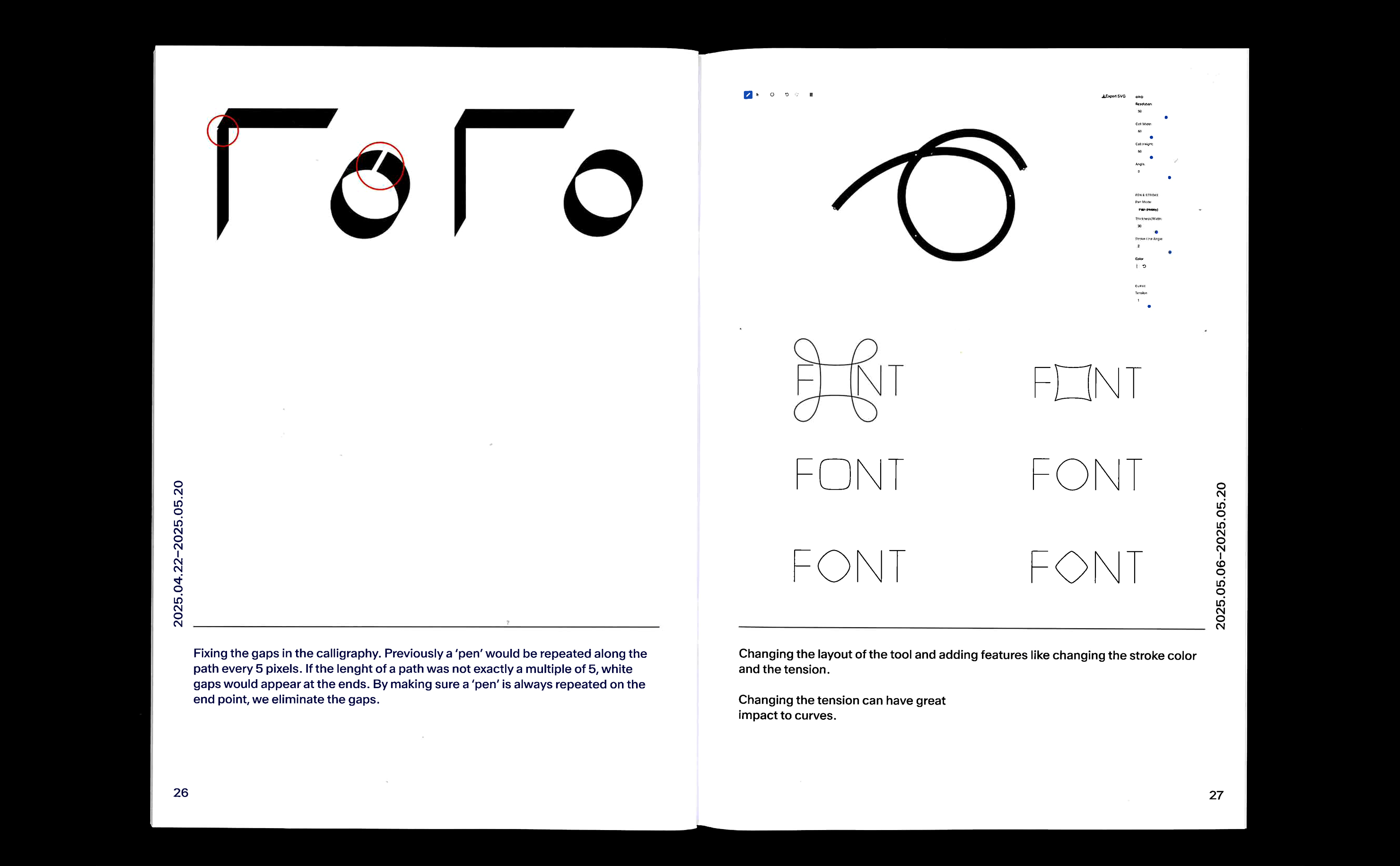
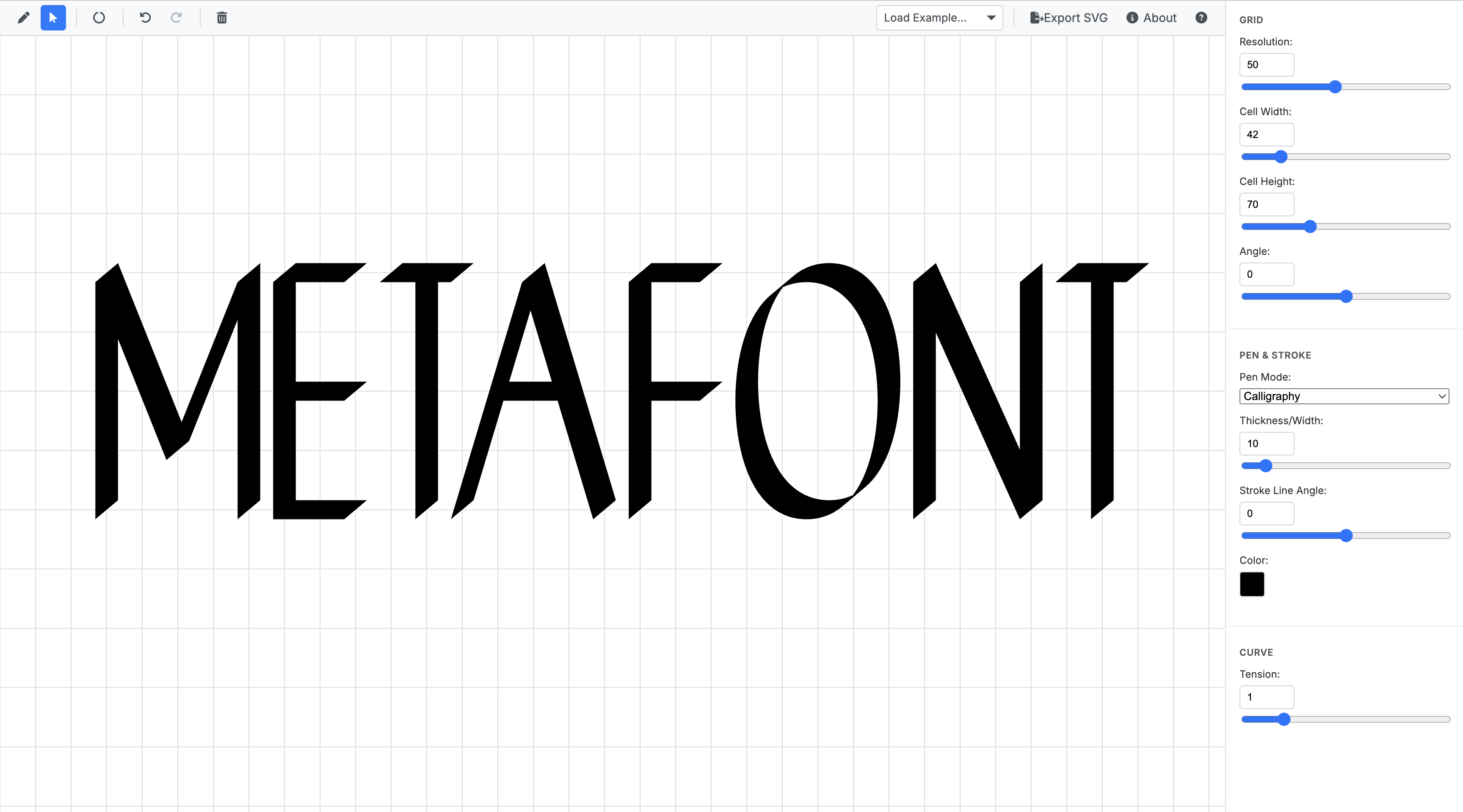
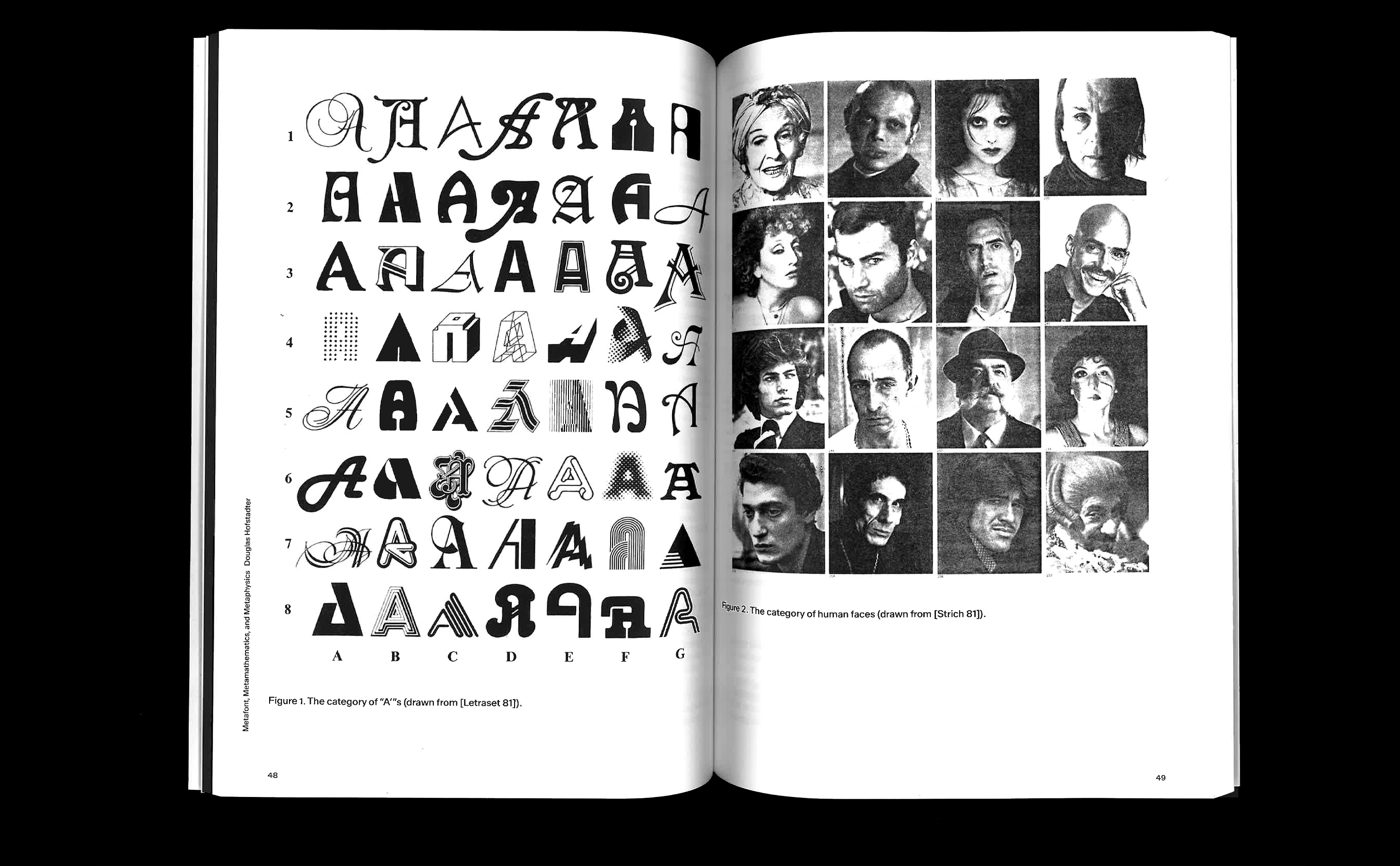
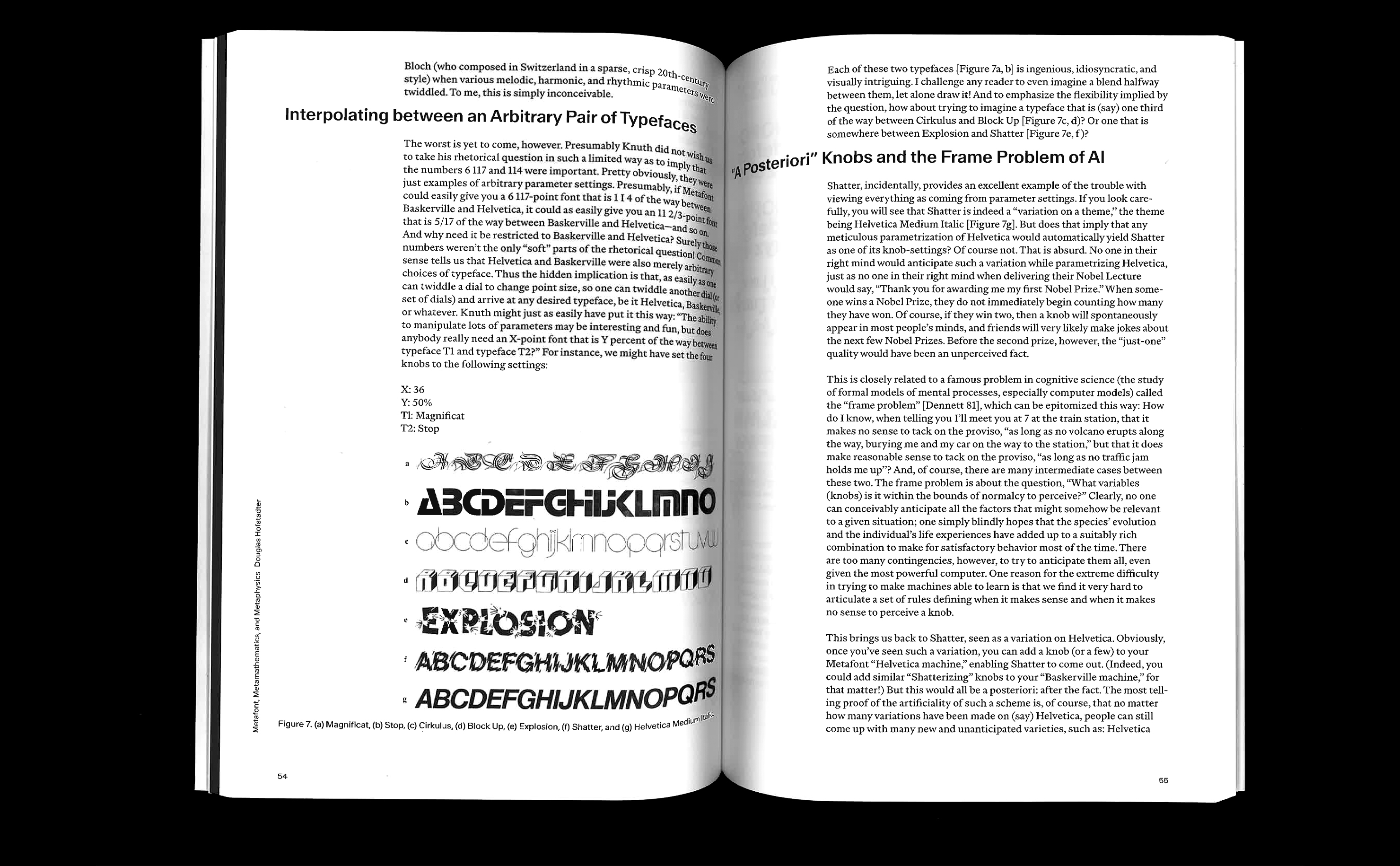
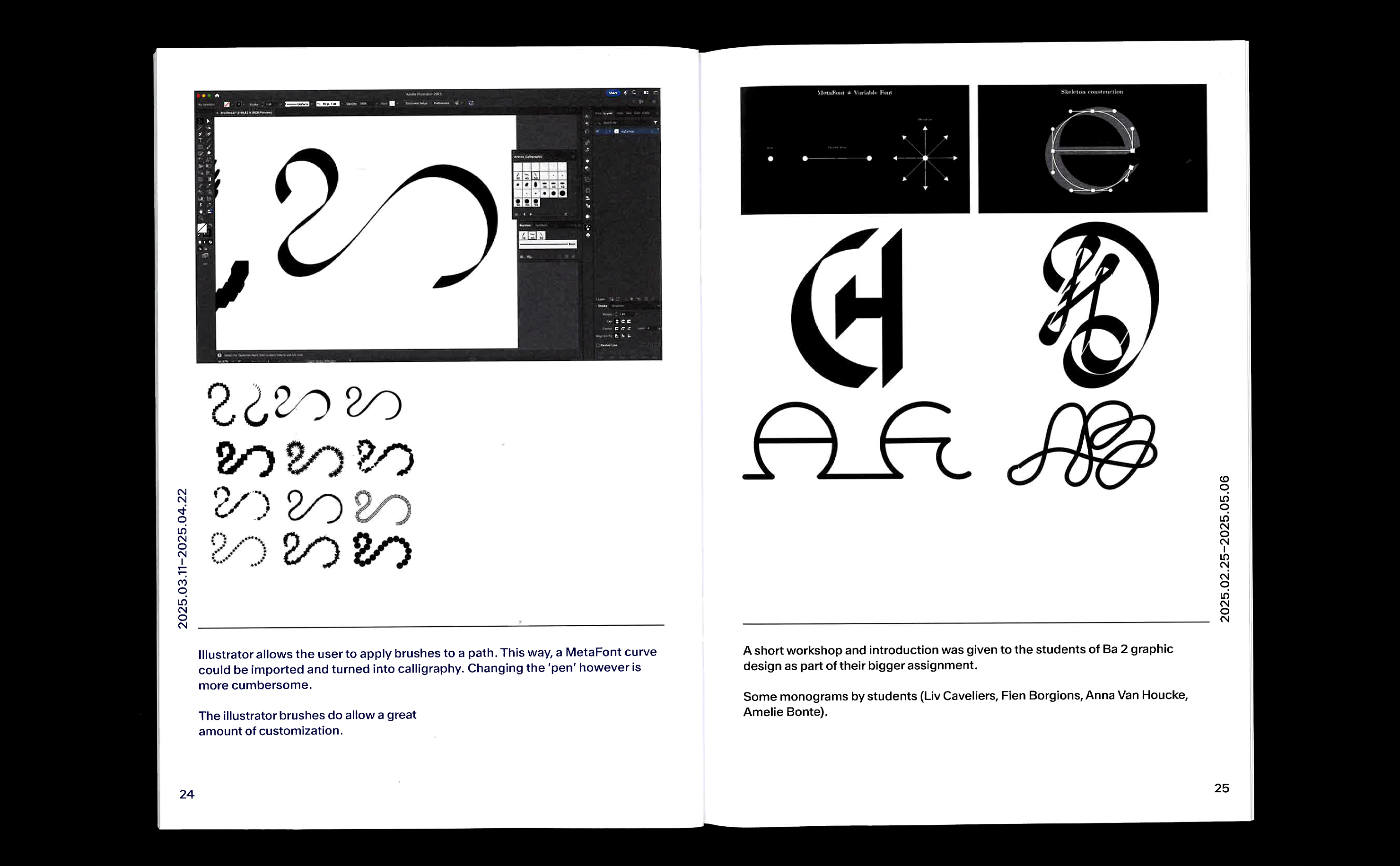
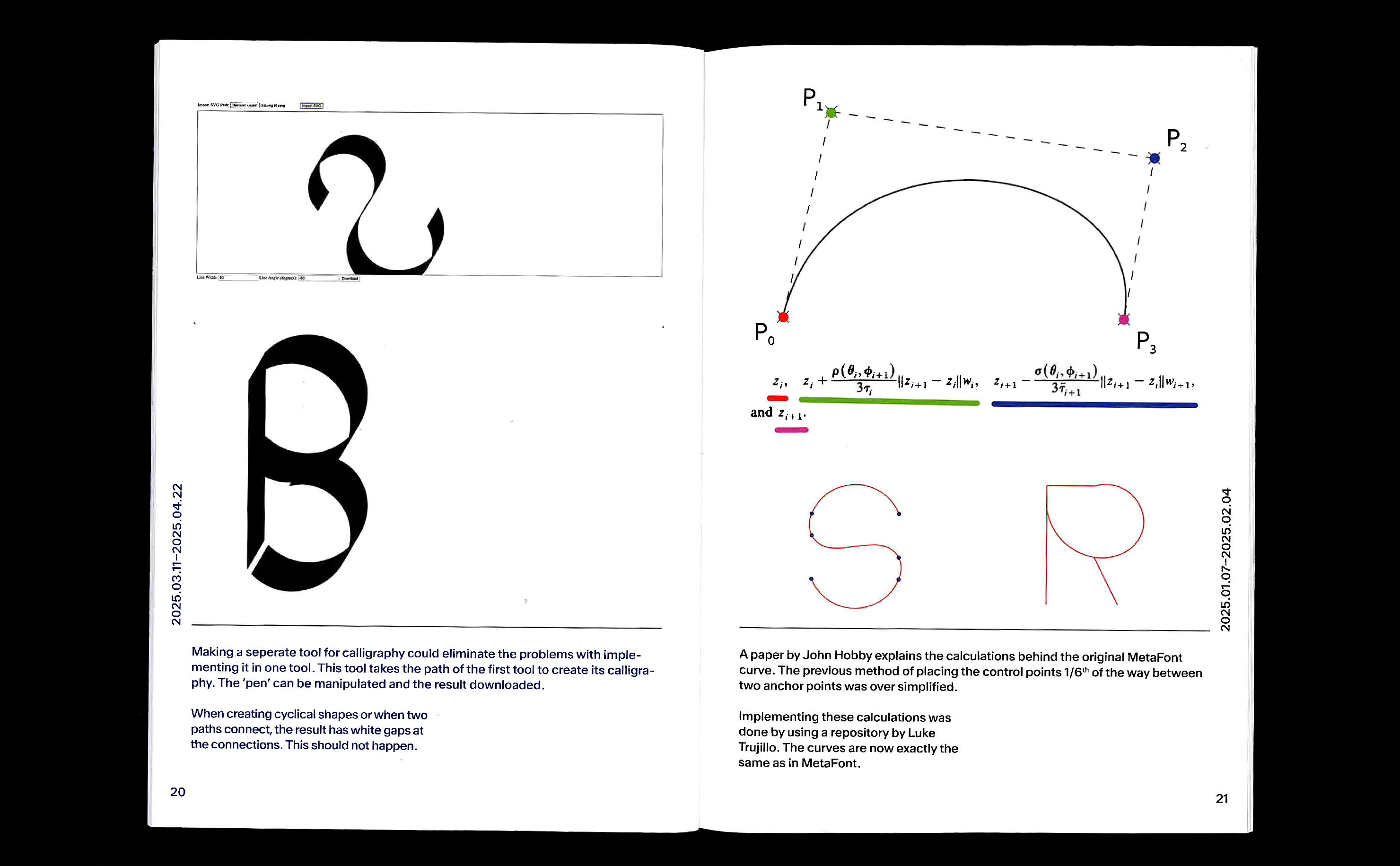
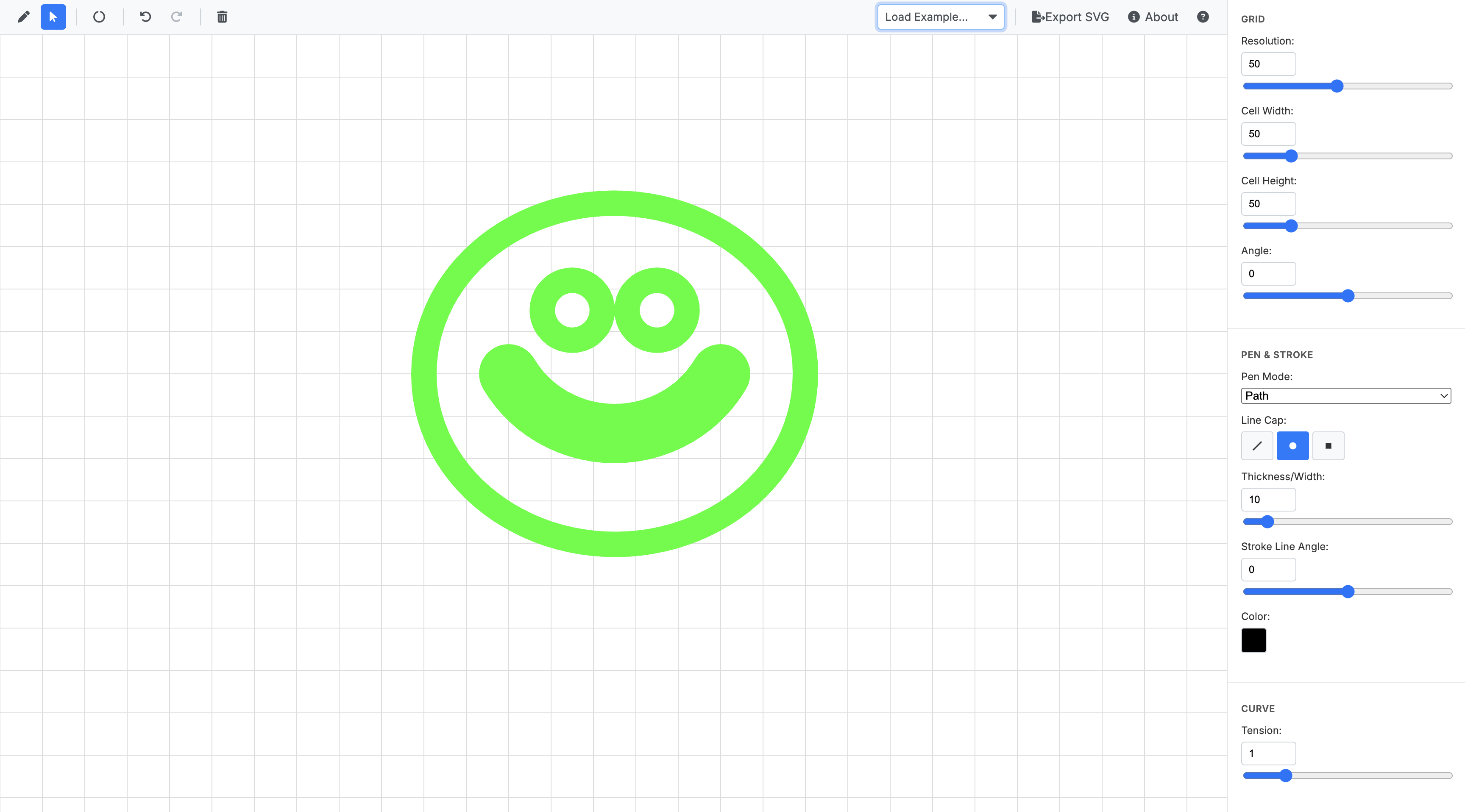
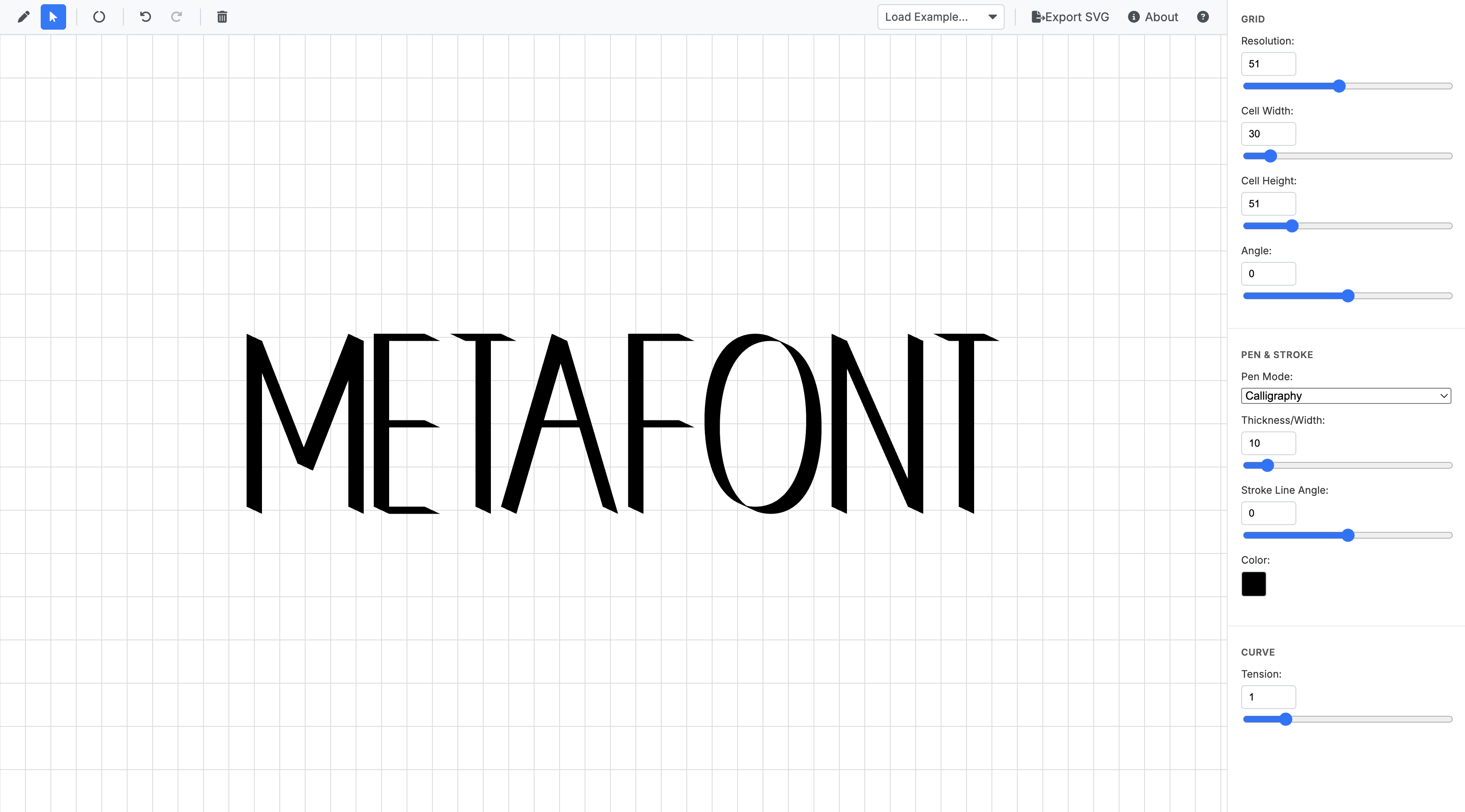
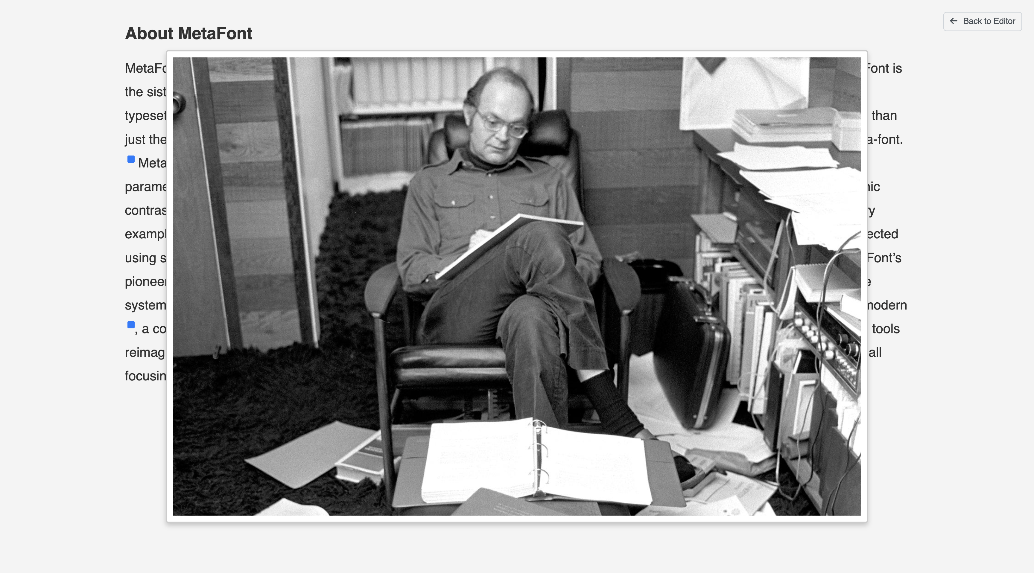
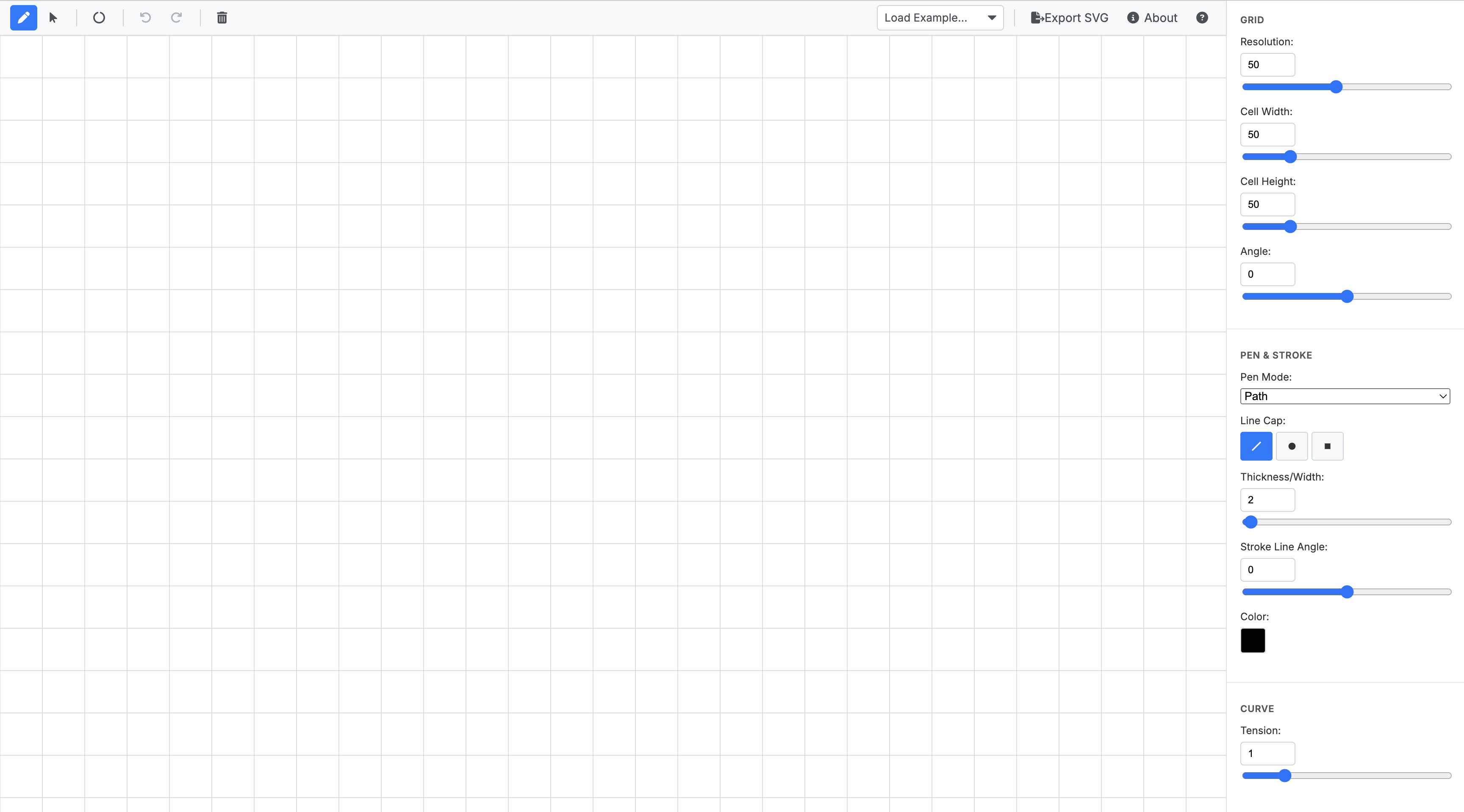
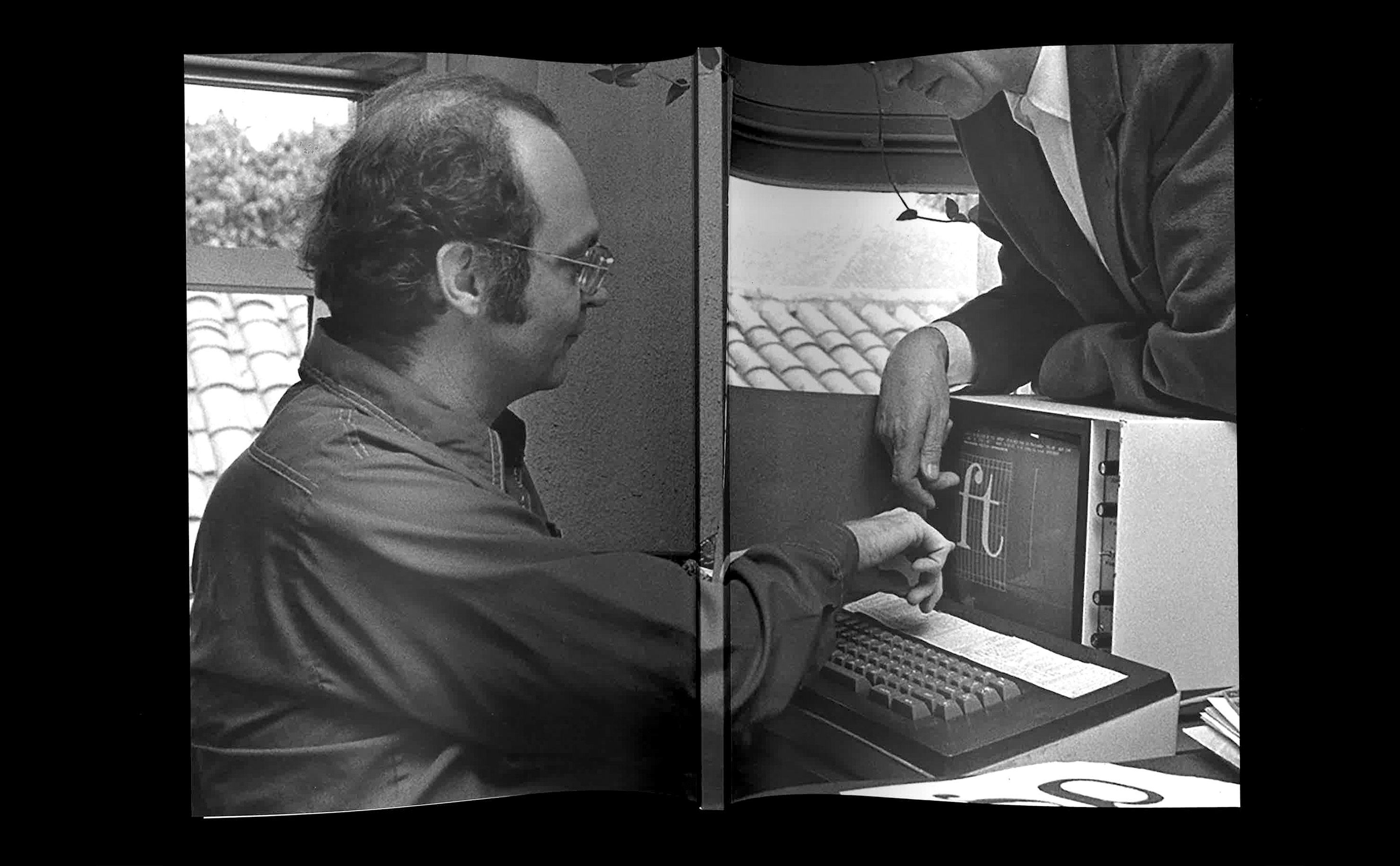
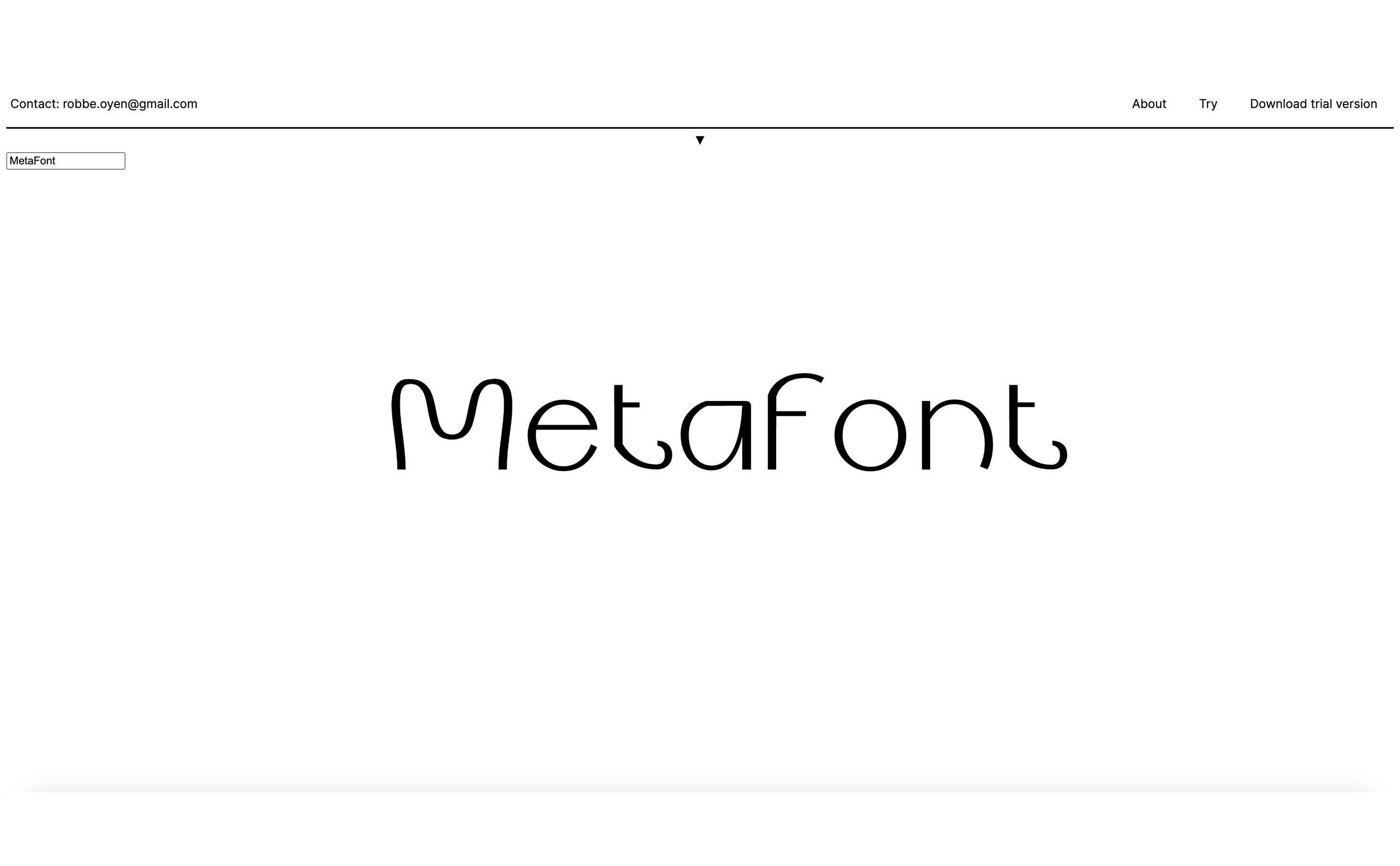
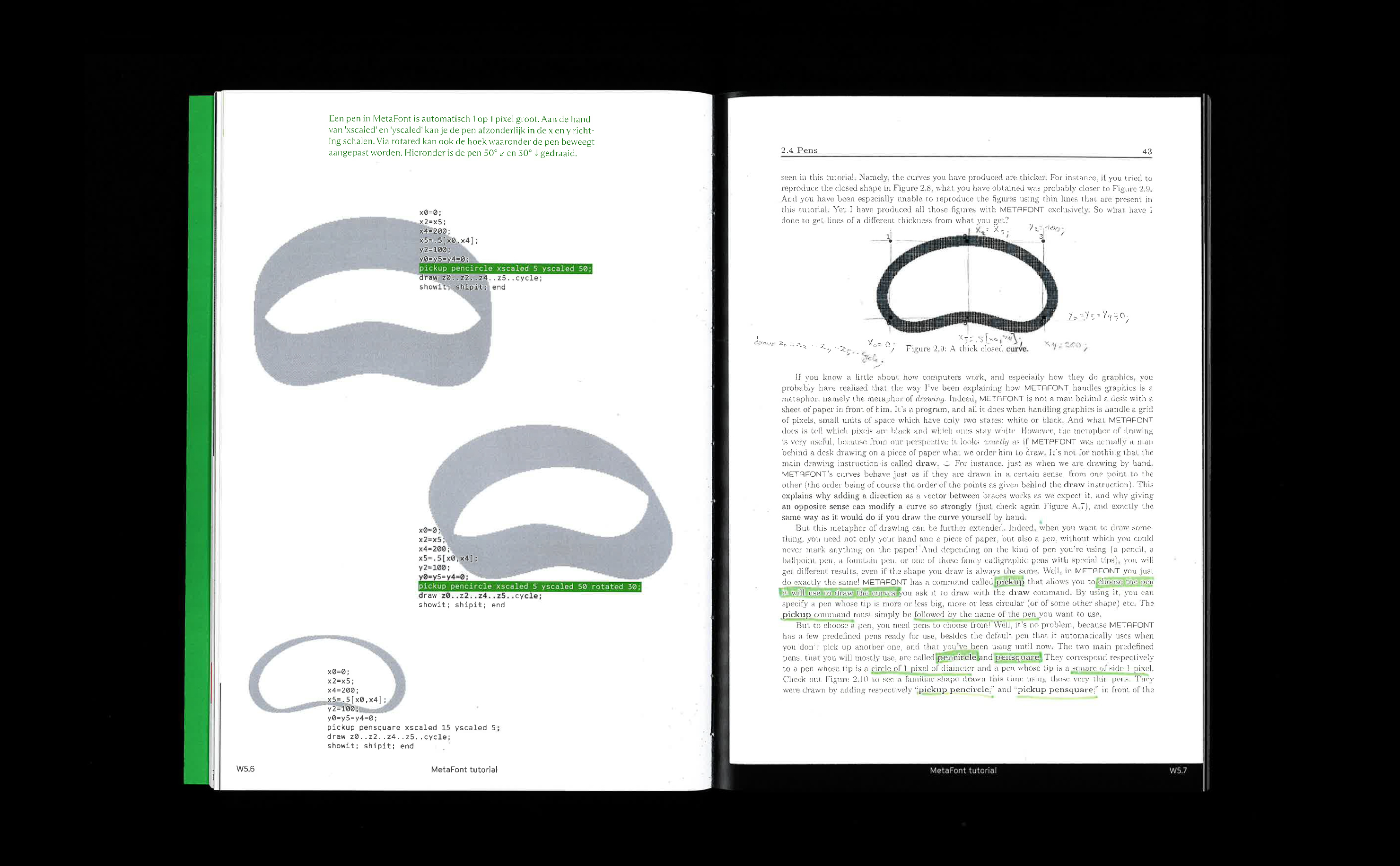
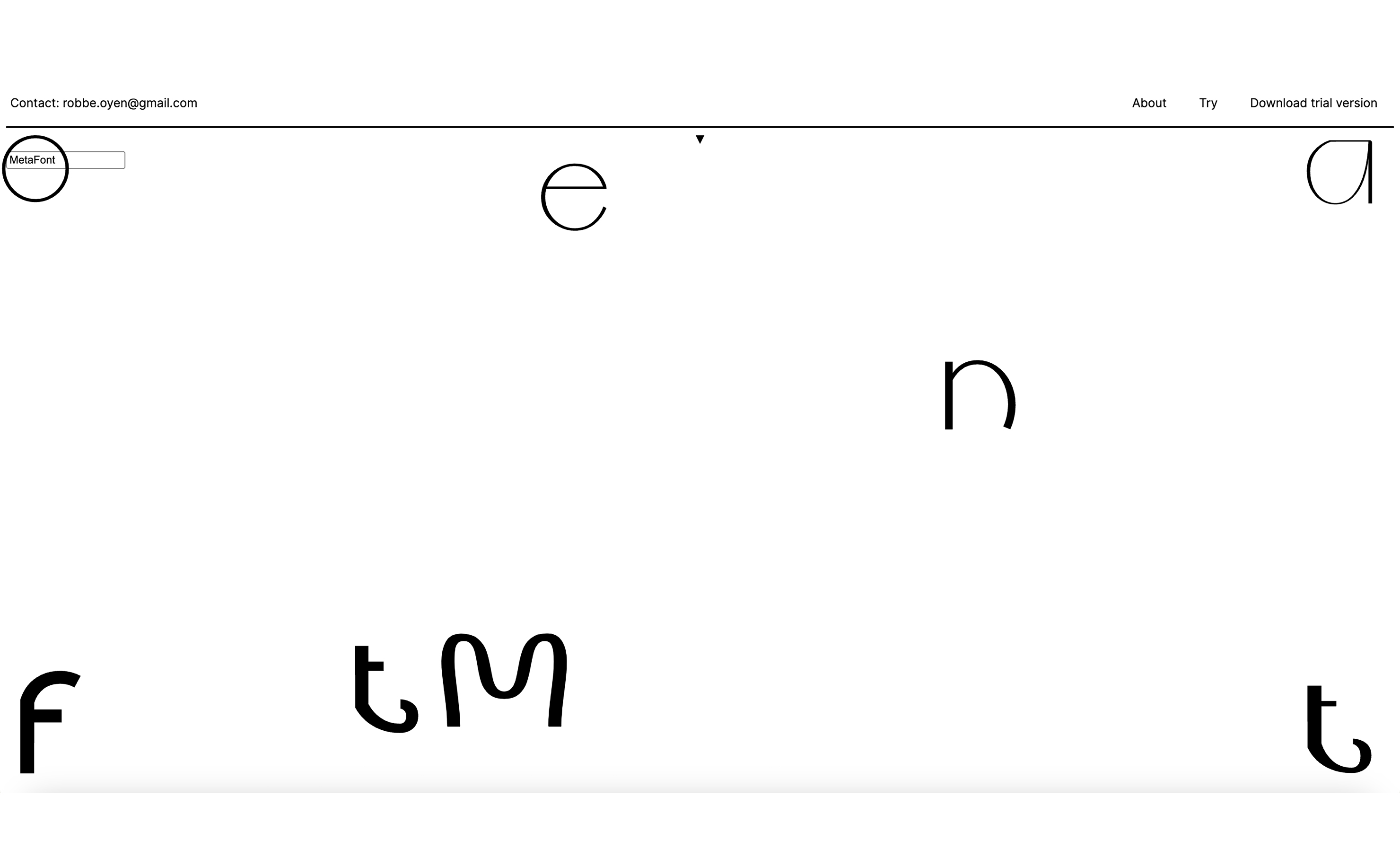
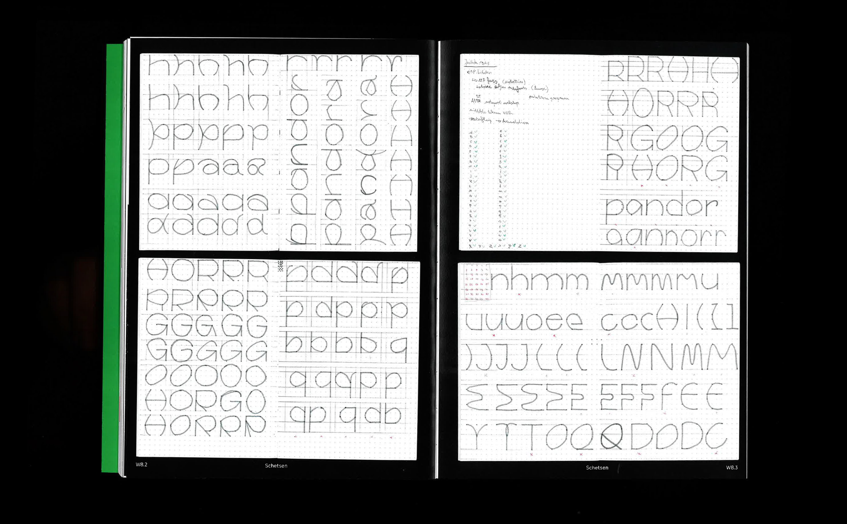
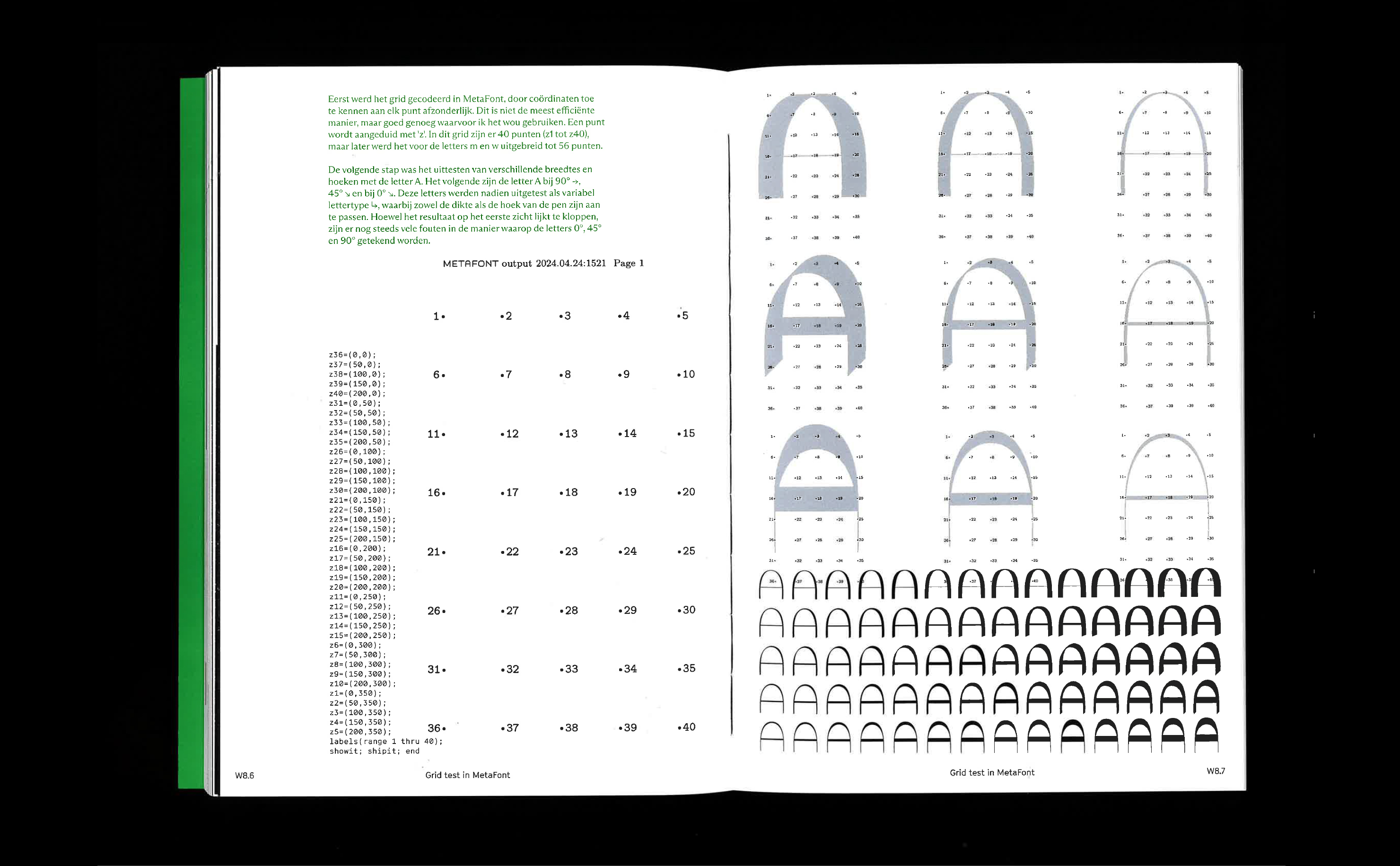
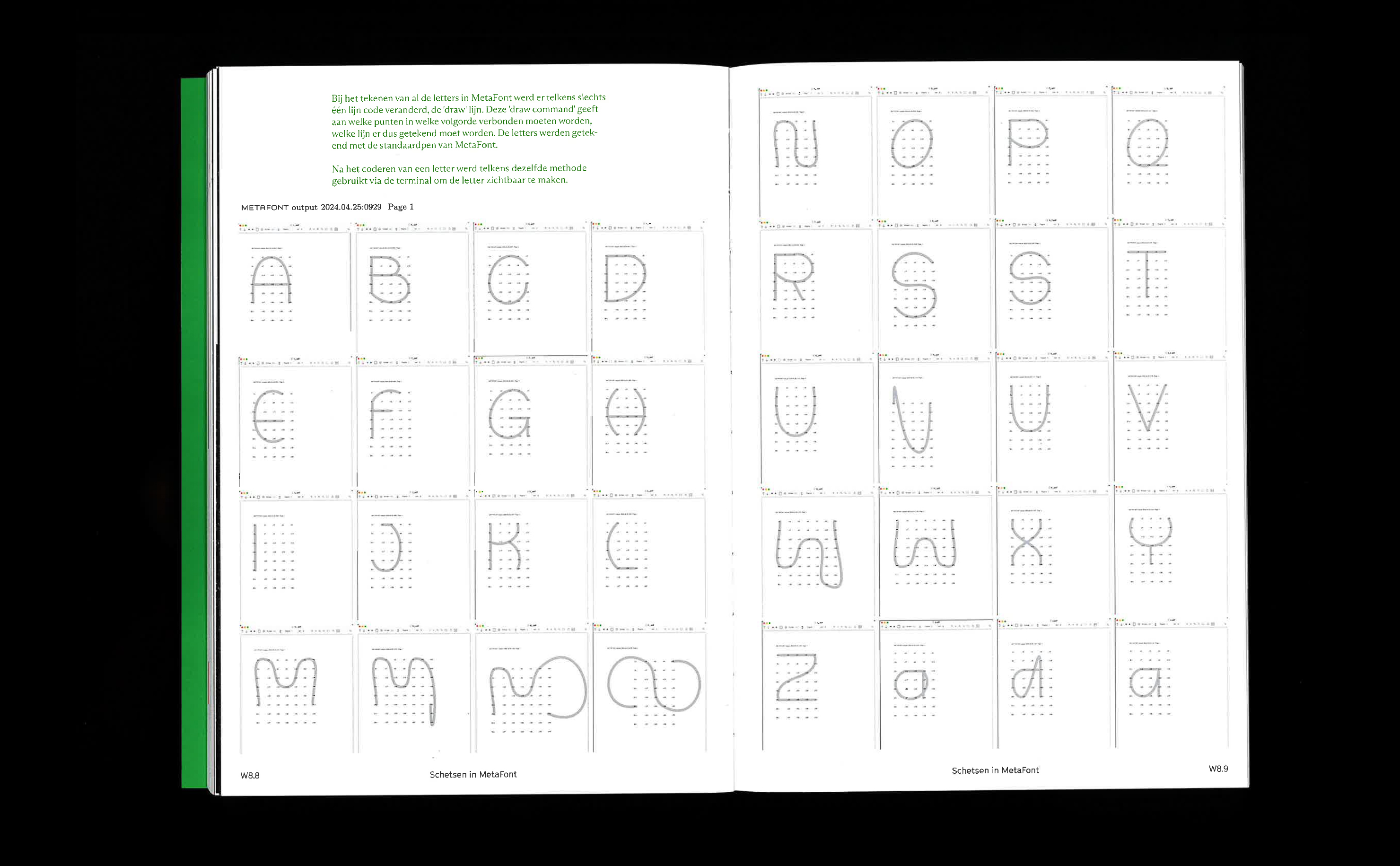
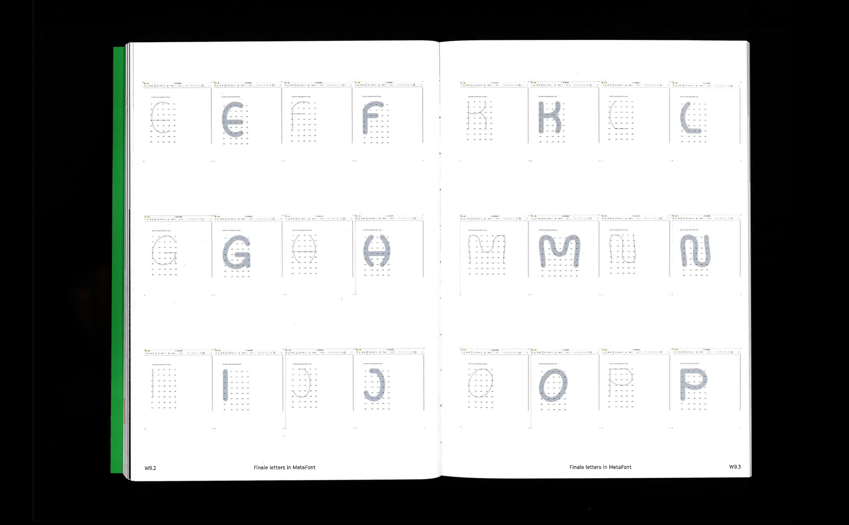
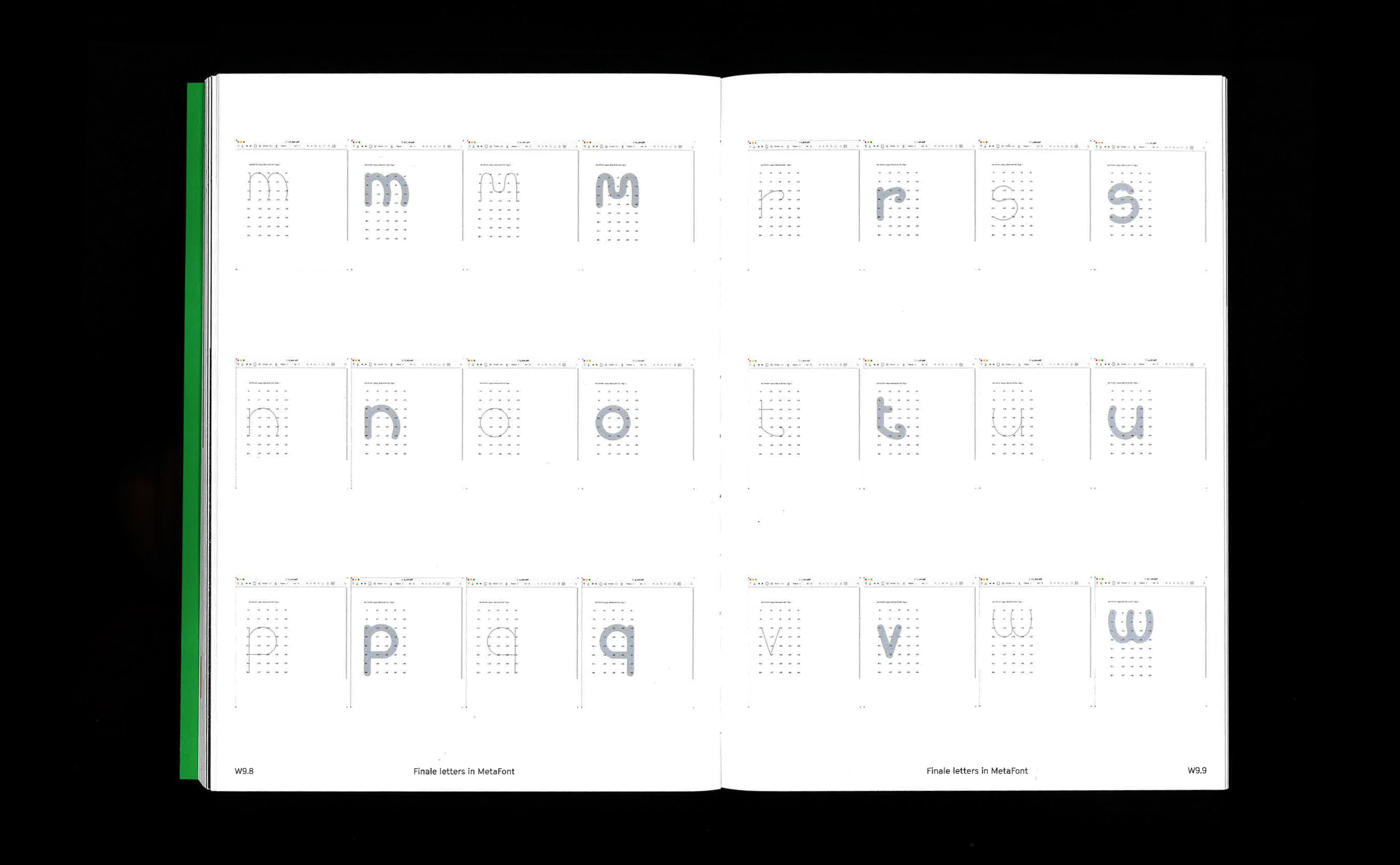
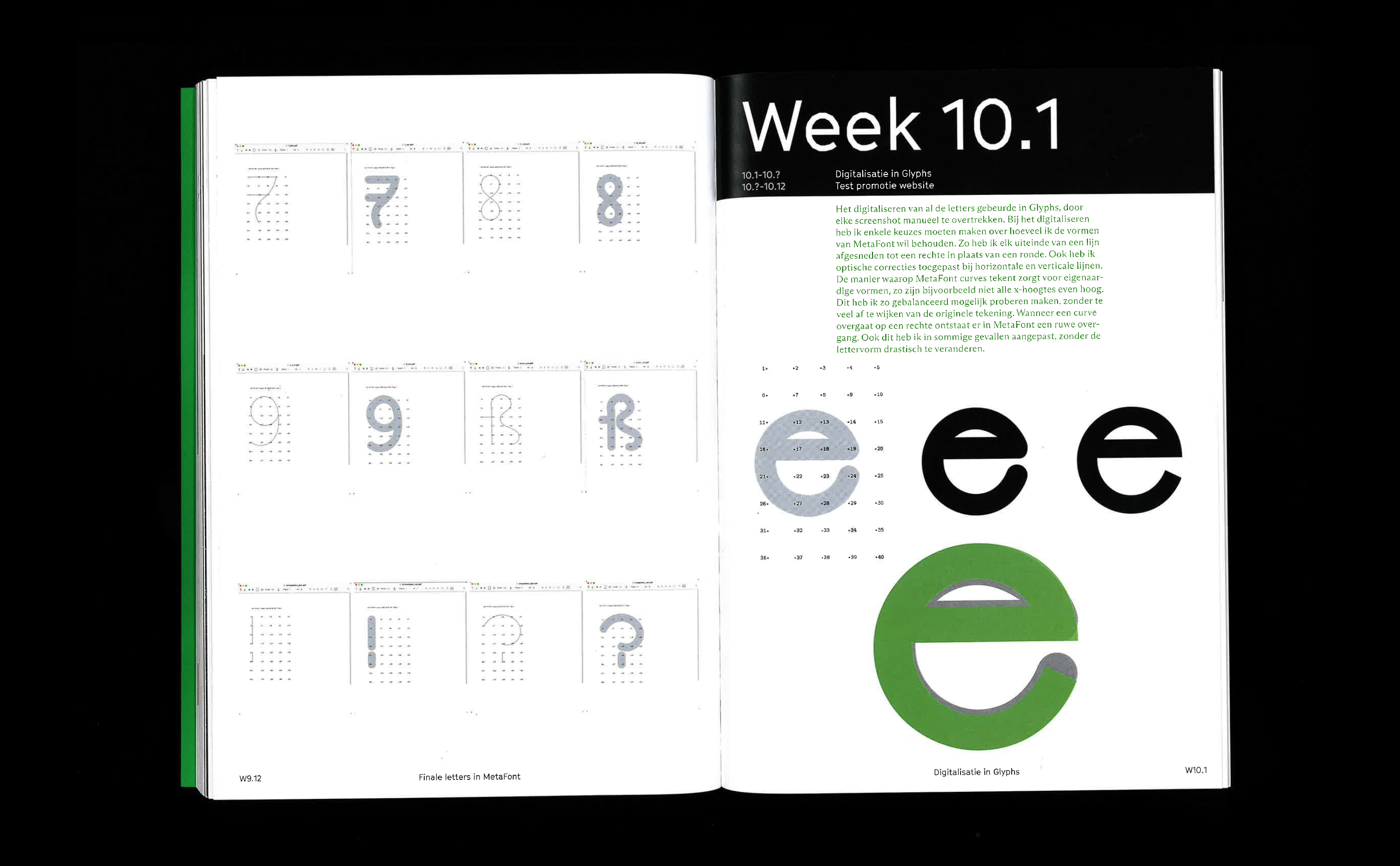
A MetaFont tool is a digital tool for drawing letterforms, inspired by the programming language developed in 1979 by Donald Knuth. Unlike traditional type design methods that rely on contours, this tool is based on a skeletal structure. This skeleton-based construction allows easy manipulation through multiple parameters such as height, width, weight or slant. Another feature of A MetaFont tool is the use of a virtual ‘pen’, simulating calligraphic strokes. In this way, a line becomes a shape, which could be described as a letter getting a ‘body’ over its ‘skeleton’. The tool allows the generation of great amounts of variation from one single skeleton.
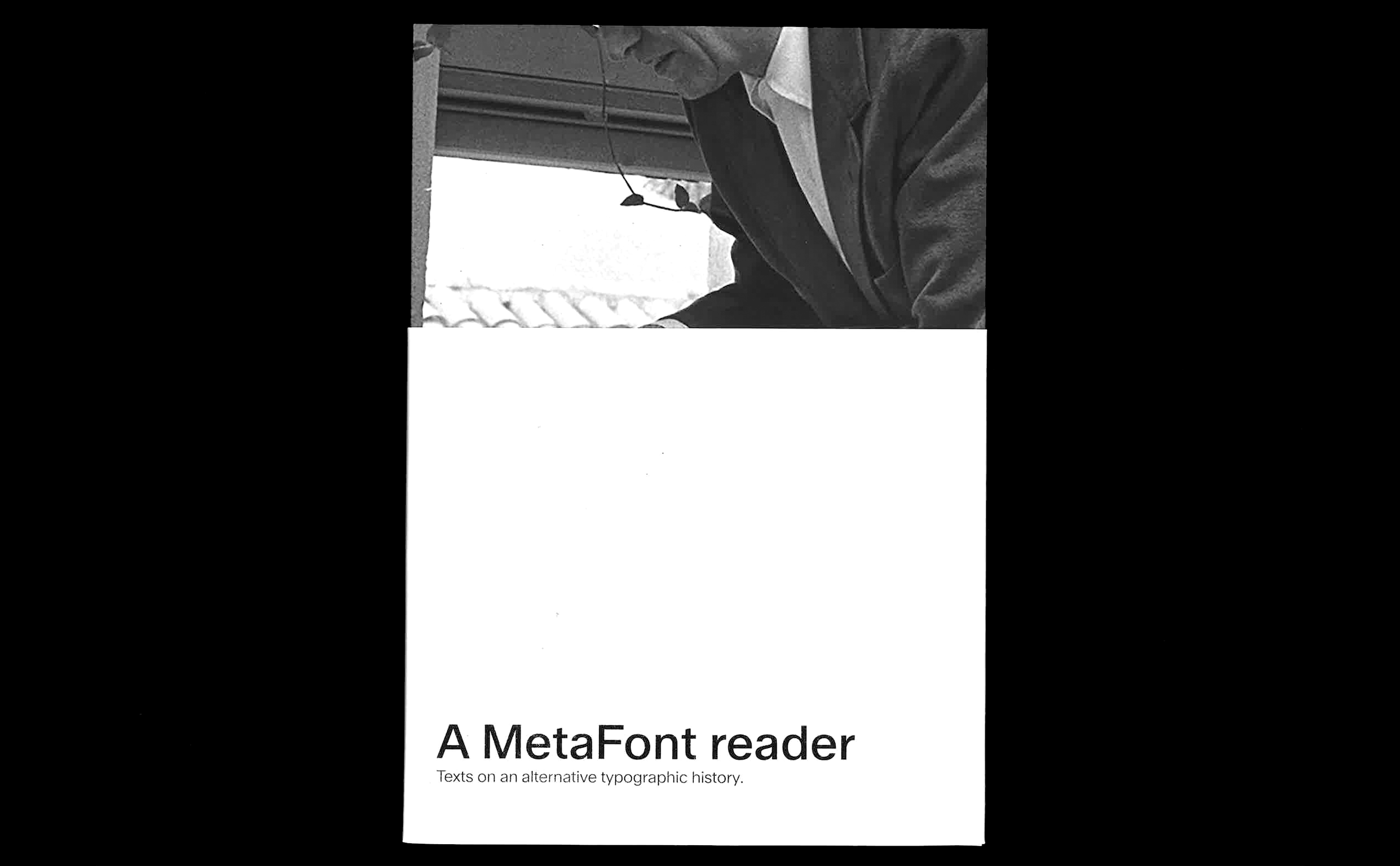
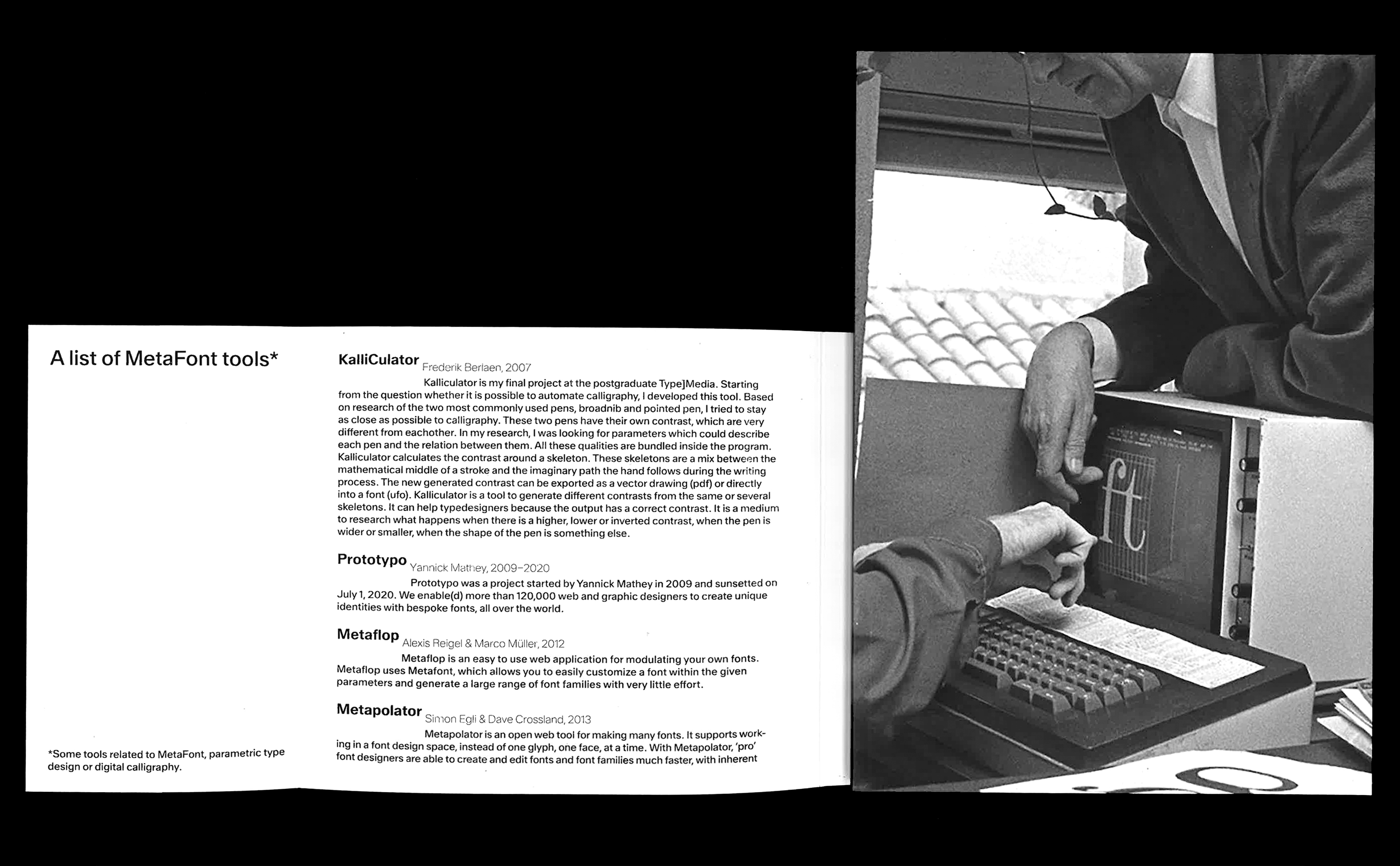
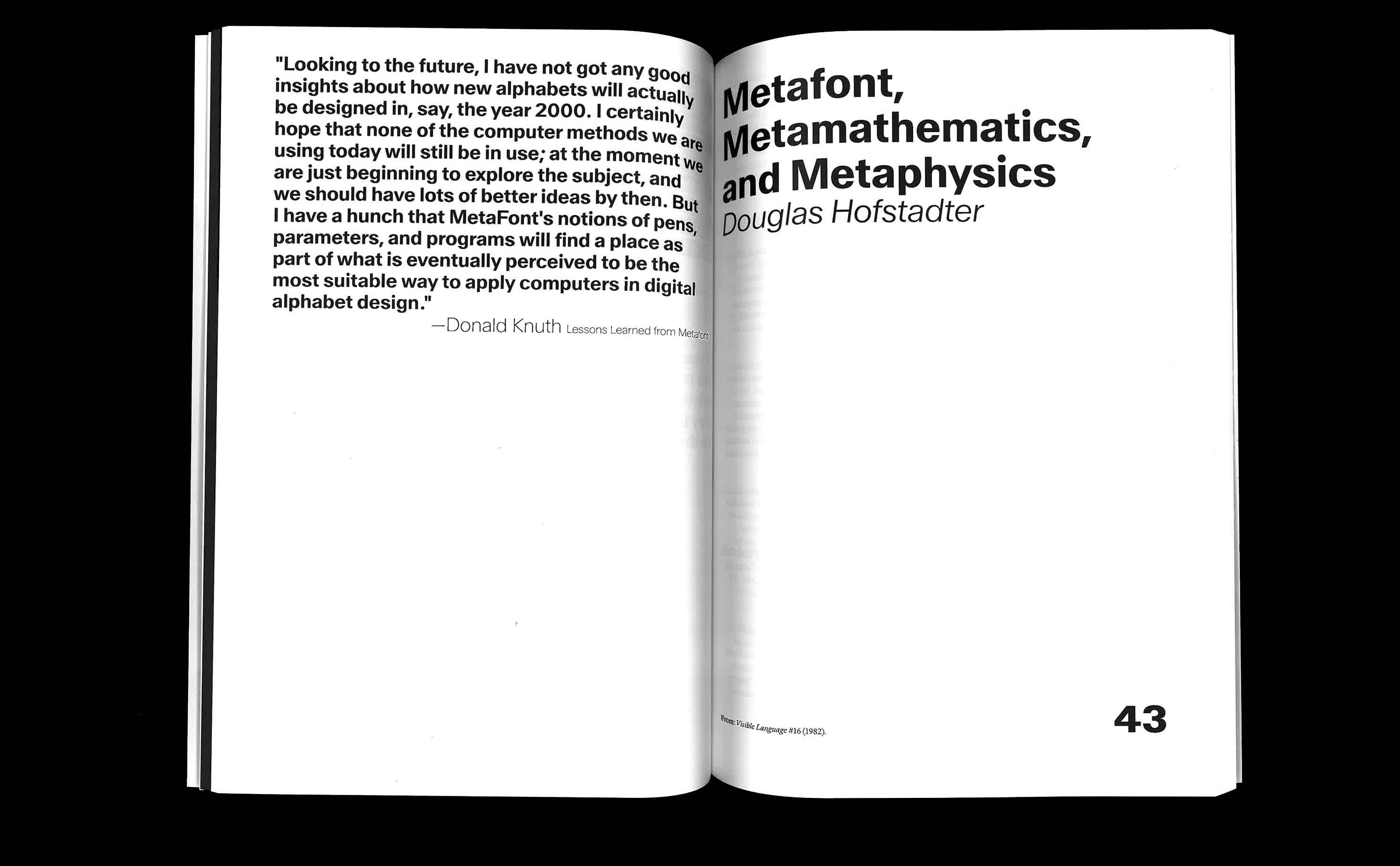
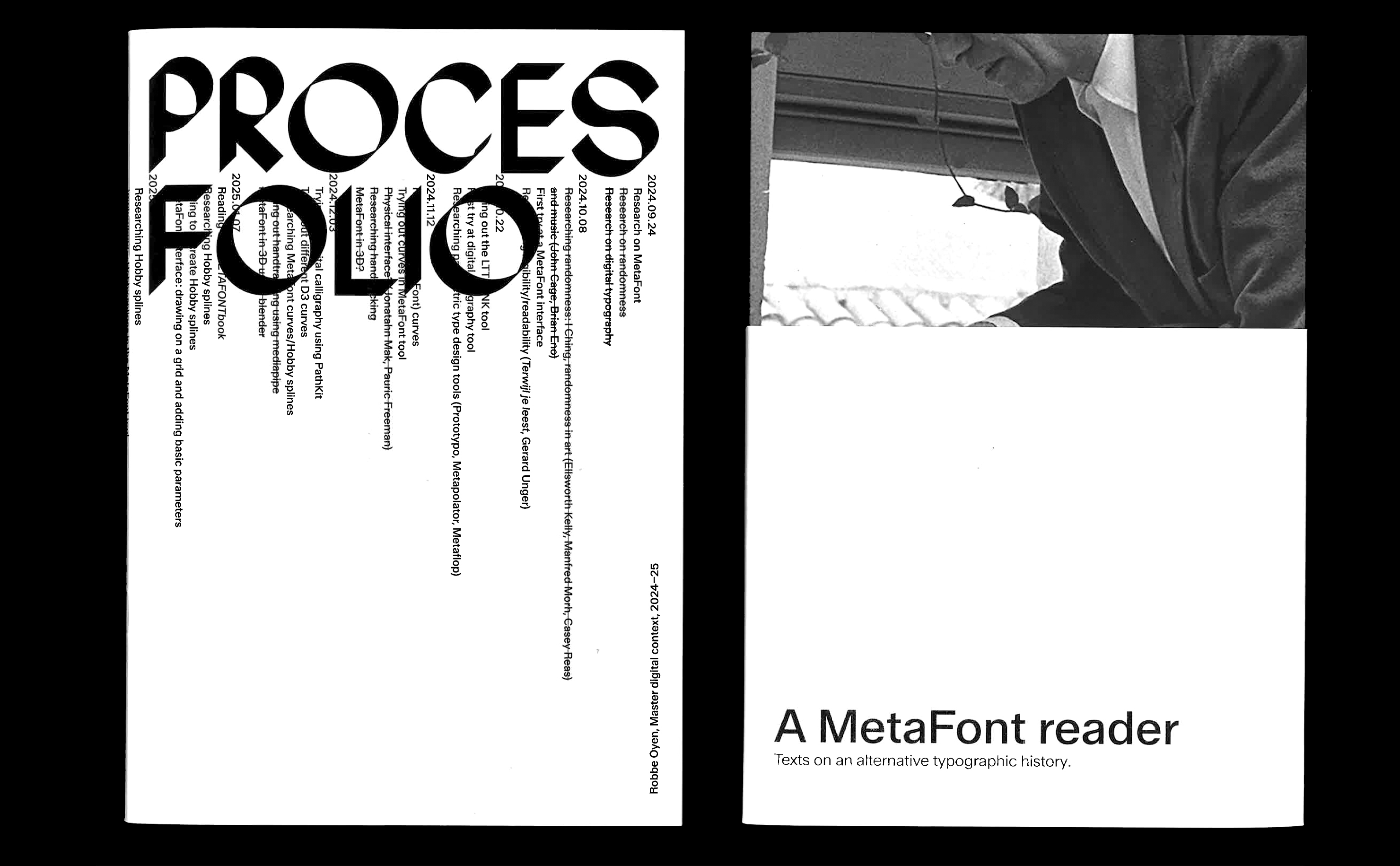
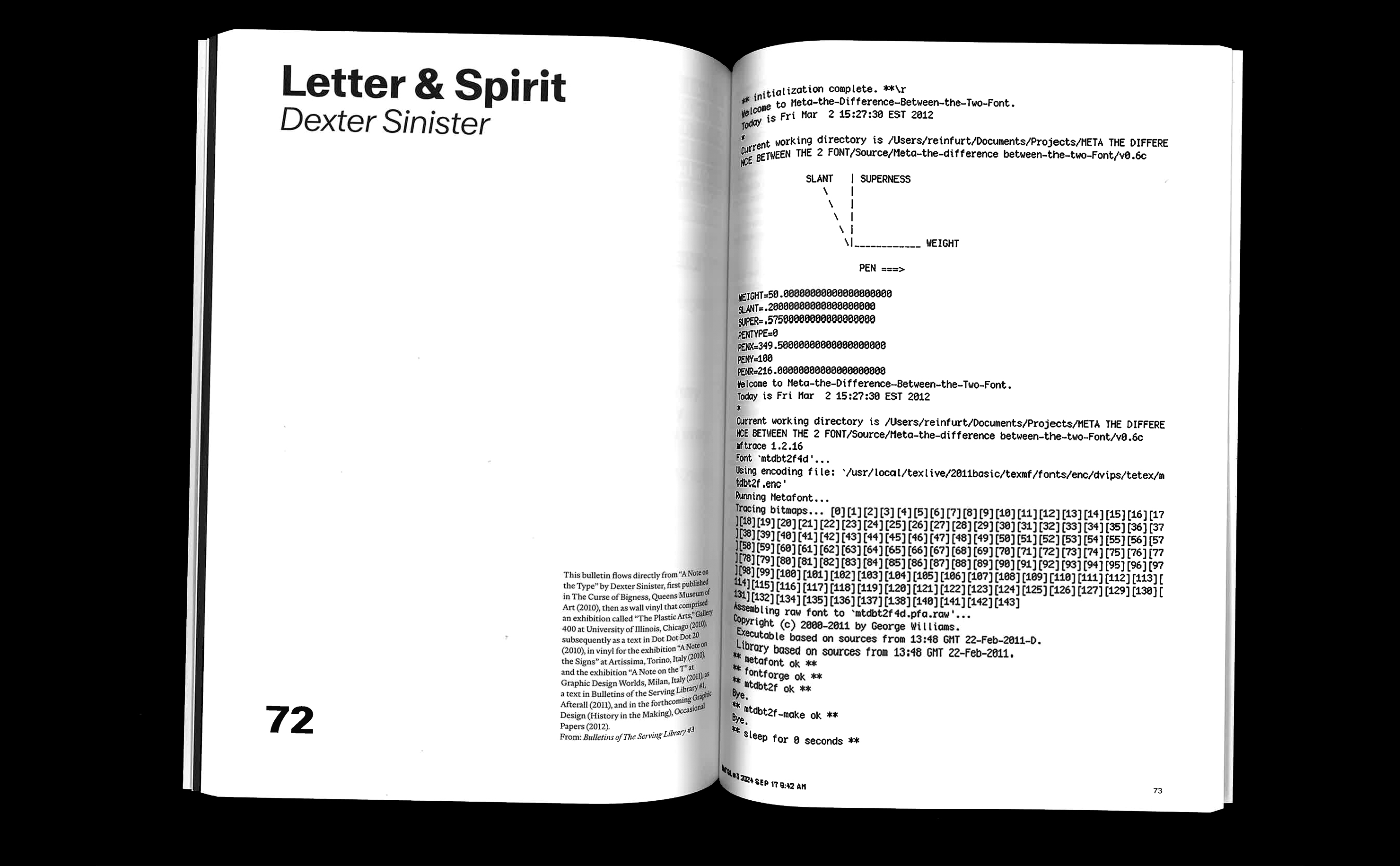
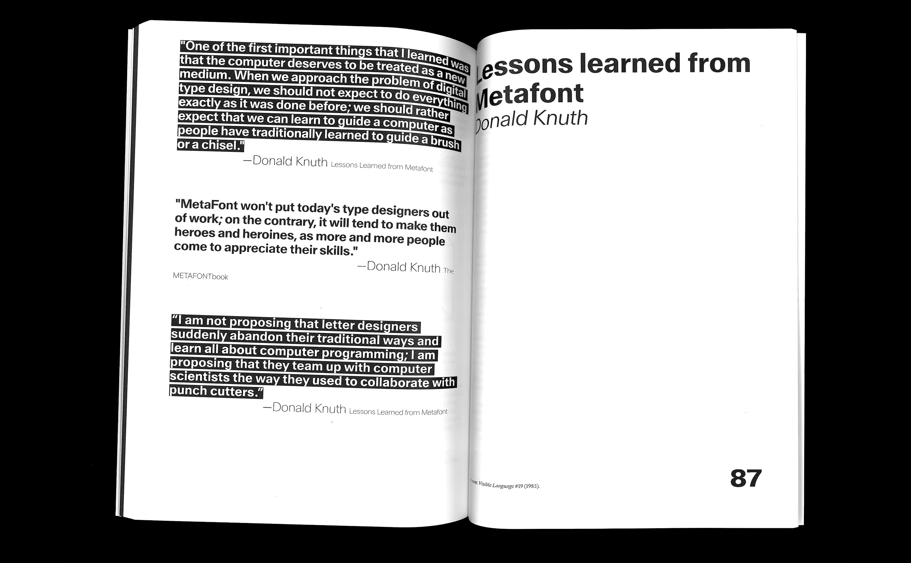
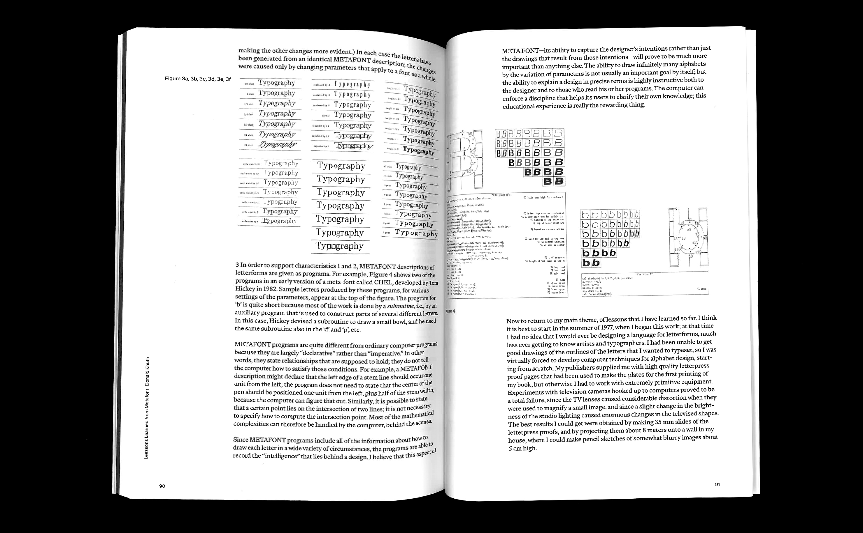
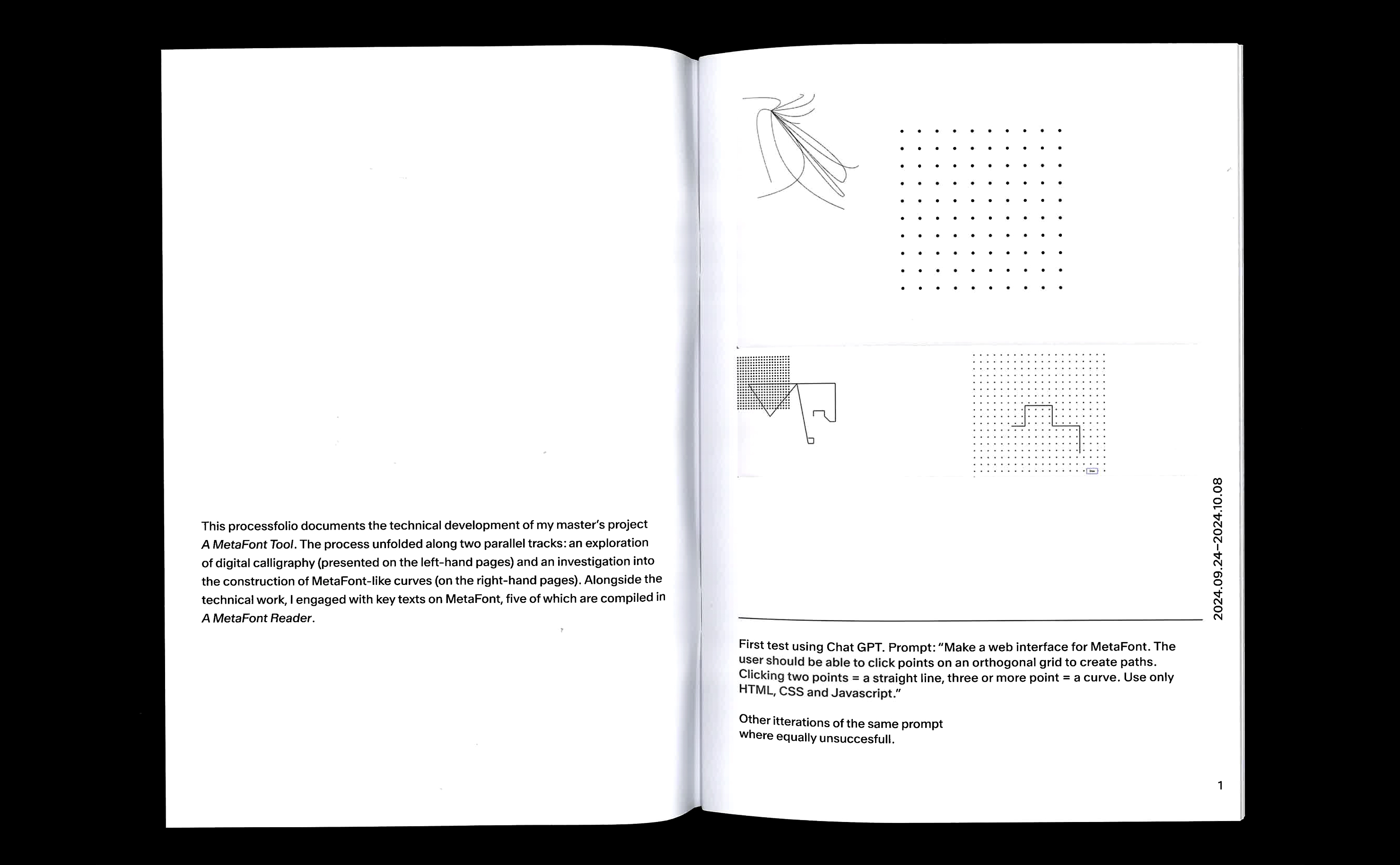
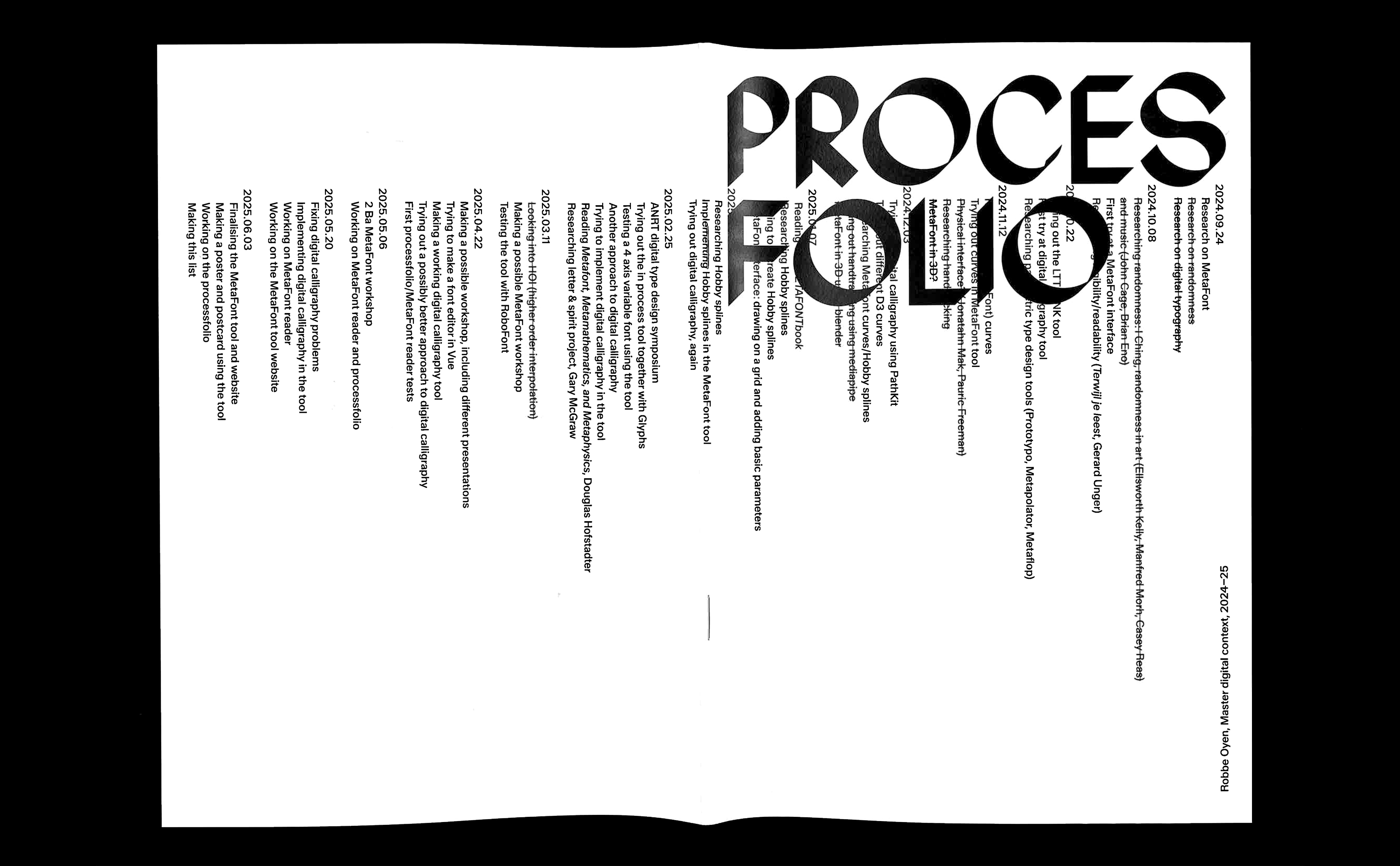
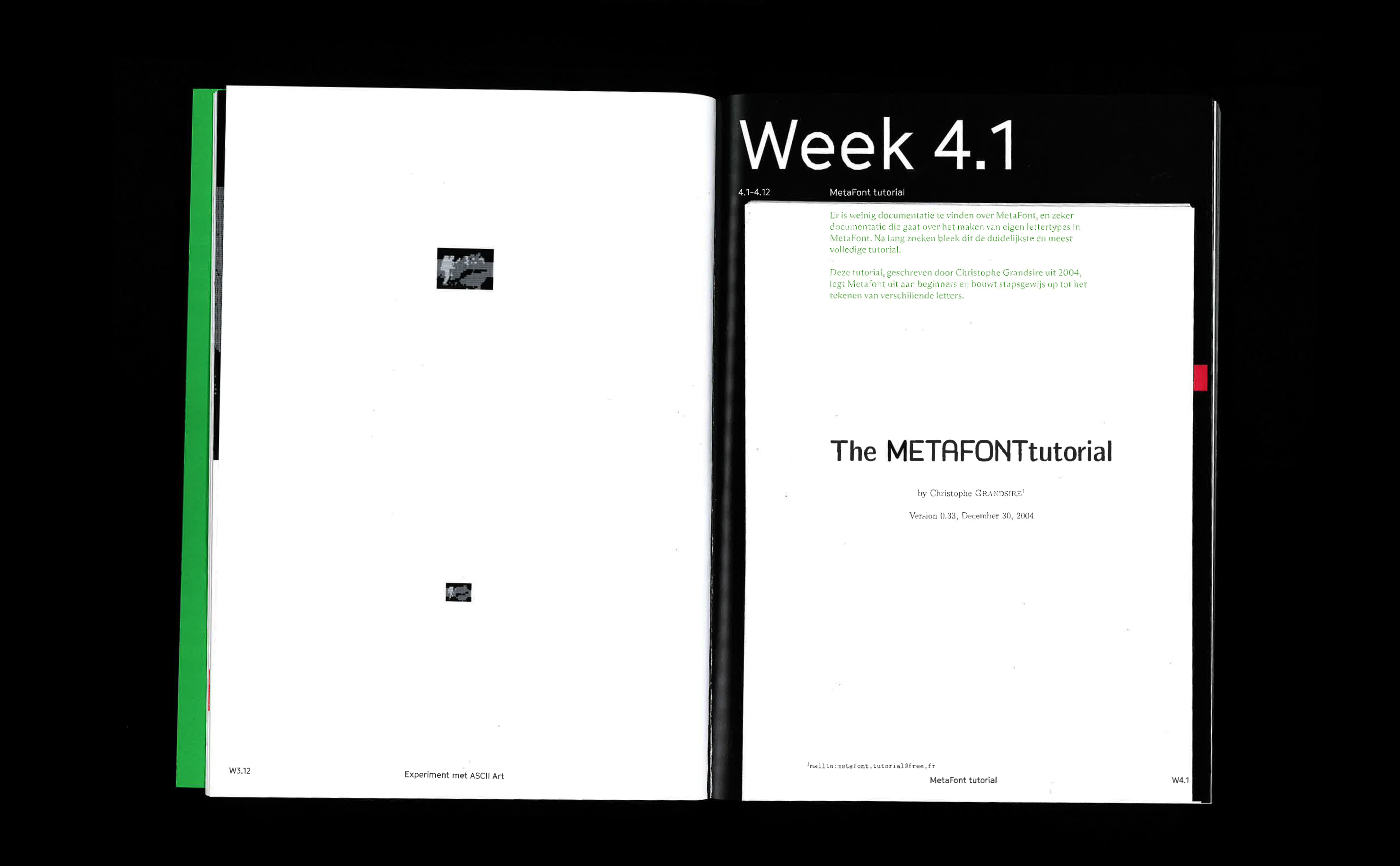
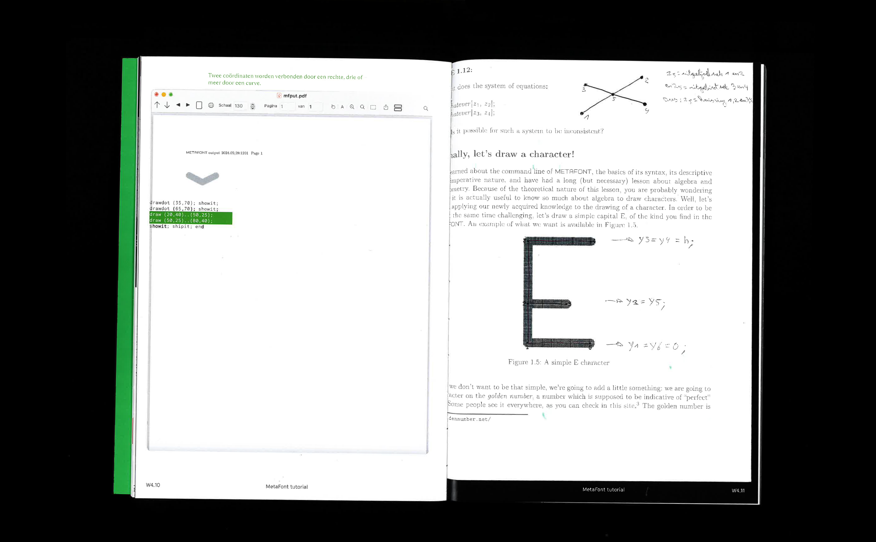
Part of this project is about archiving knowledge about MetaFont. A MetaFont reader collects 5 key texts on MetaFont. The reader hopes to inspire others to start their own research in MetaFont. The texts are accompanied by a list of several contemporary 'type tools', inspired by or borowing aspects of MetaFont.
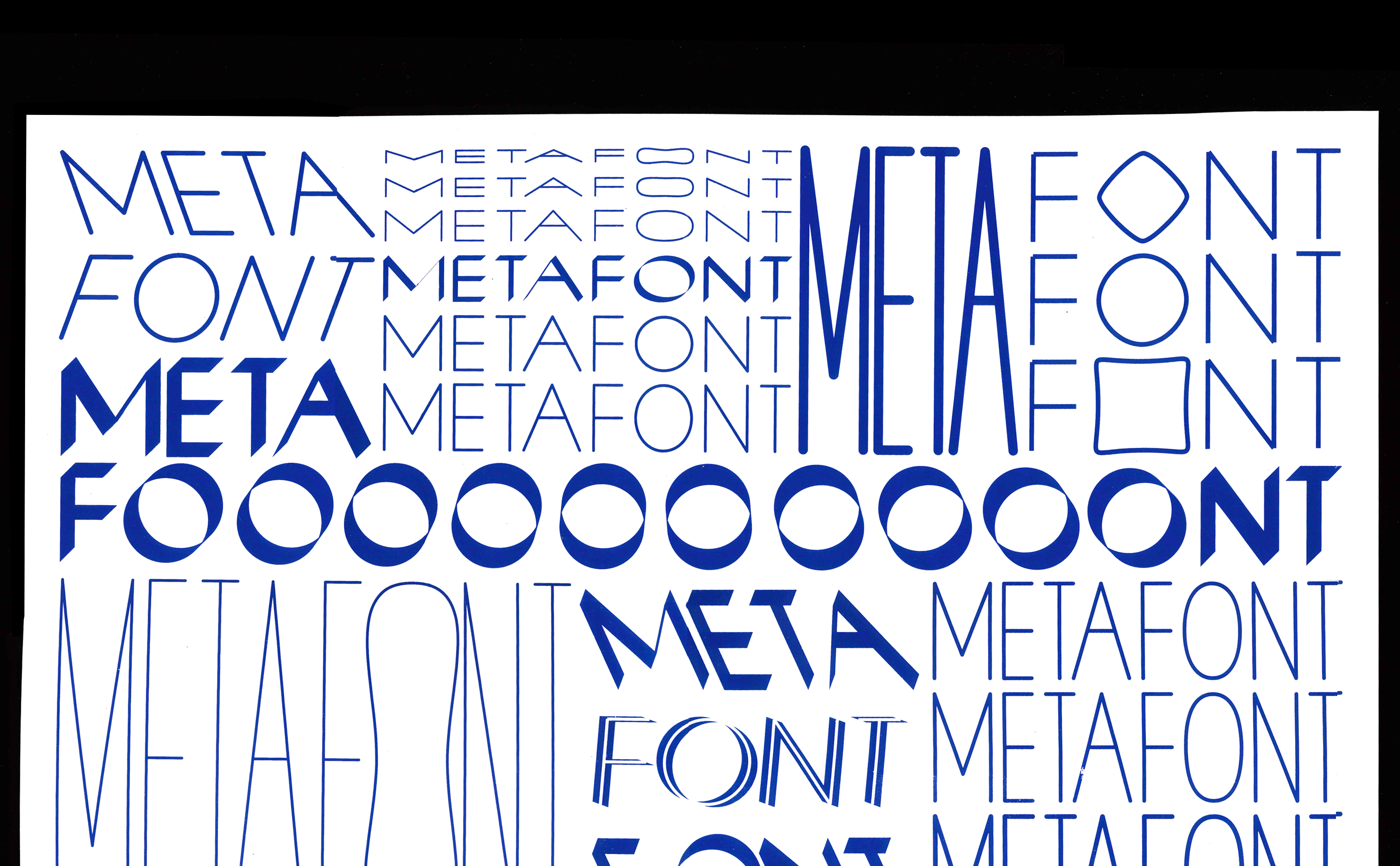
Meta-ironic-pomo-Font
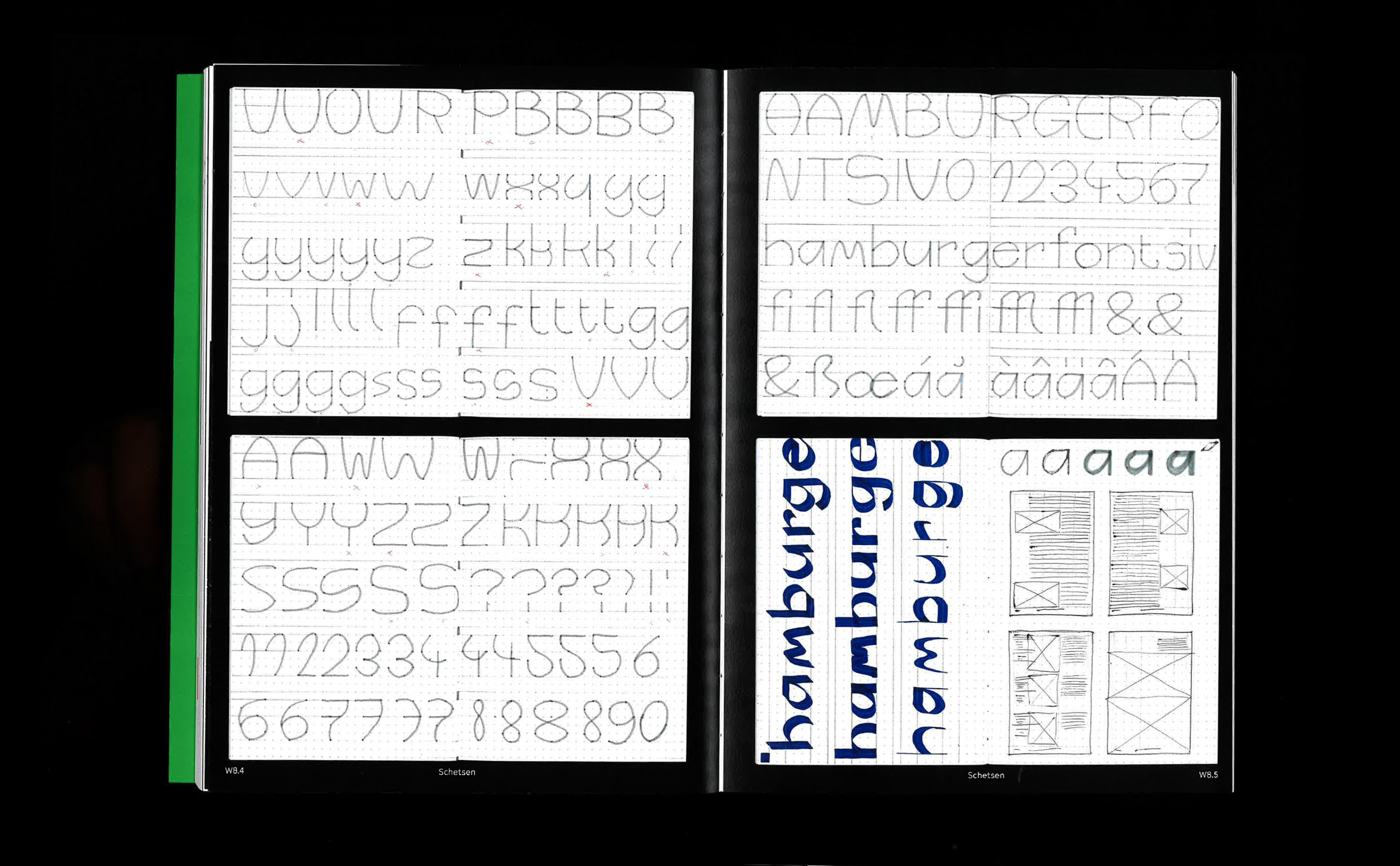
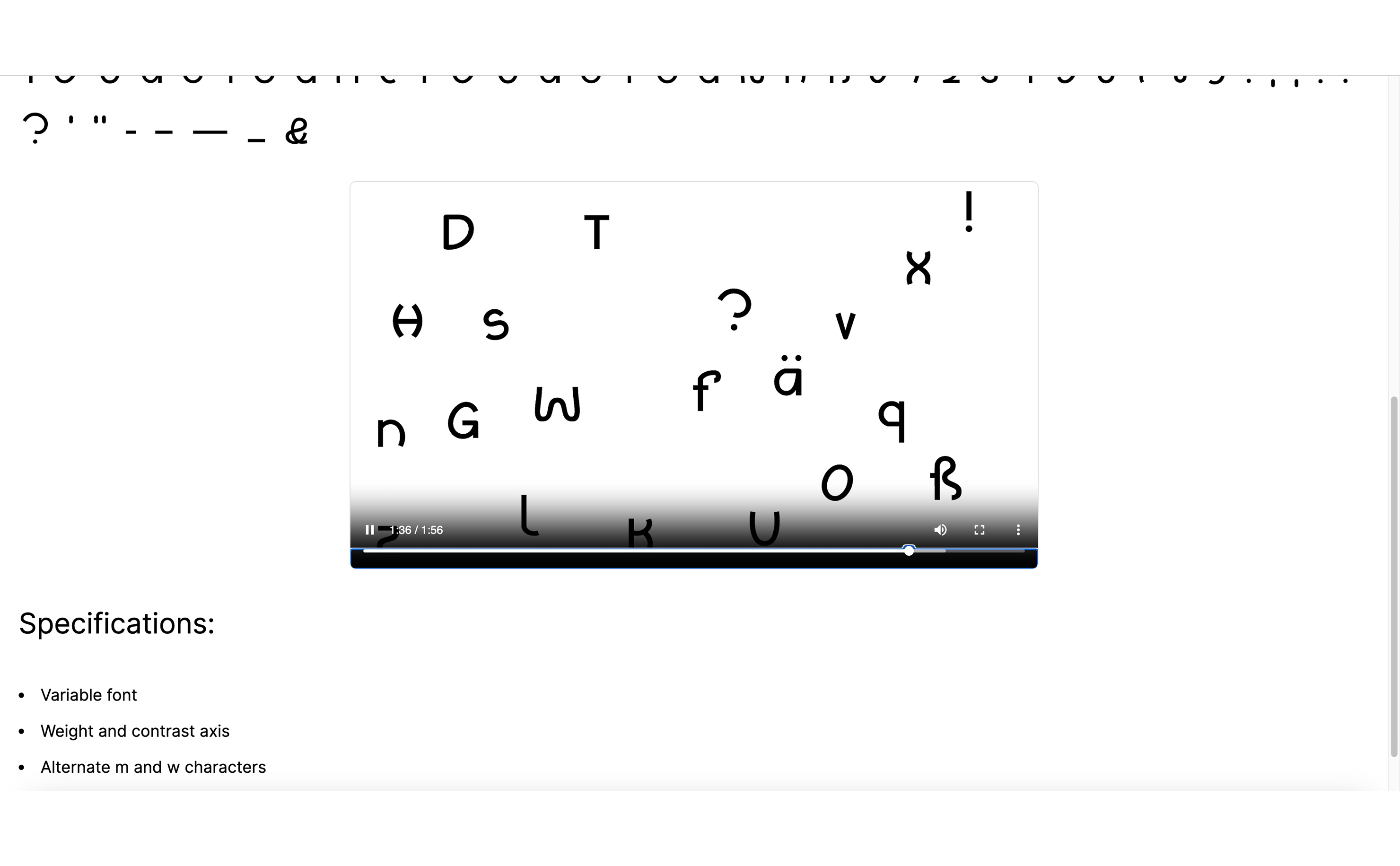
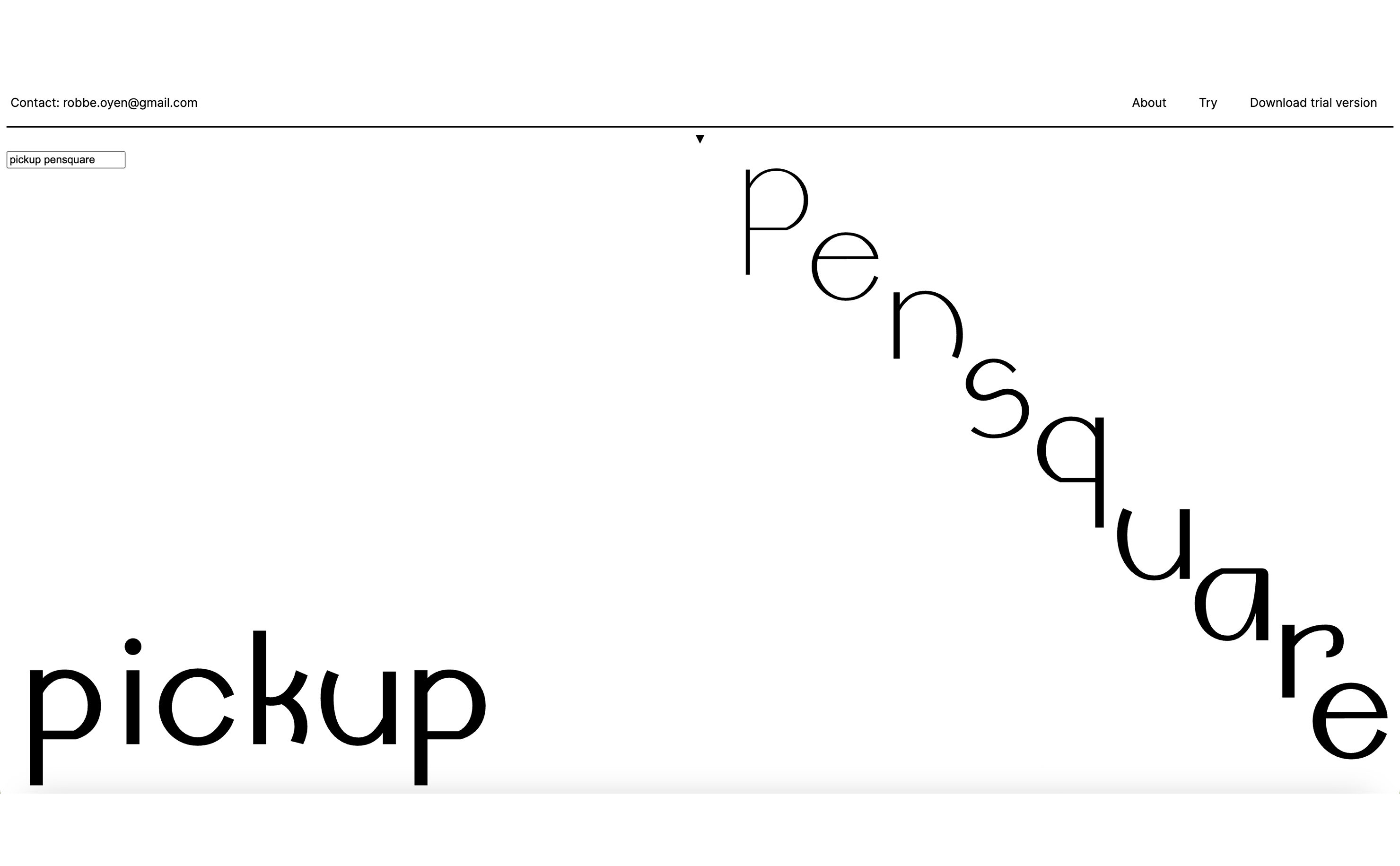
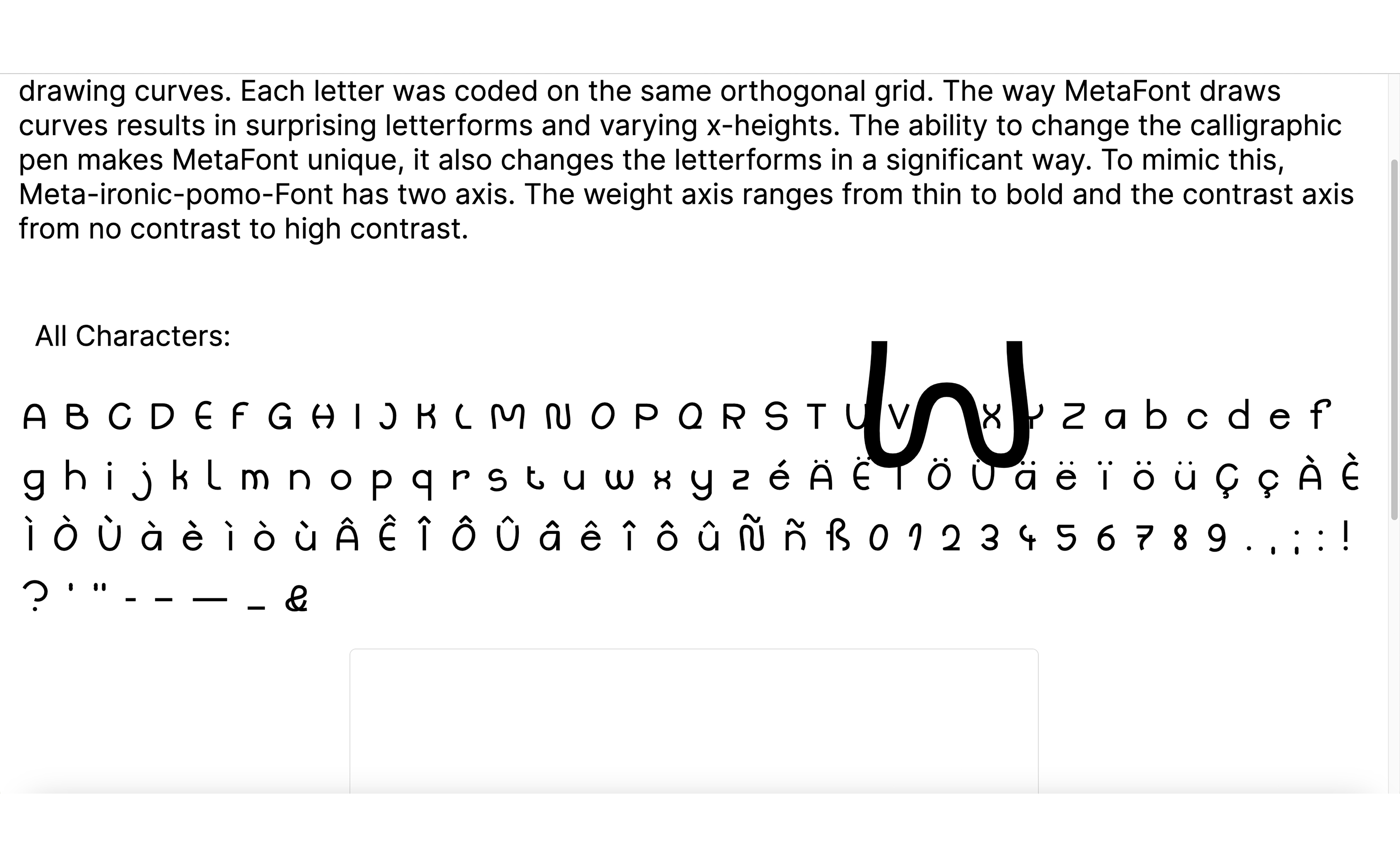
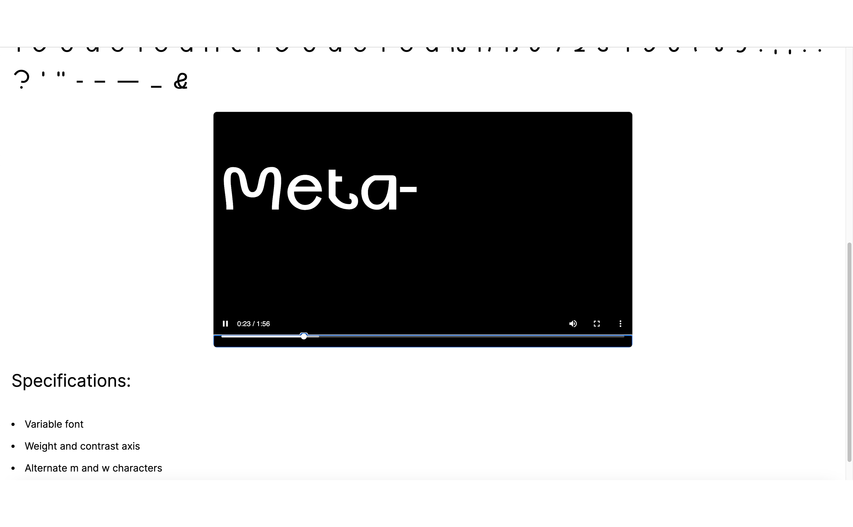
Meta-ironic-pomo-Font is inspired by and made with MetaFont, the 1979 programming language made by Donald Knuth. The typeface uses MetaFont's specific way of connecting points and drawing curves. Each letter was coded on the same orthogonal grid. The way MetaFont draws curves results in surprising letterforms and varying x-heights. The ability to change the calligraphic pen makes MetaFont unique, it also changes the letterforms in a significant way. To mimic this, Meta-ironic-pomo-Font has two axis. The weight axis ranges from thin to bold and the contrast axis from no contrast to high contrast.
Lunacy
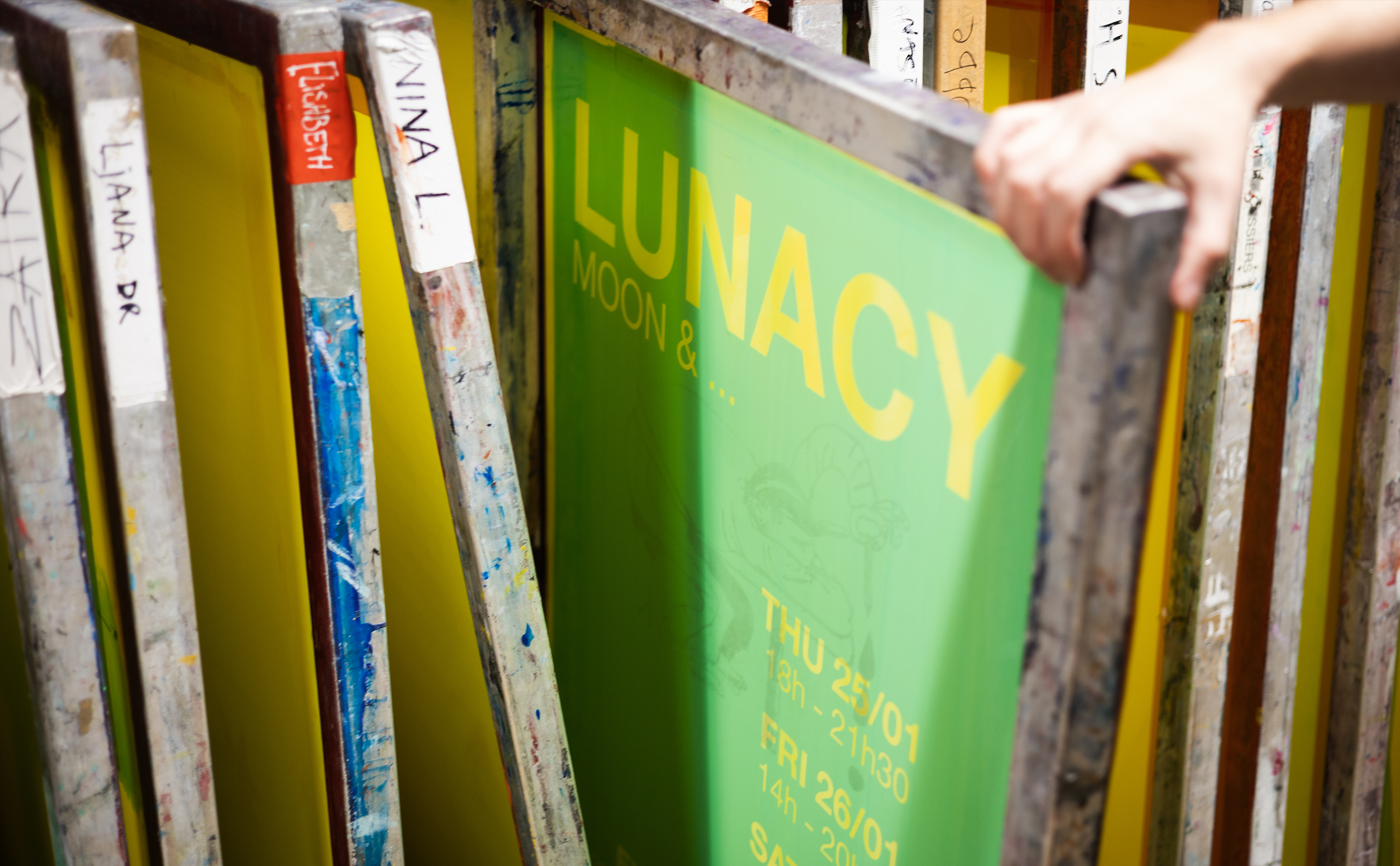
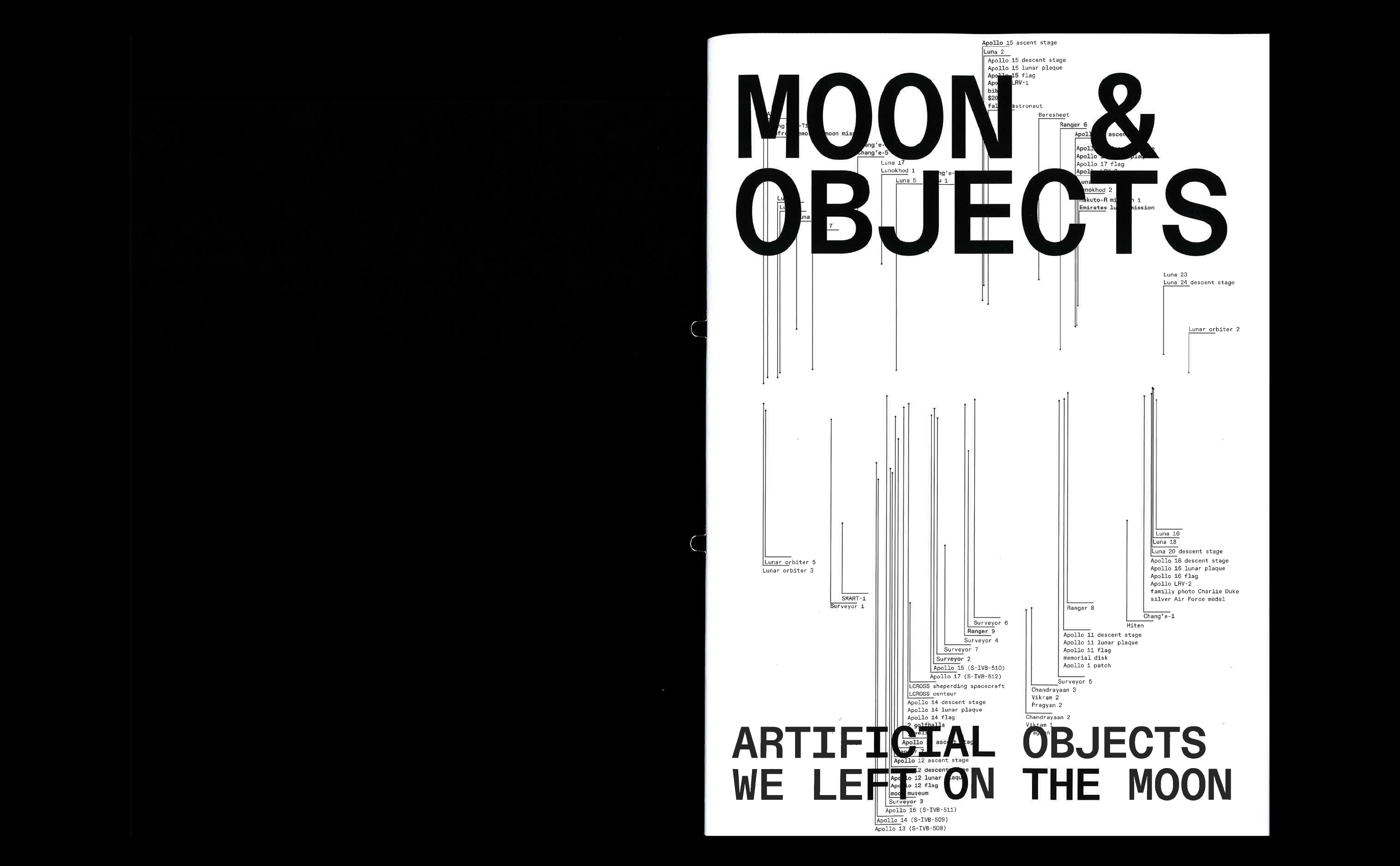
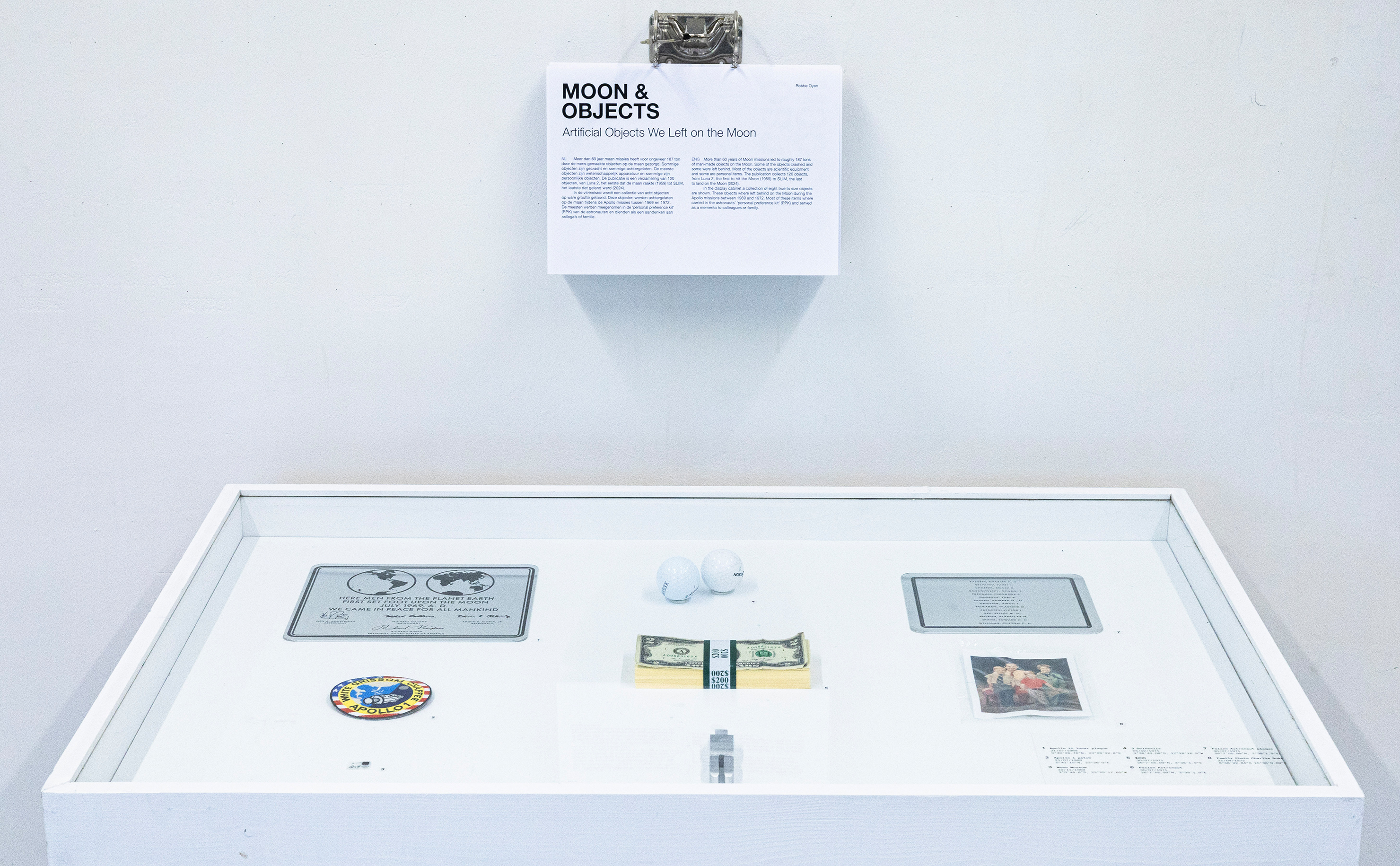
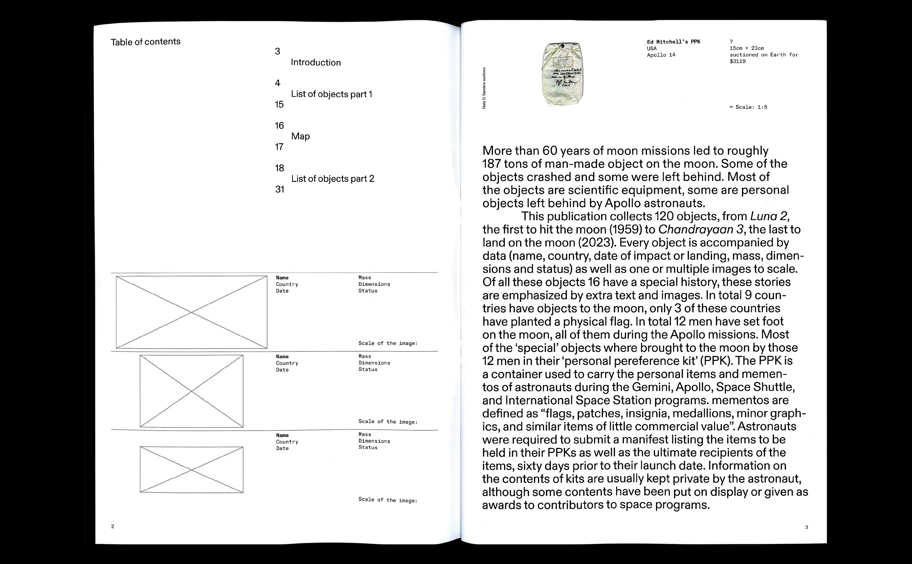
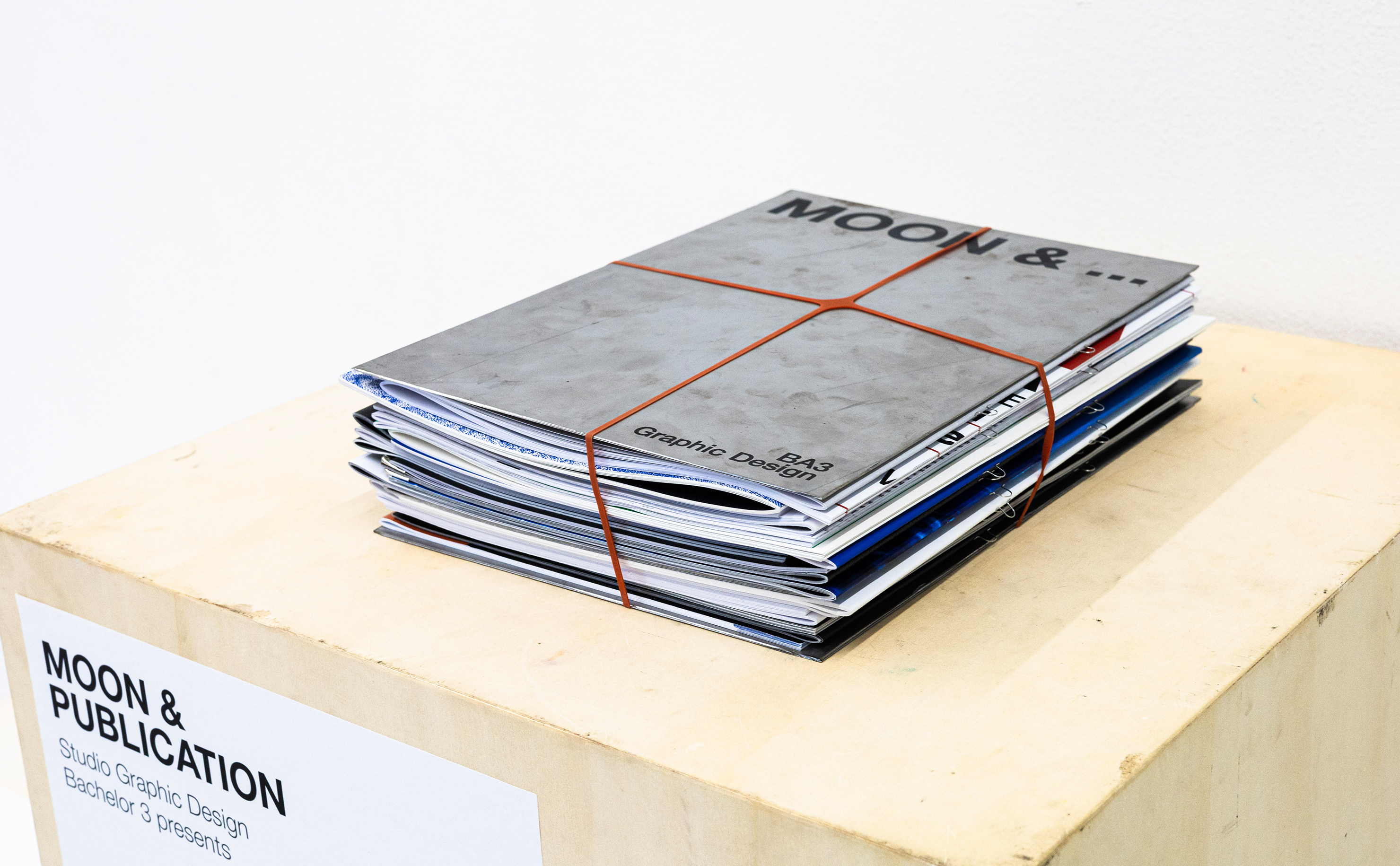
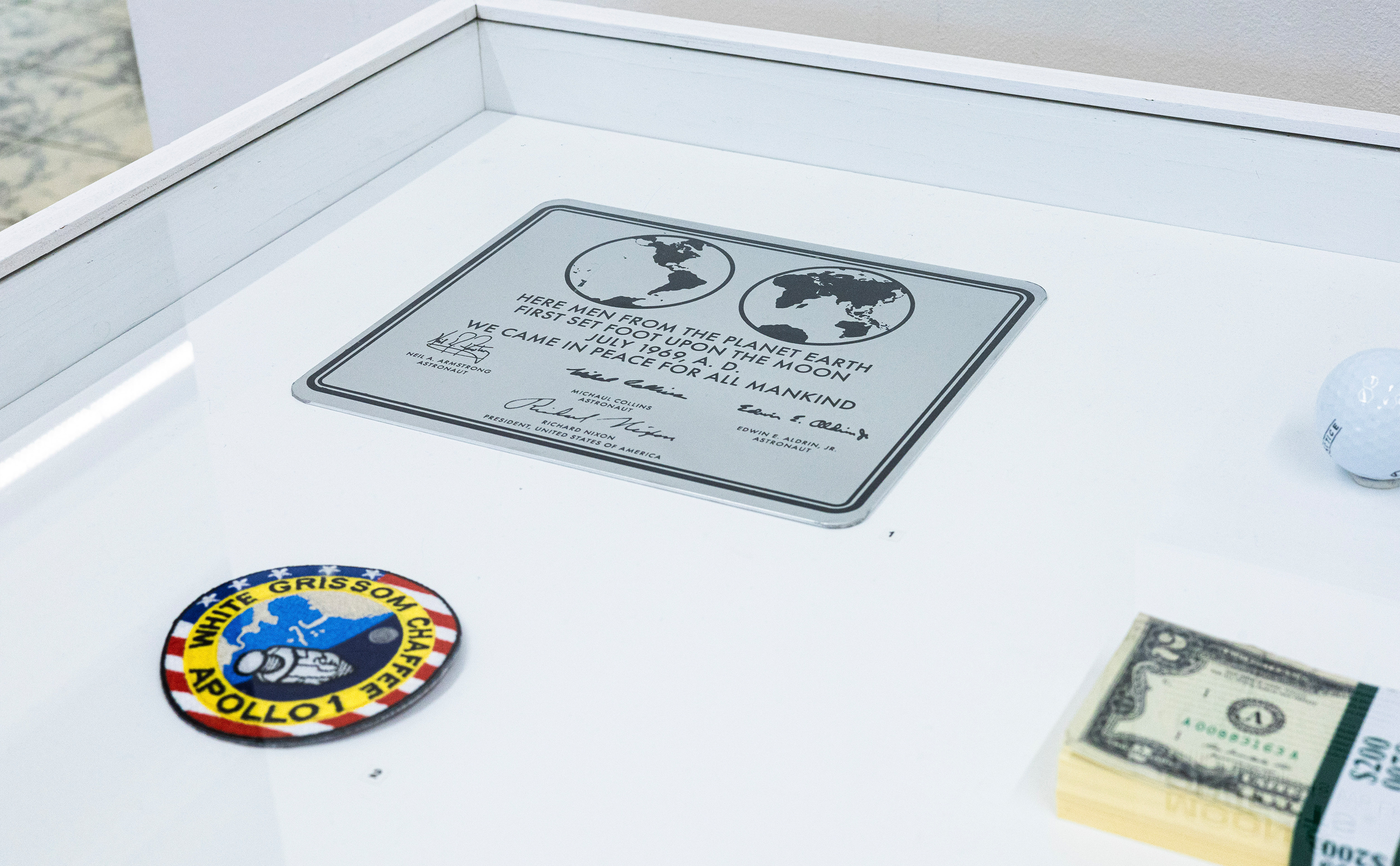
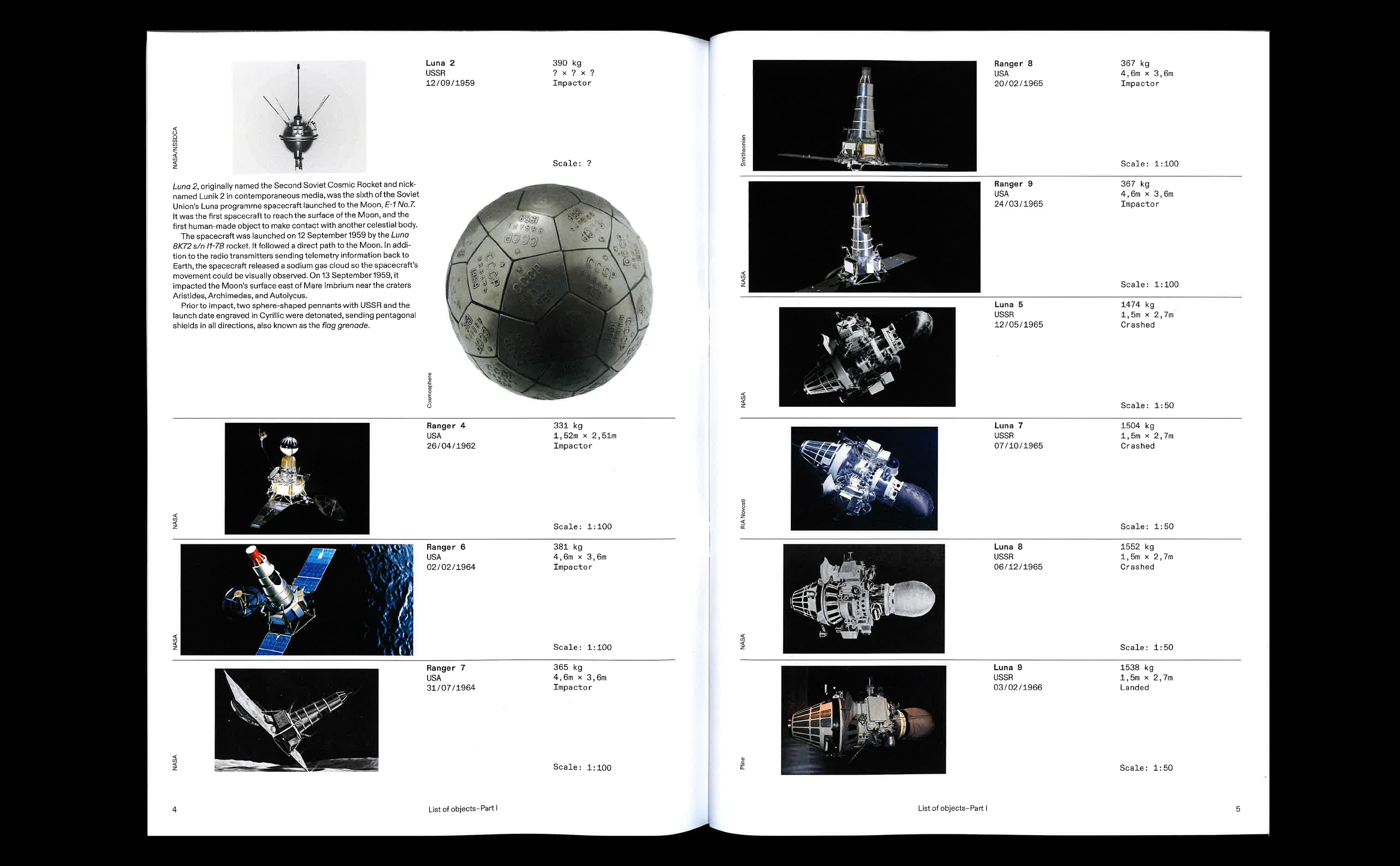
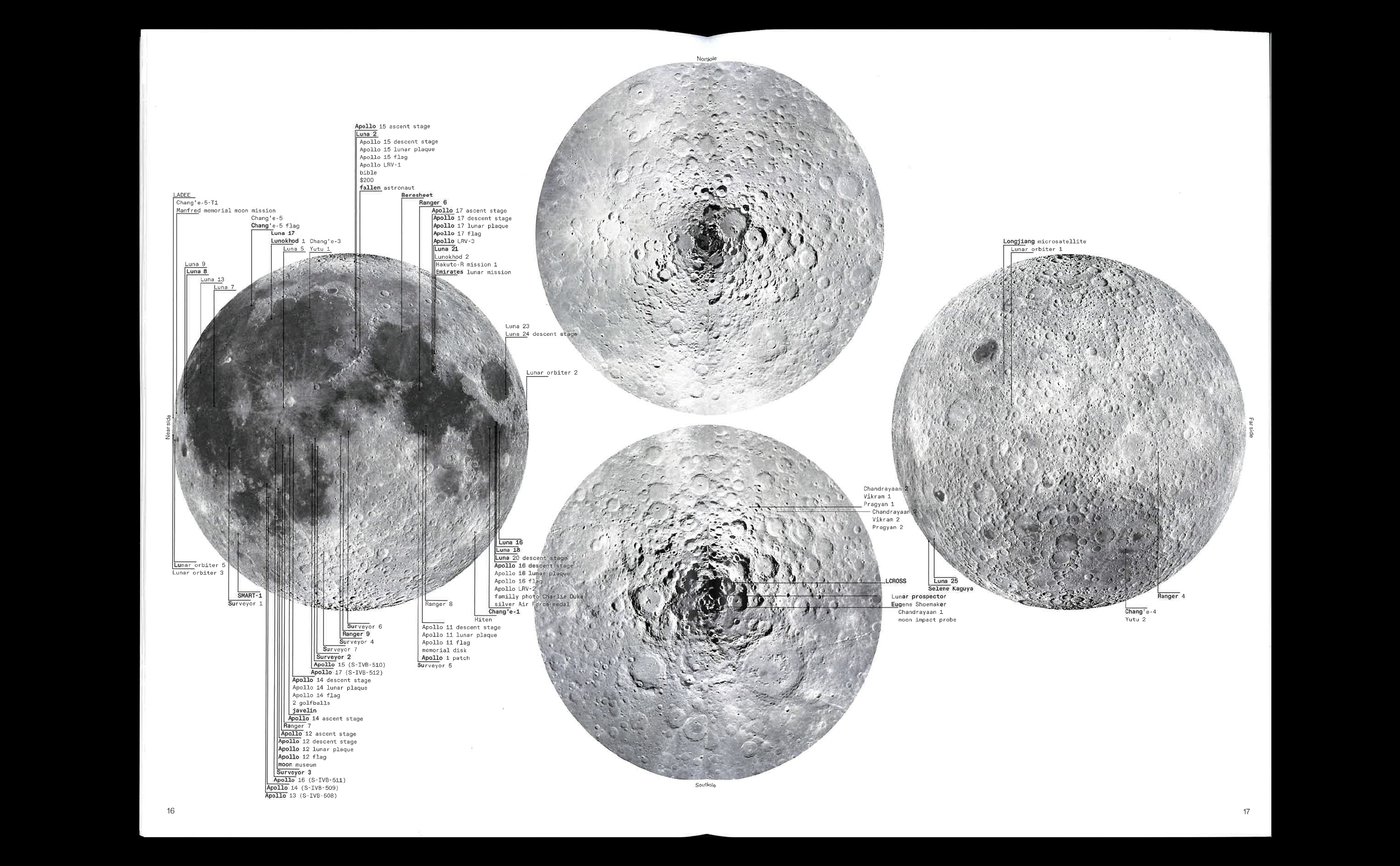
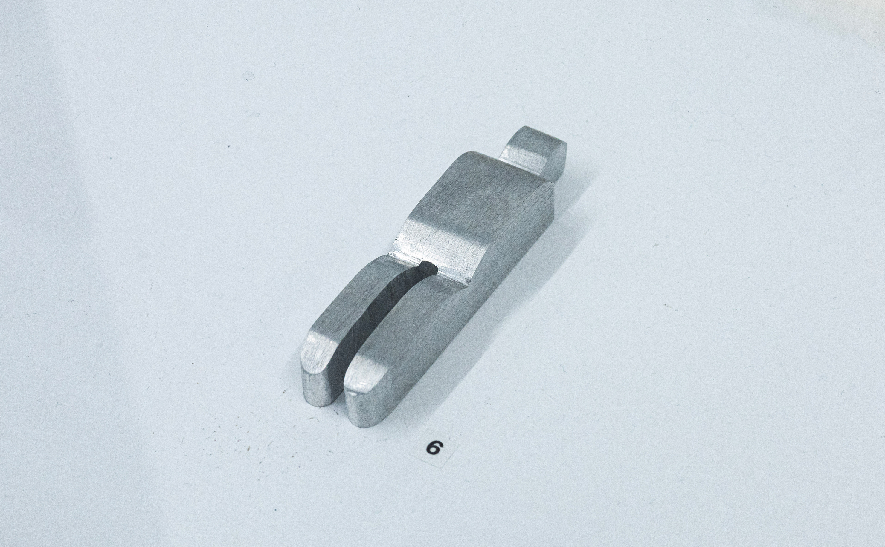
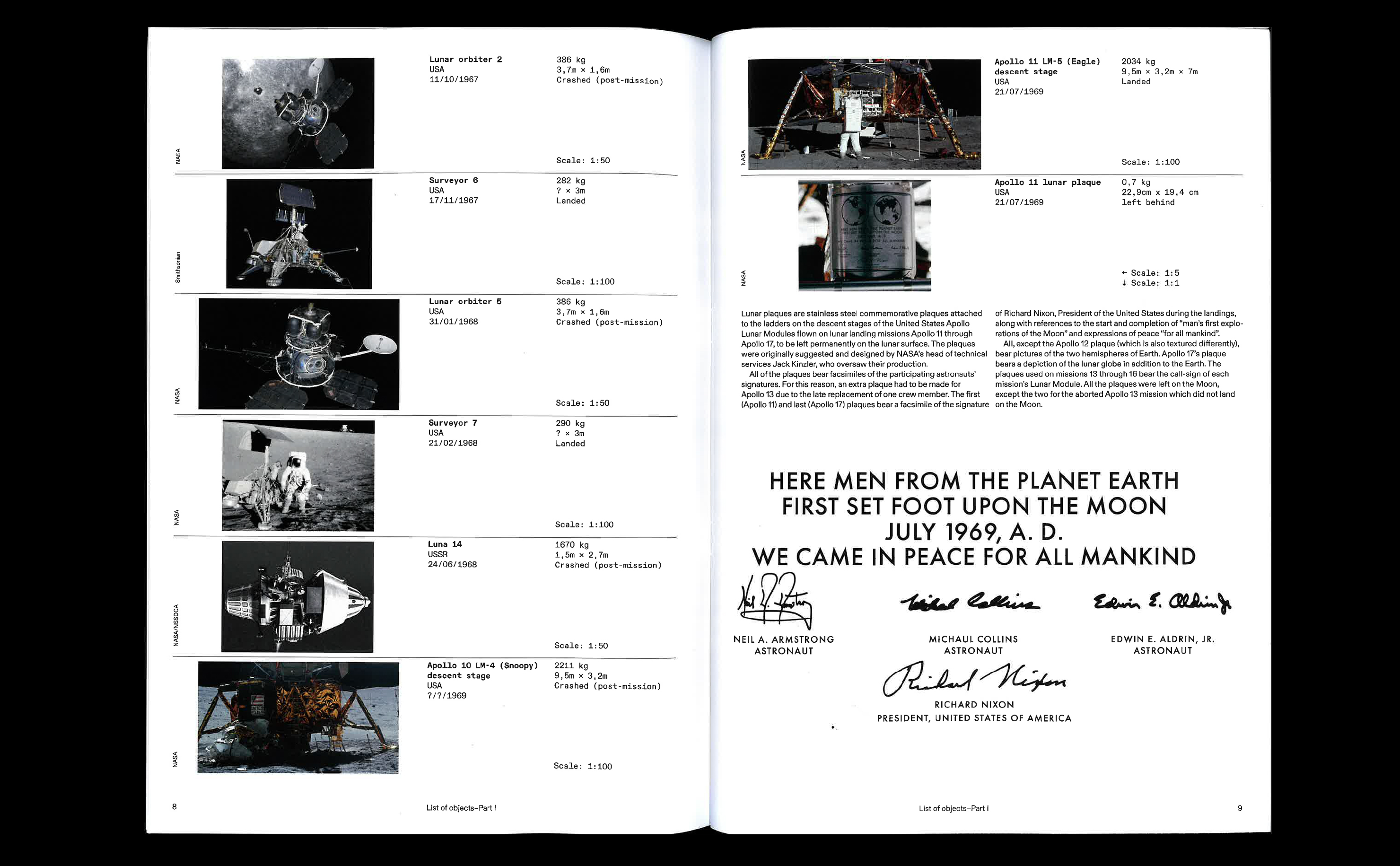
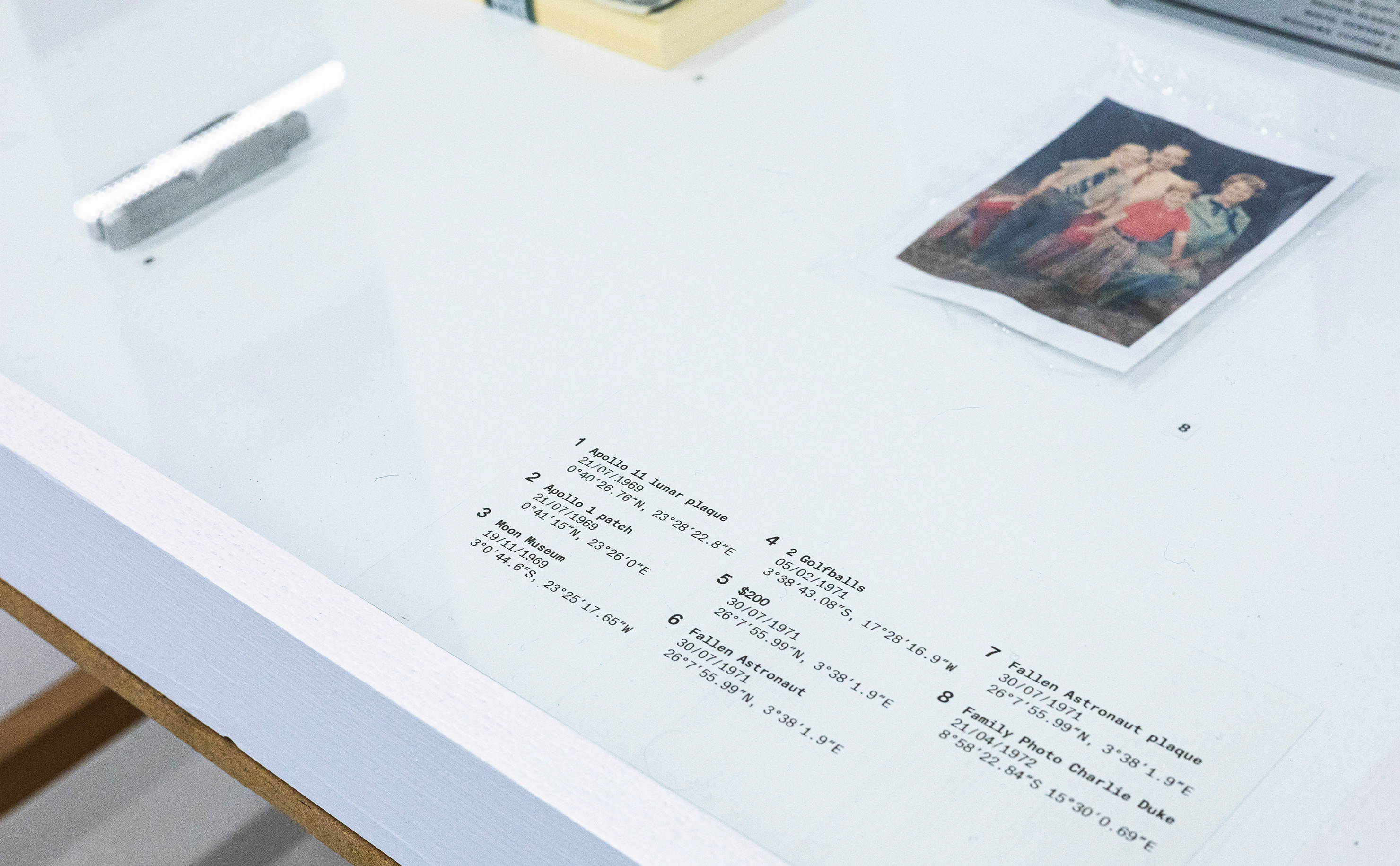
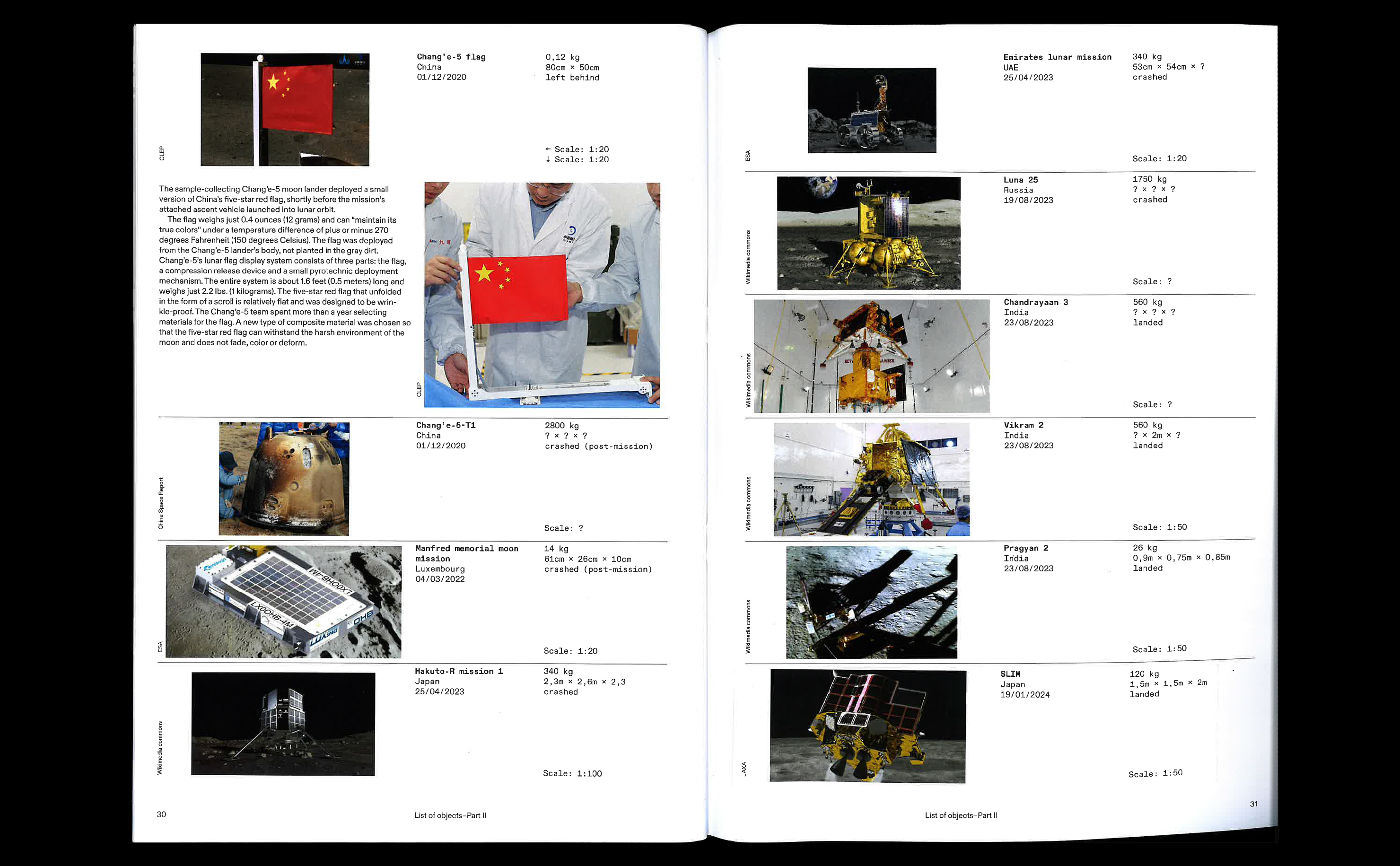
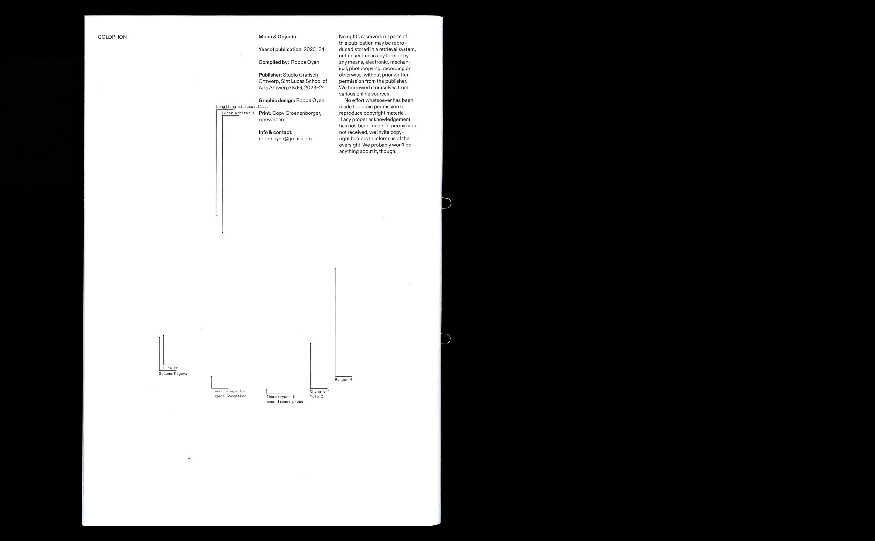
Lunacy was an exhibition by the 3rd bachelor student’s graphic design. This year, the Moon was our muse. Each student chose a different aspect of the Moon. For each topic a publication and installation where made and exhibited. My part delved into the manmade objects left on the Moon. The installation is a collection of replicas, eight small objects—with a special story—left behind during the Apollo missions. An A4 publication accompanies the installation by listing all artificial objects left on the Moon.
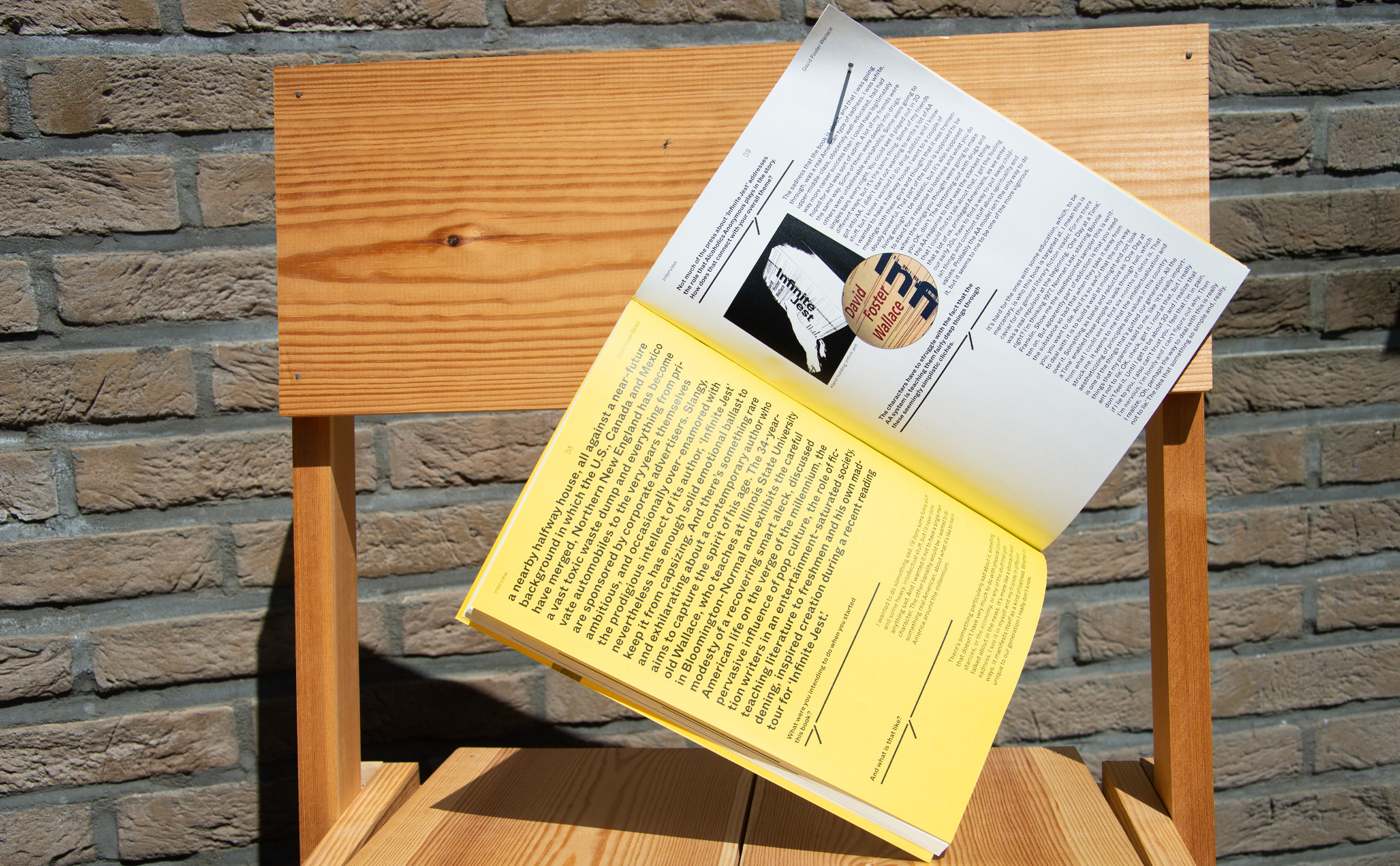
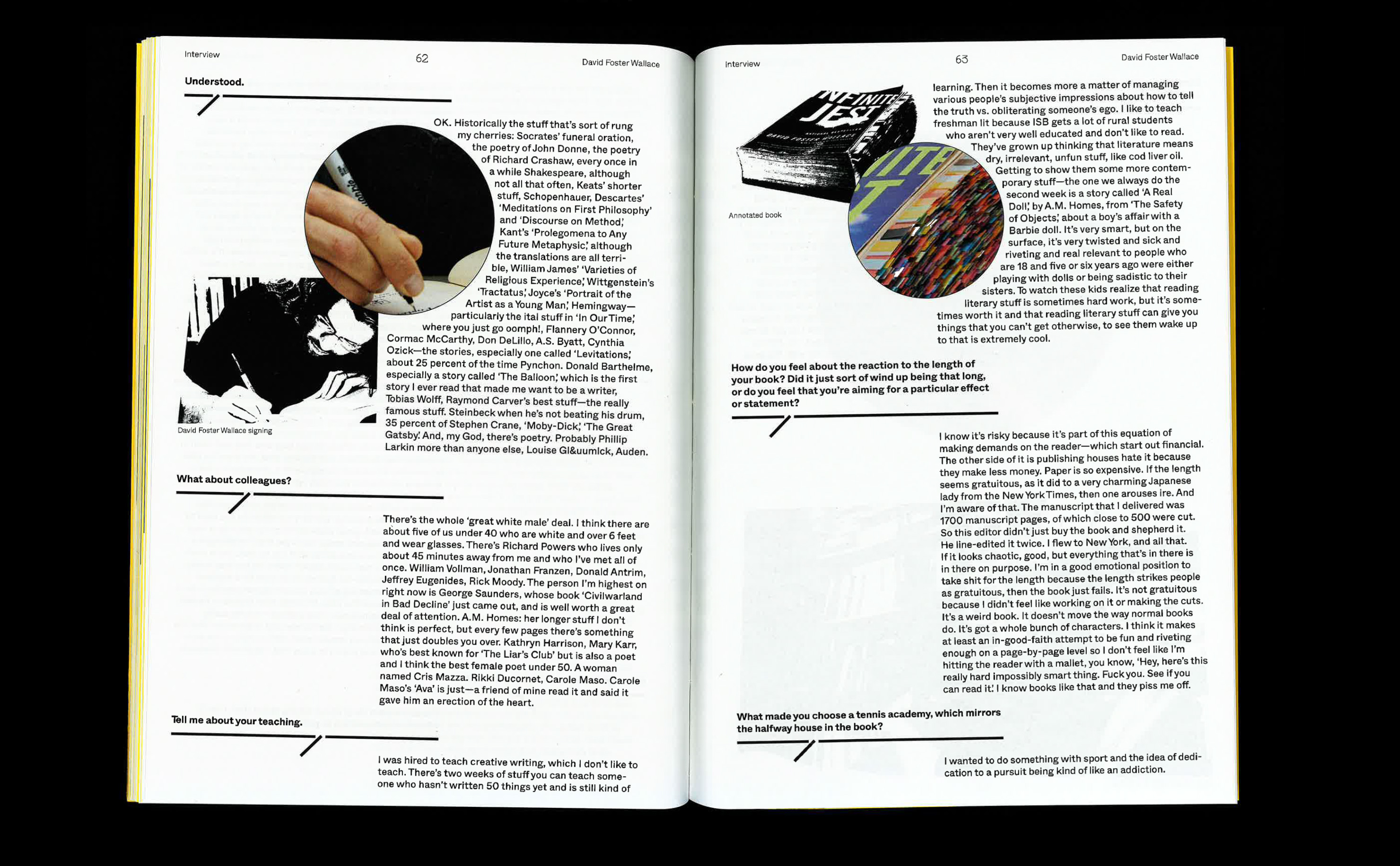
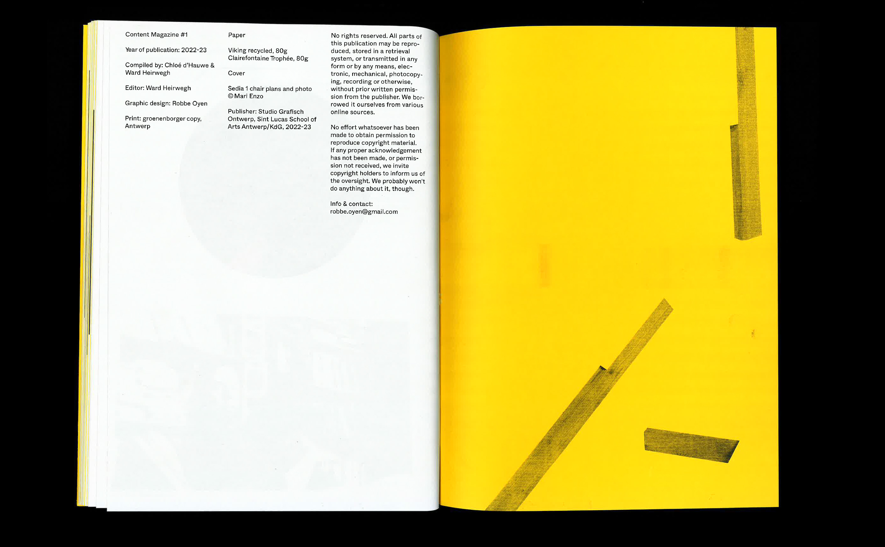
Content Magazine
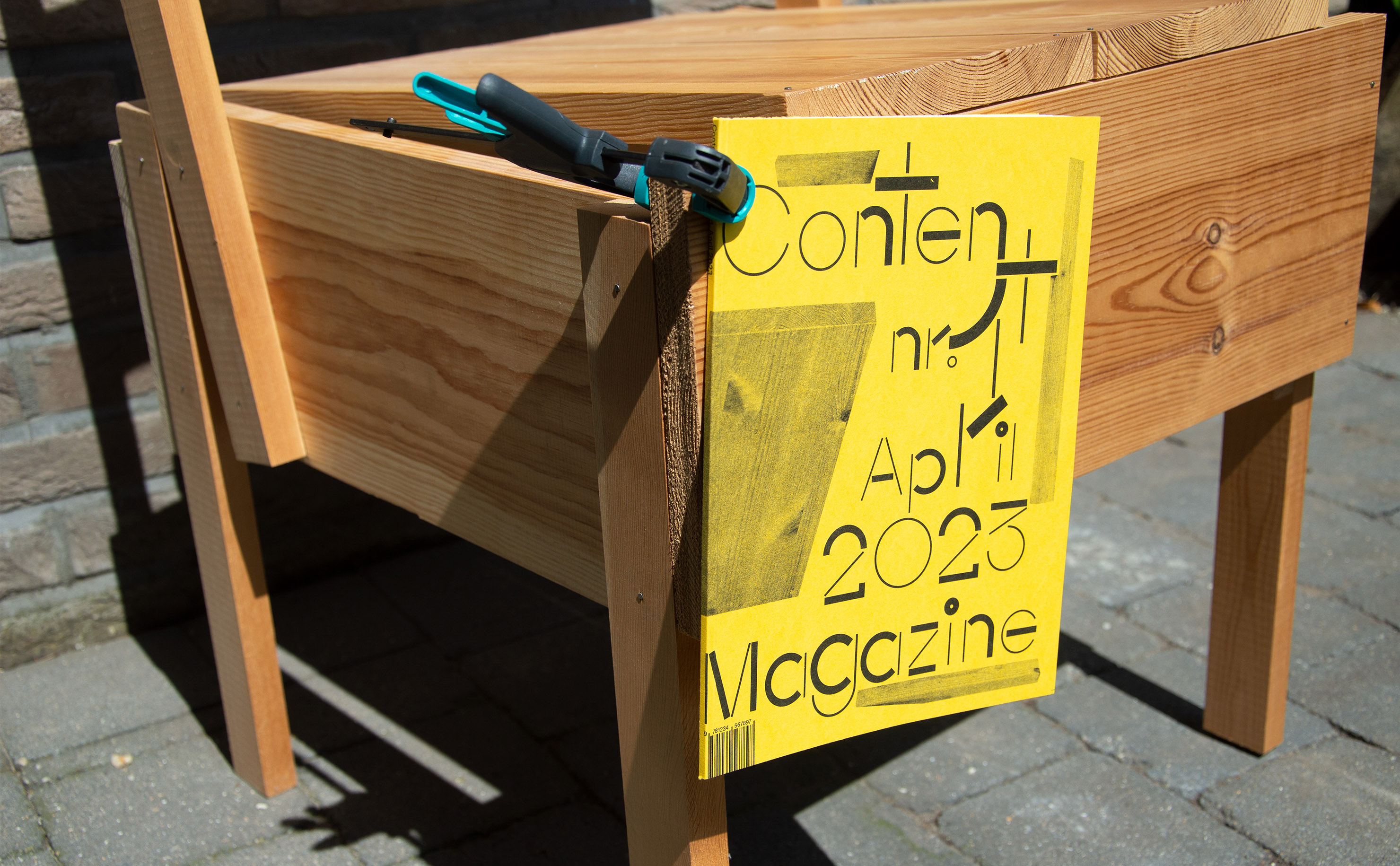
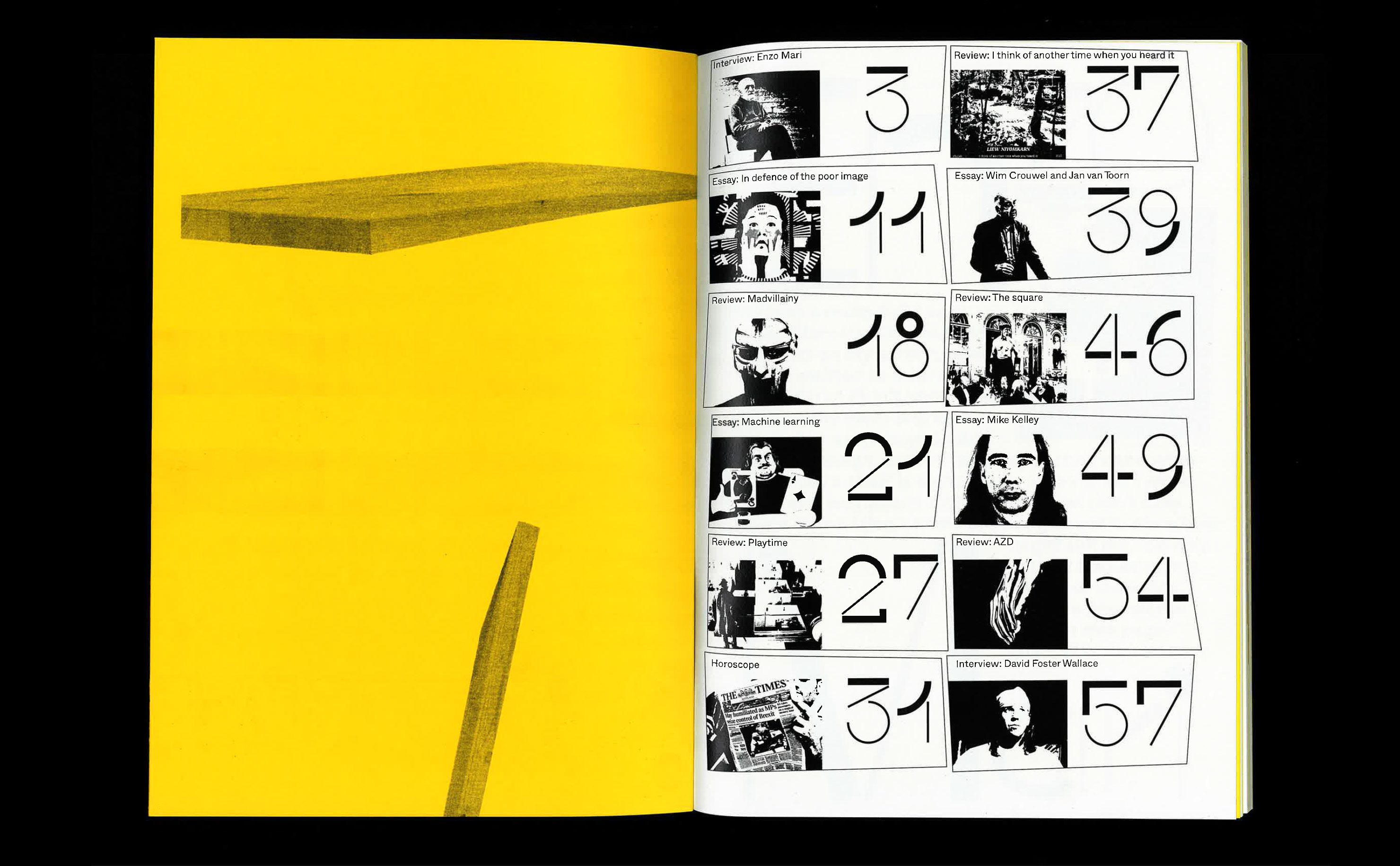
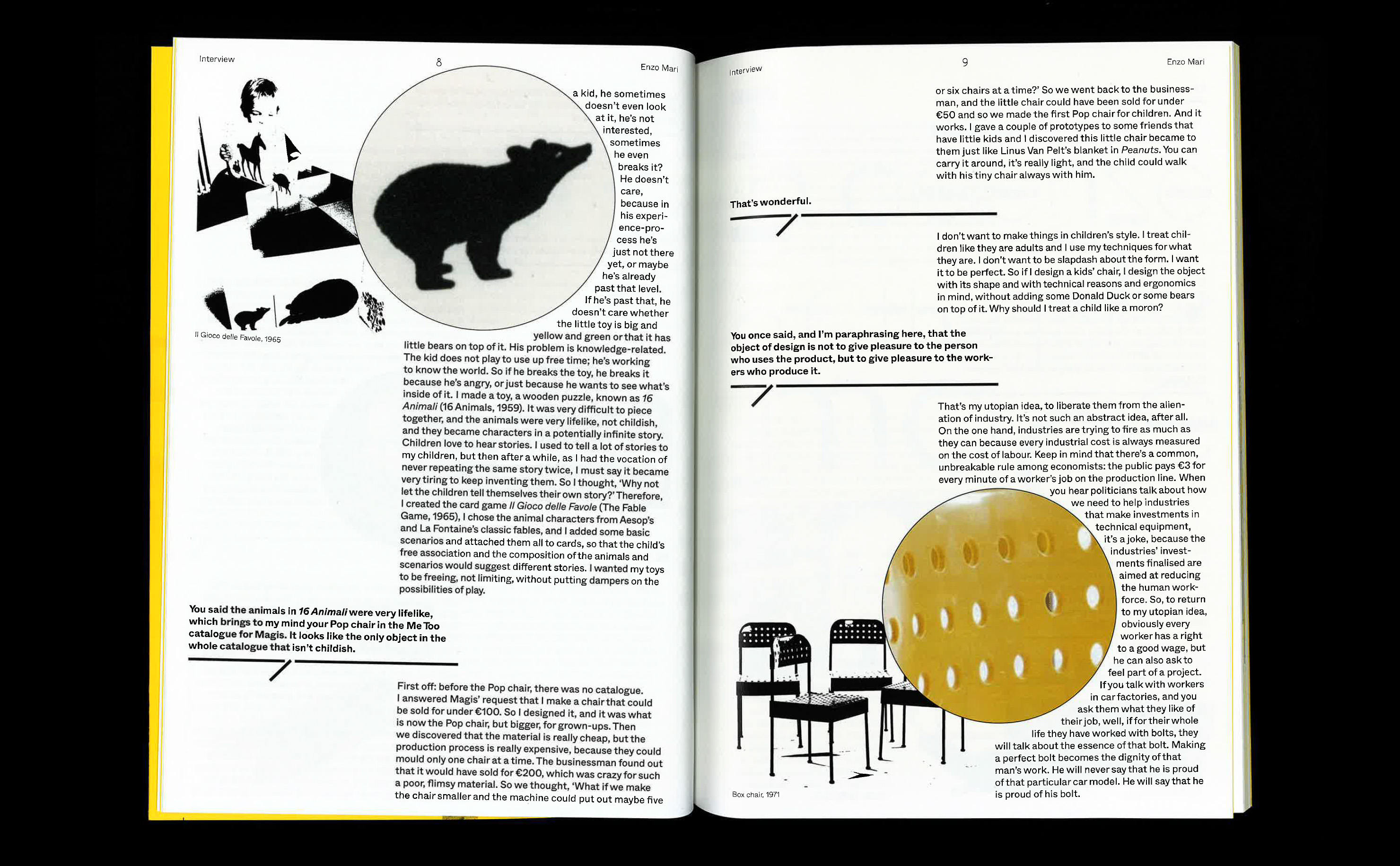
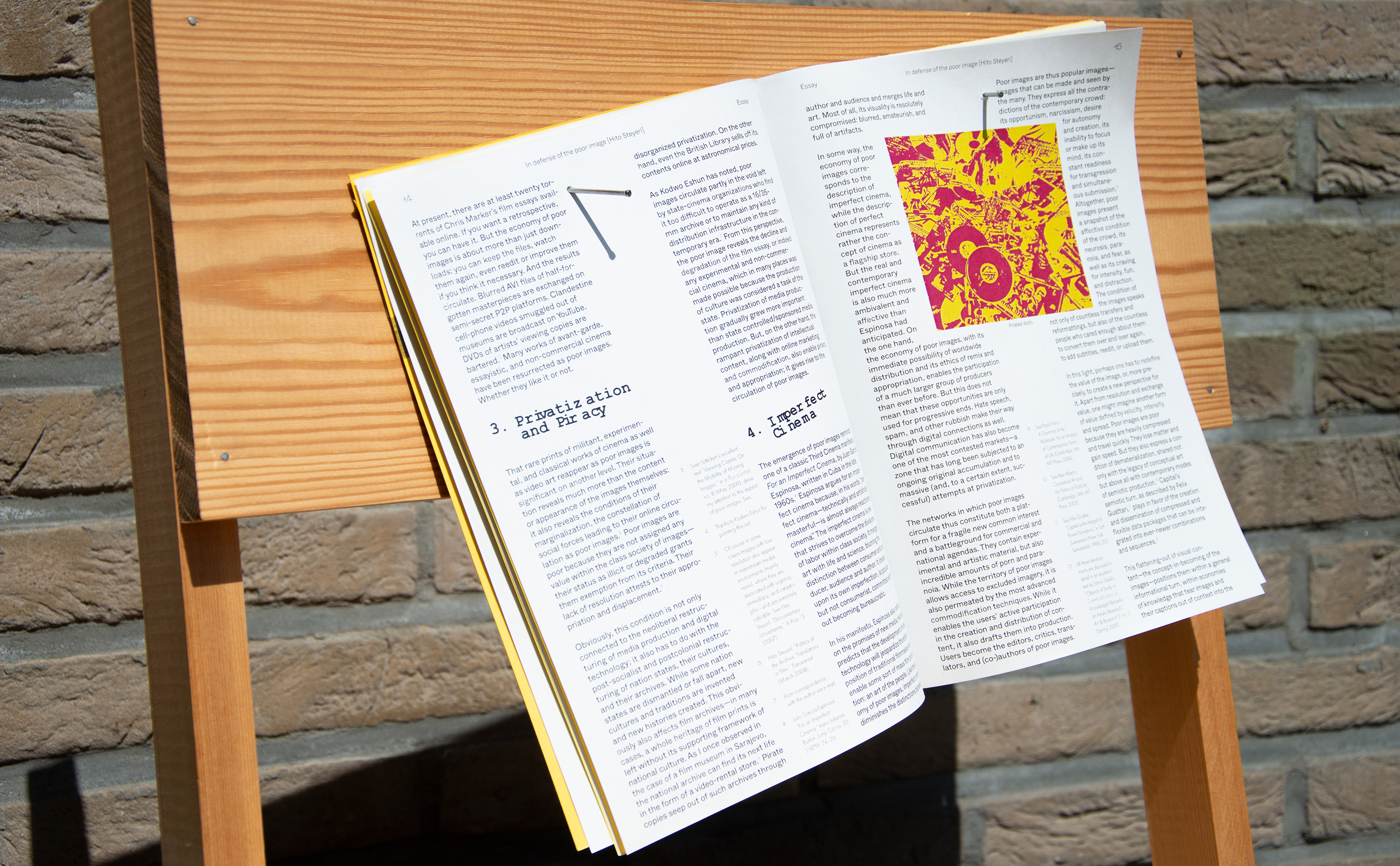
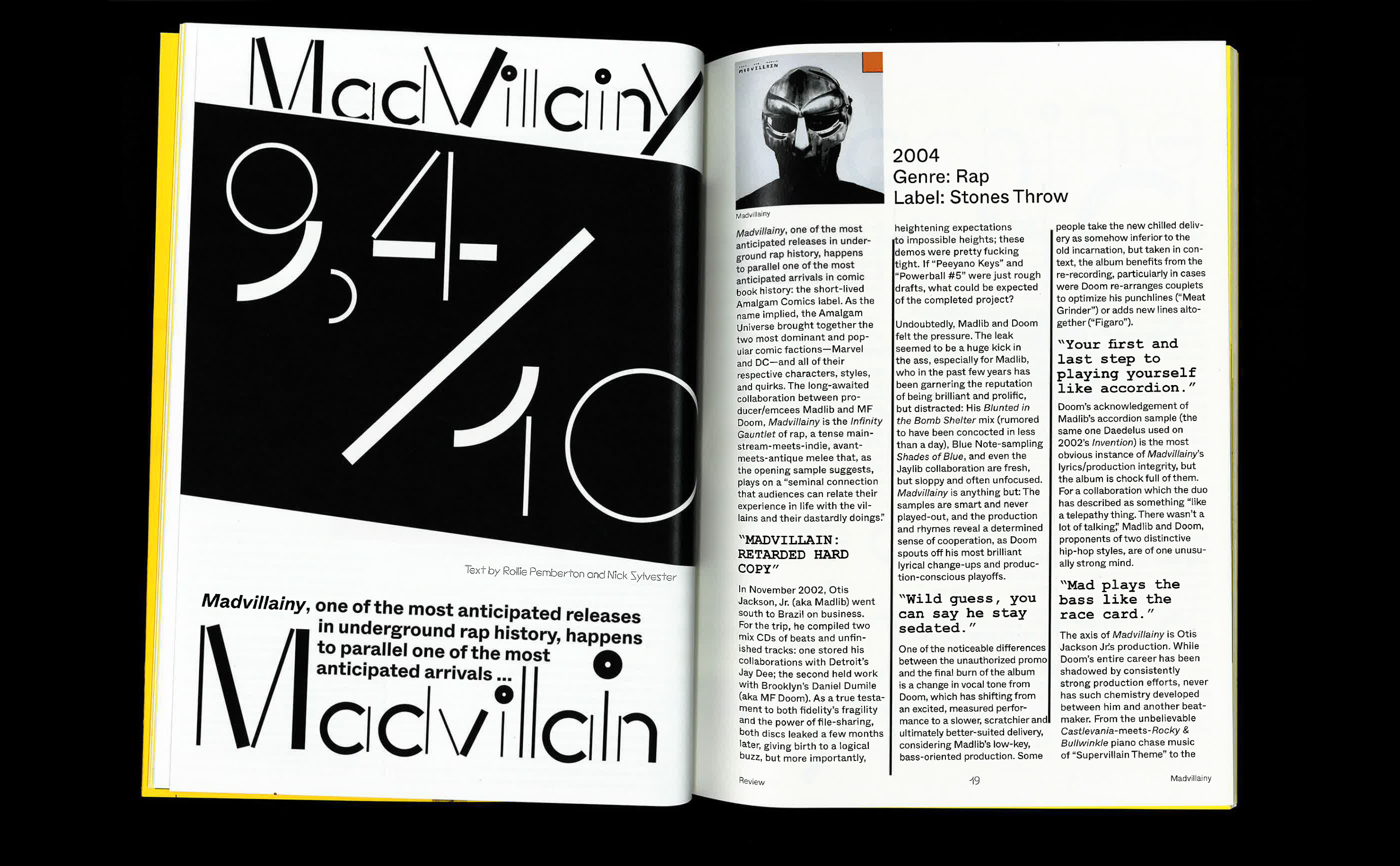
Content magazine is a publication filled with must reads and must knows in the art and design world. The magazine gets its visual inspiration from the DIY community and Enzo Mari’s project ‘Autoprogetazione?’. The images in the publication mimic the visual language in Mari’s ‘Autoprogetazione’. The typography on the cover and titlepages resemble the imperfection typically found in opensource/DIY projects. A dynamic composition was made using elements of typography and a deconstructed Enzo Mari chair. The interior pages are printed on 80 g/m2 recycled paper, with a black Riso-print on the cover.
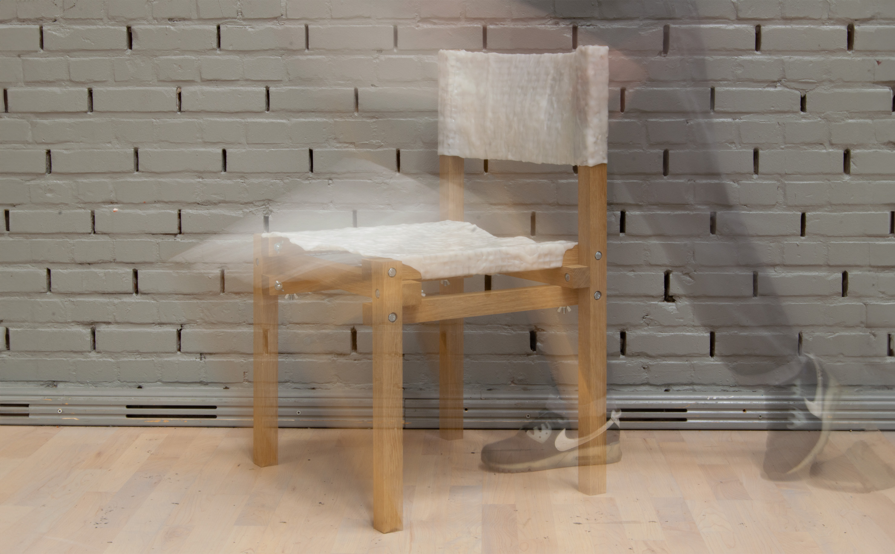
Nameless chair
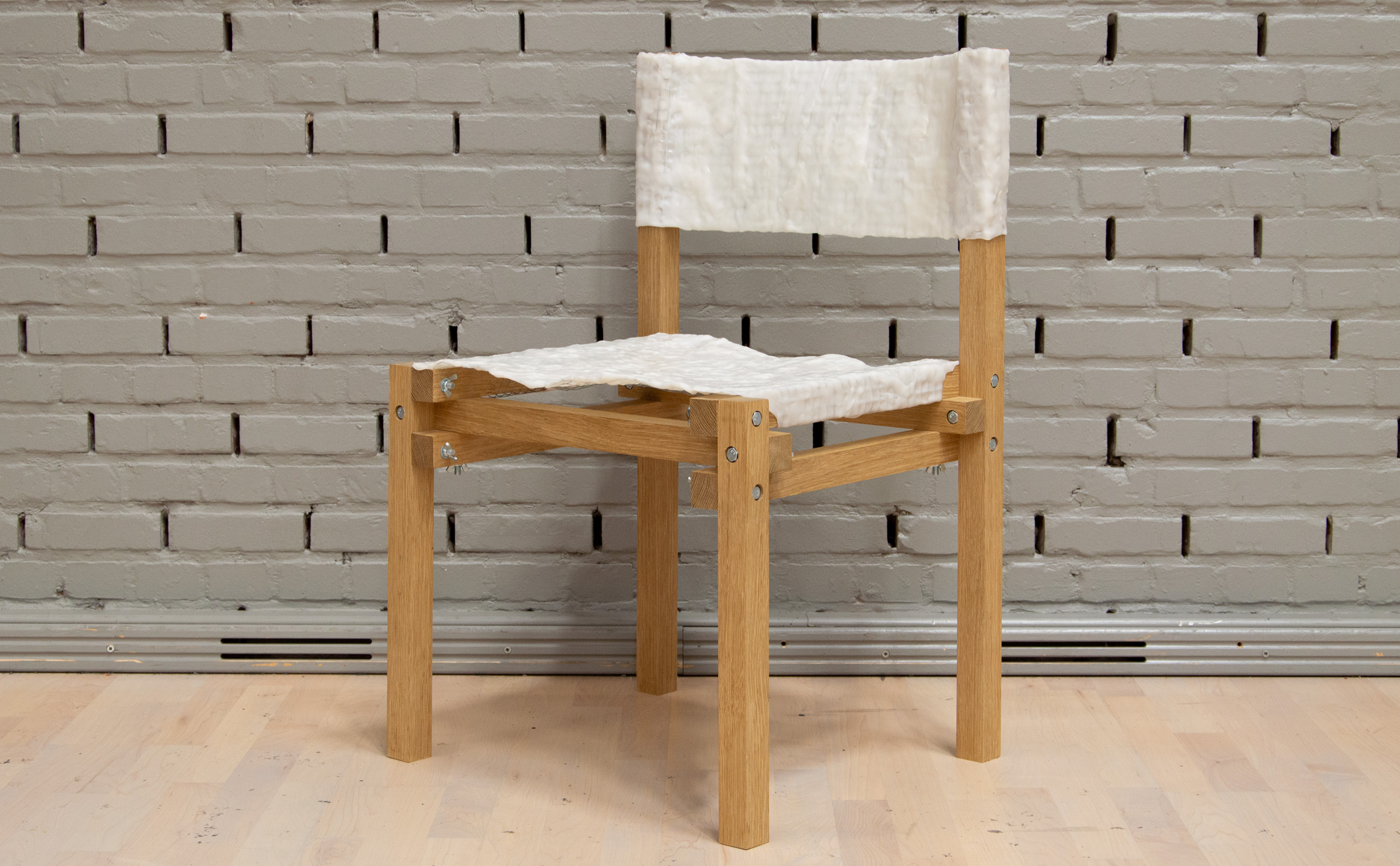
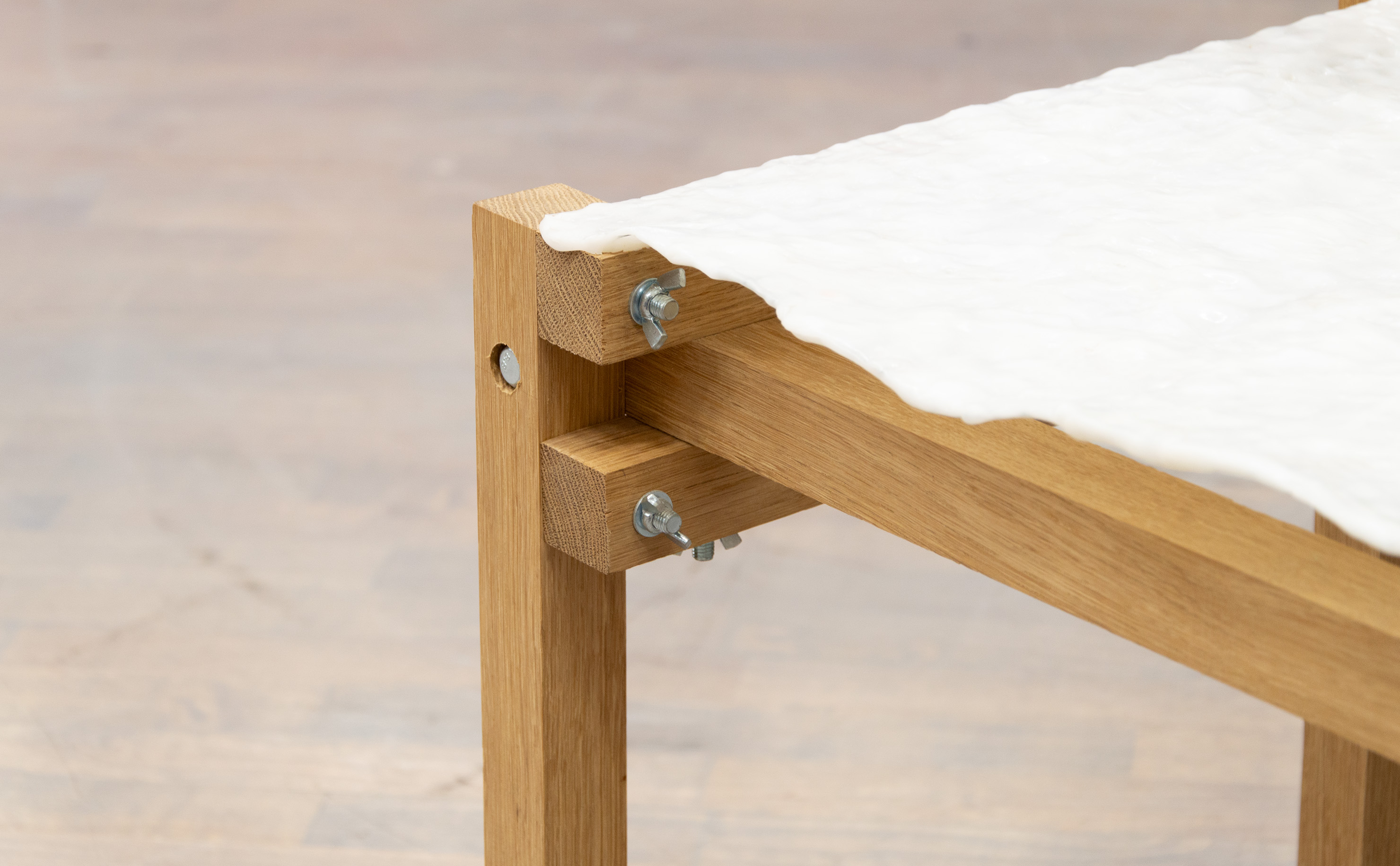
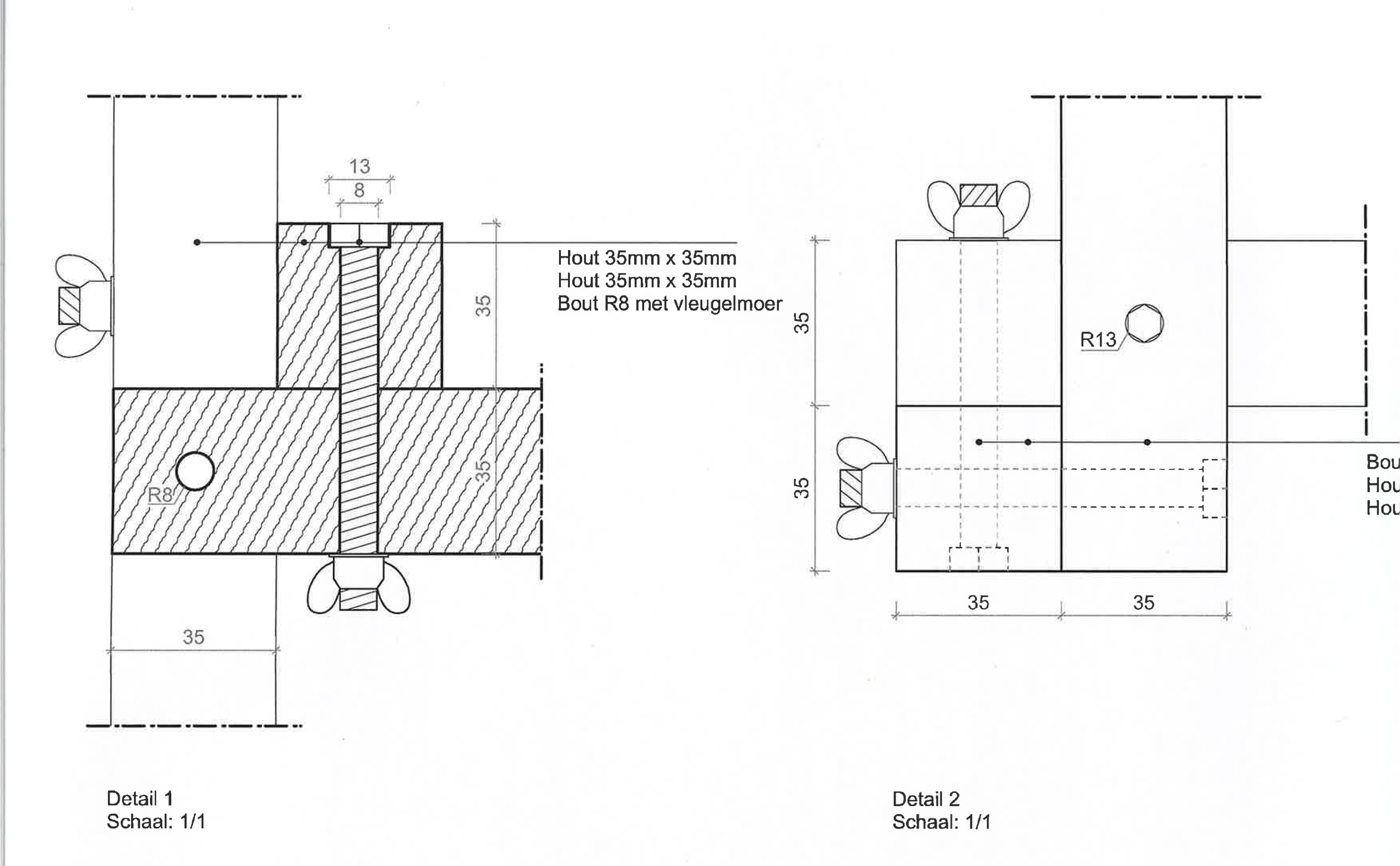
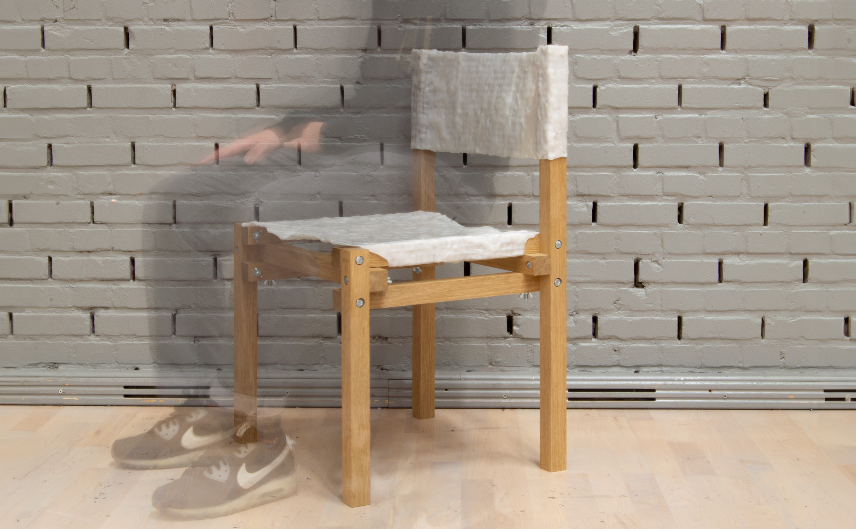
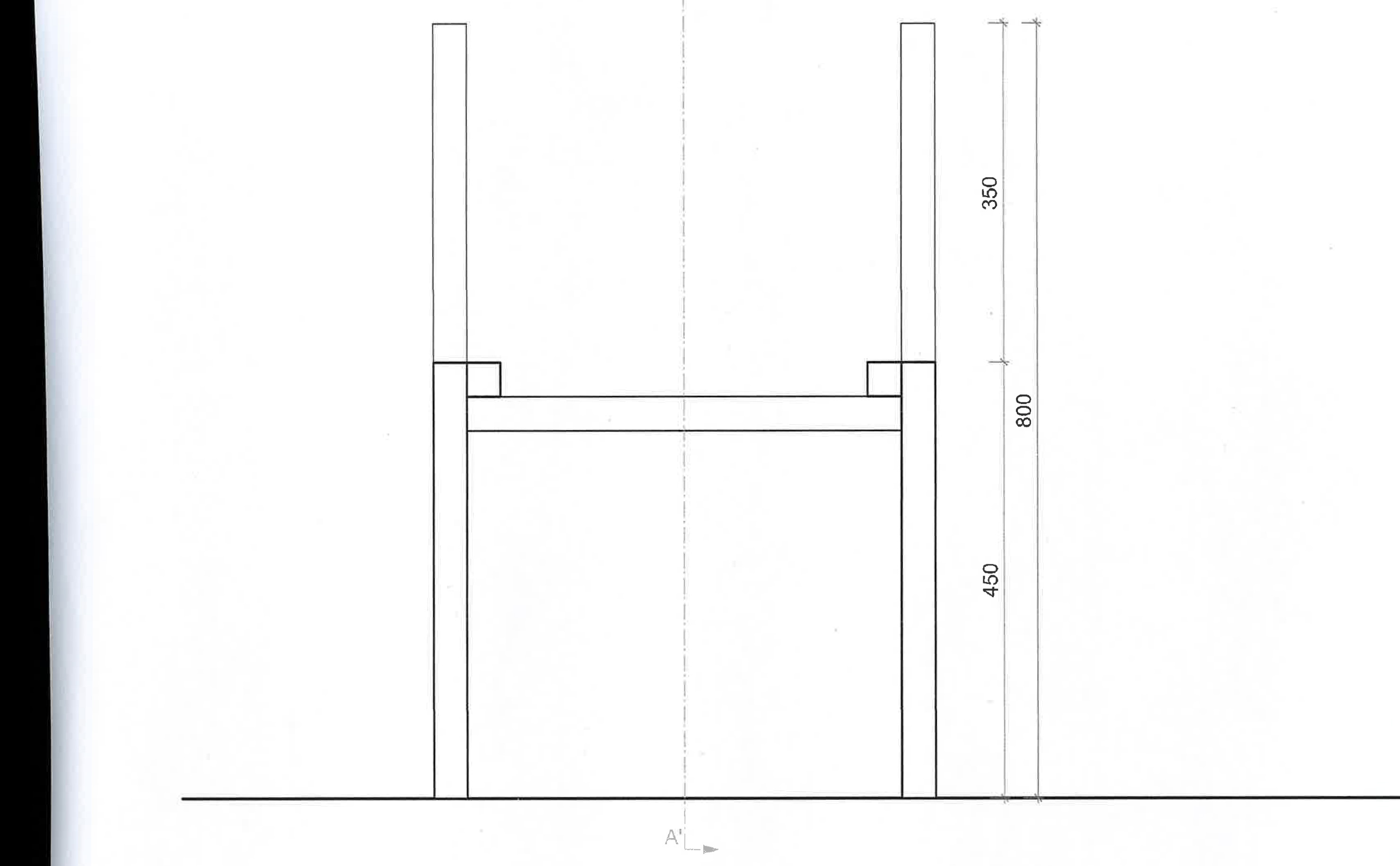
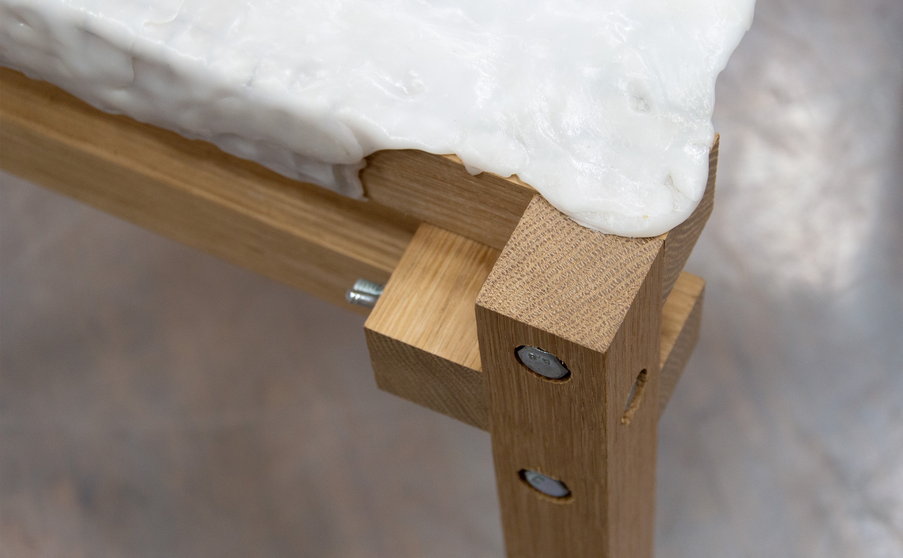
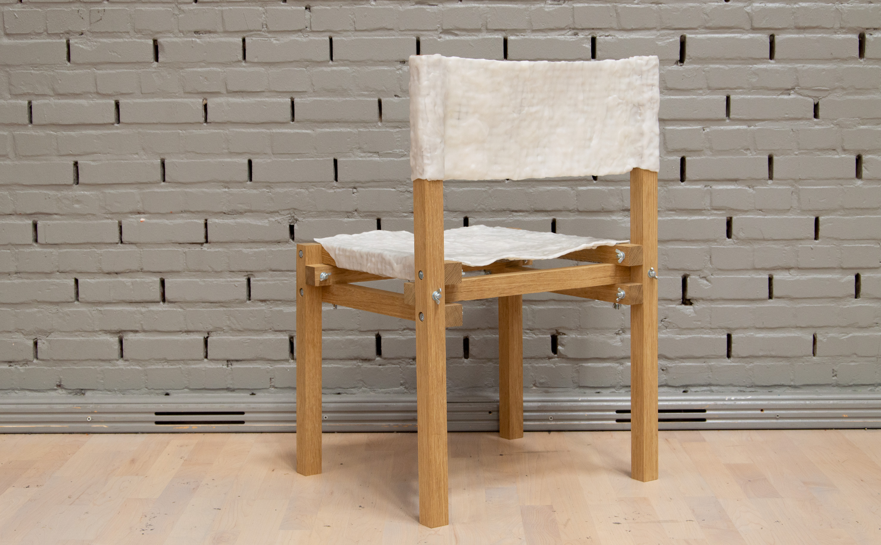
An open-source chair with customization in mind. A wooden frame, build with cartesian knots, makes up the frame for this chair. This structure is build using readily available materials, including nuts and bolts. By using ‘polycaprolactone’ (PCL), a biodegradable polyester with a low melting point, the maker can mould the seat and backrest by hand. This process ensures a unique result with every build chair, sparking a certain sentimental value with the maker. This chair requires a level of detail by the maker, which other DIY-furniture doesn’t.
Procrastinator's Club
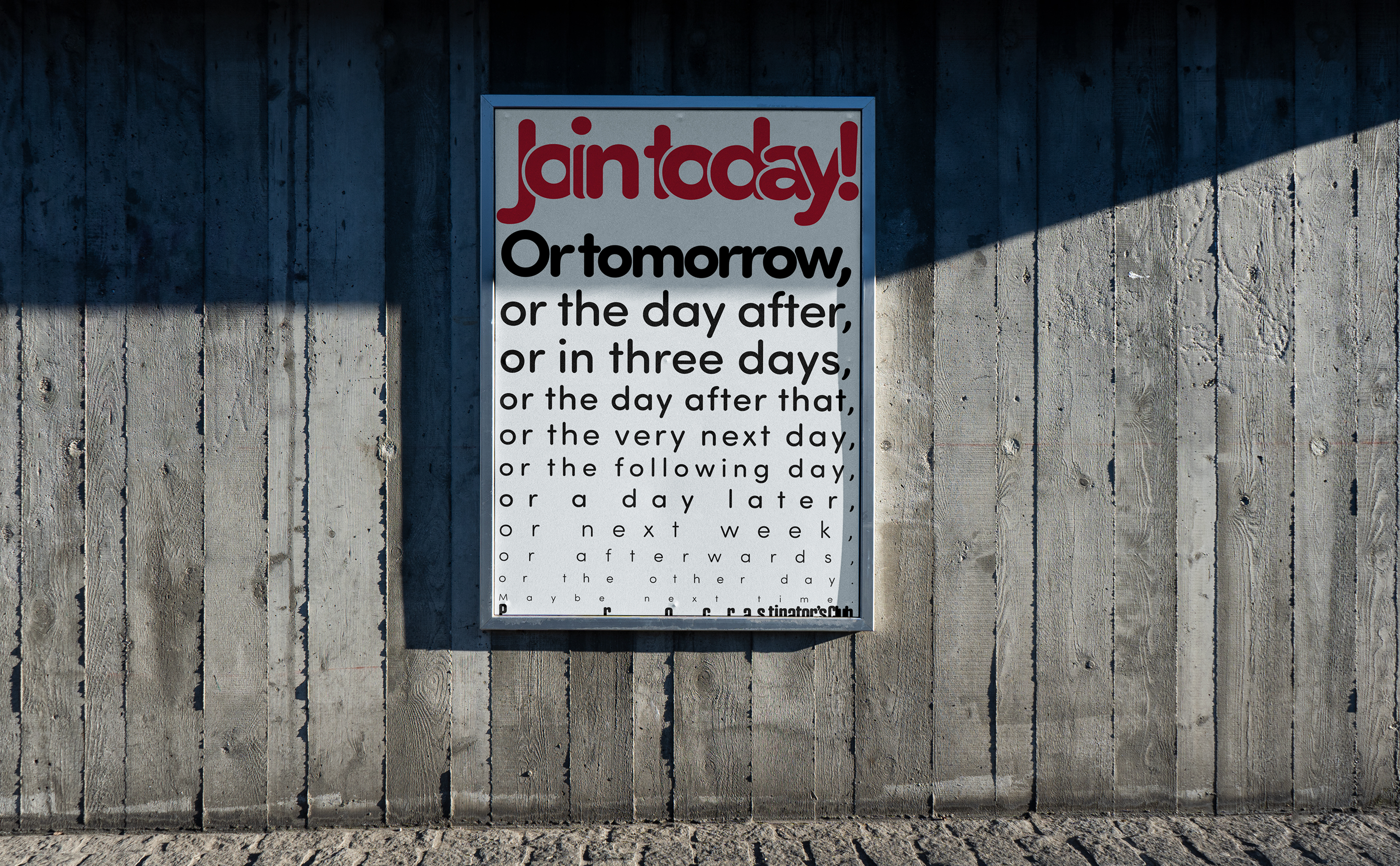
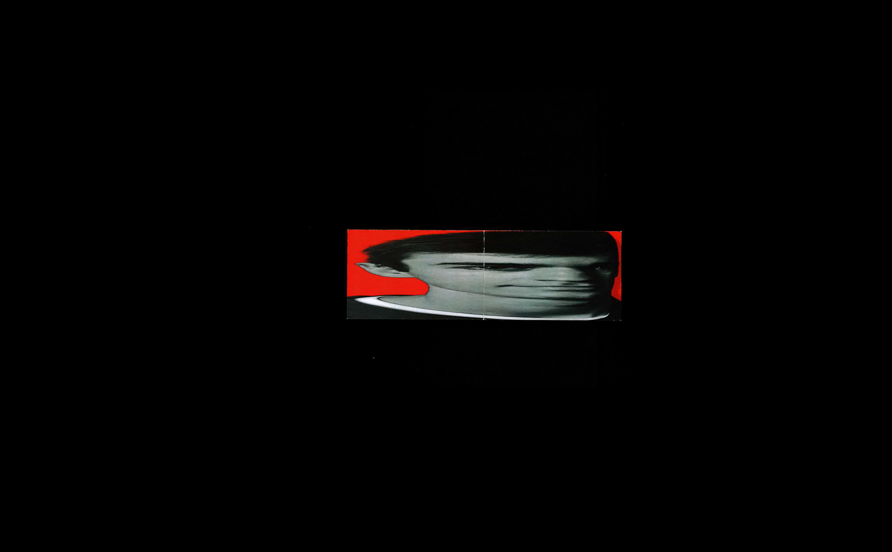
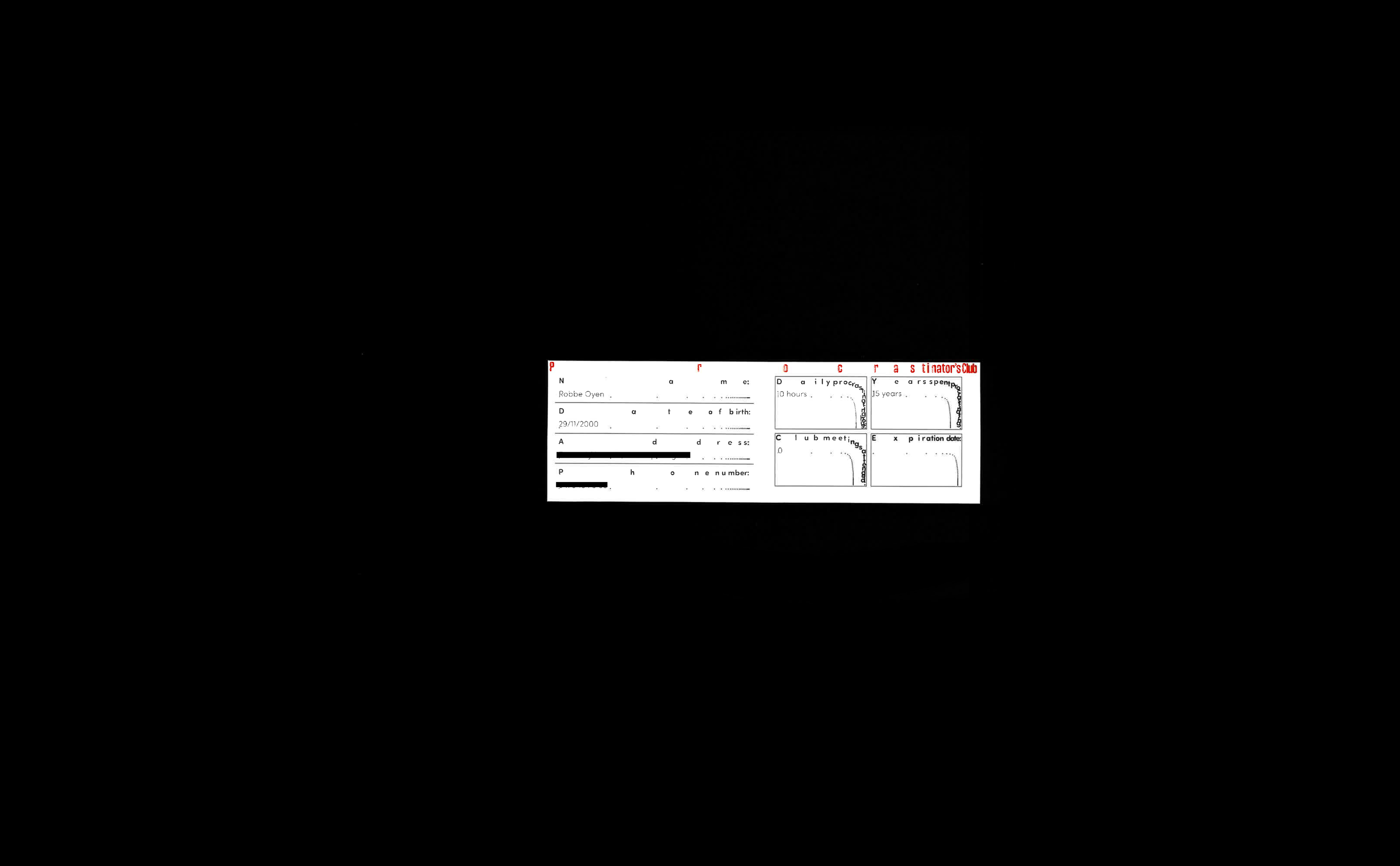
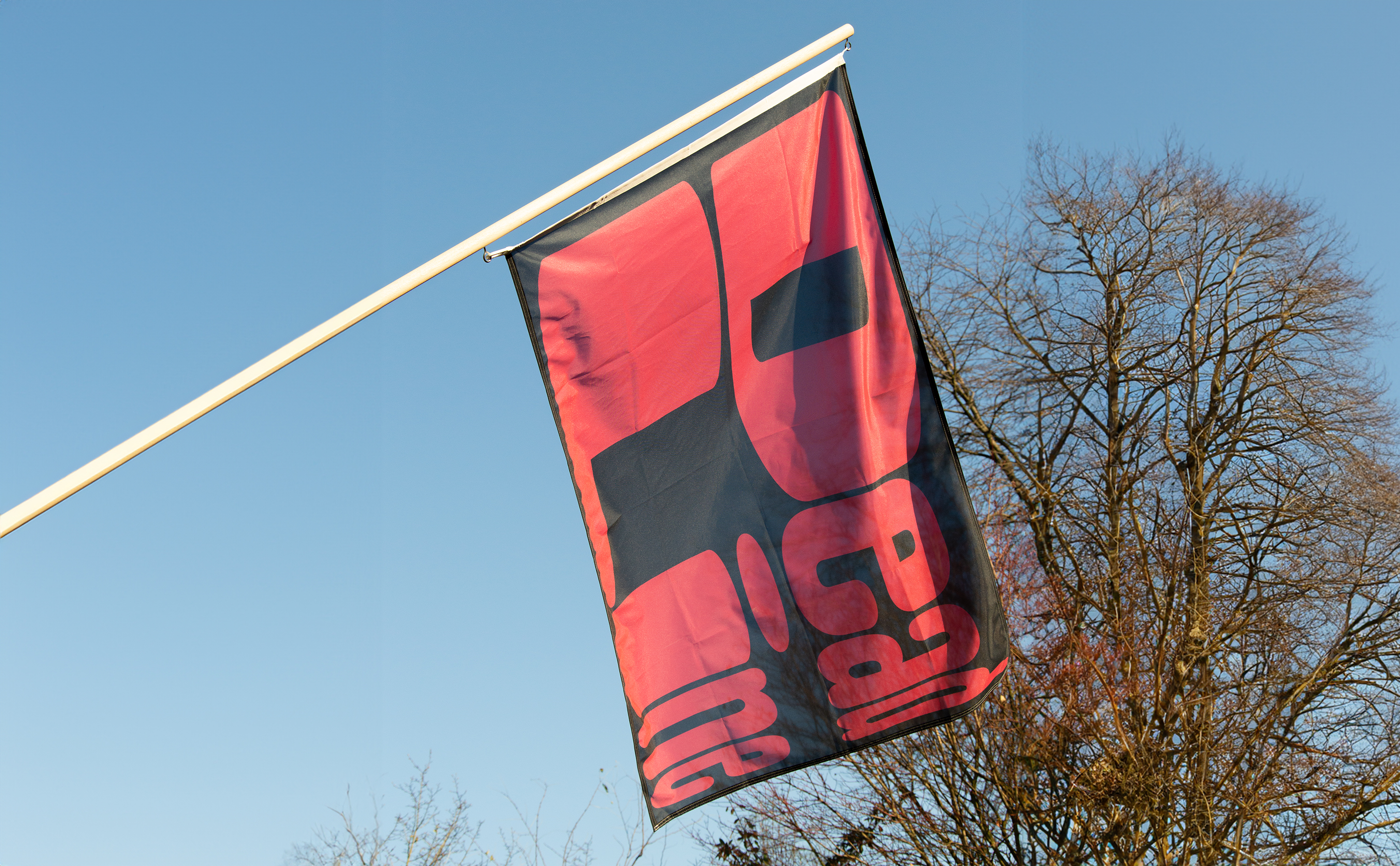
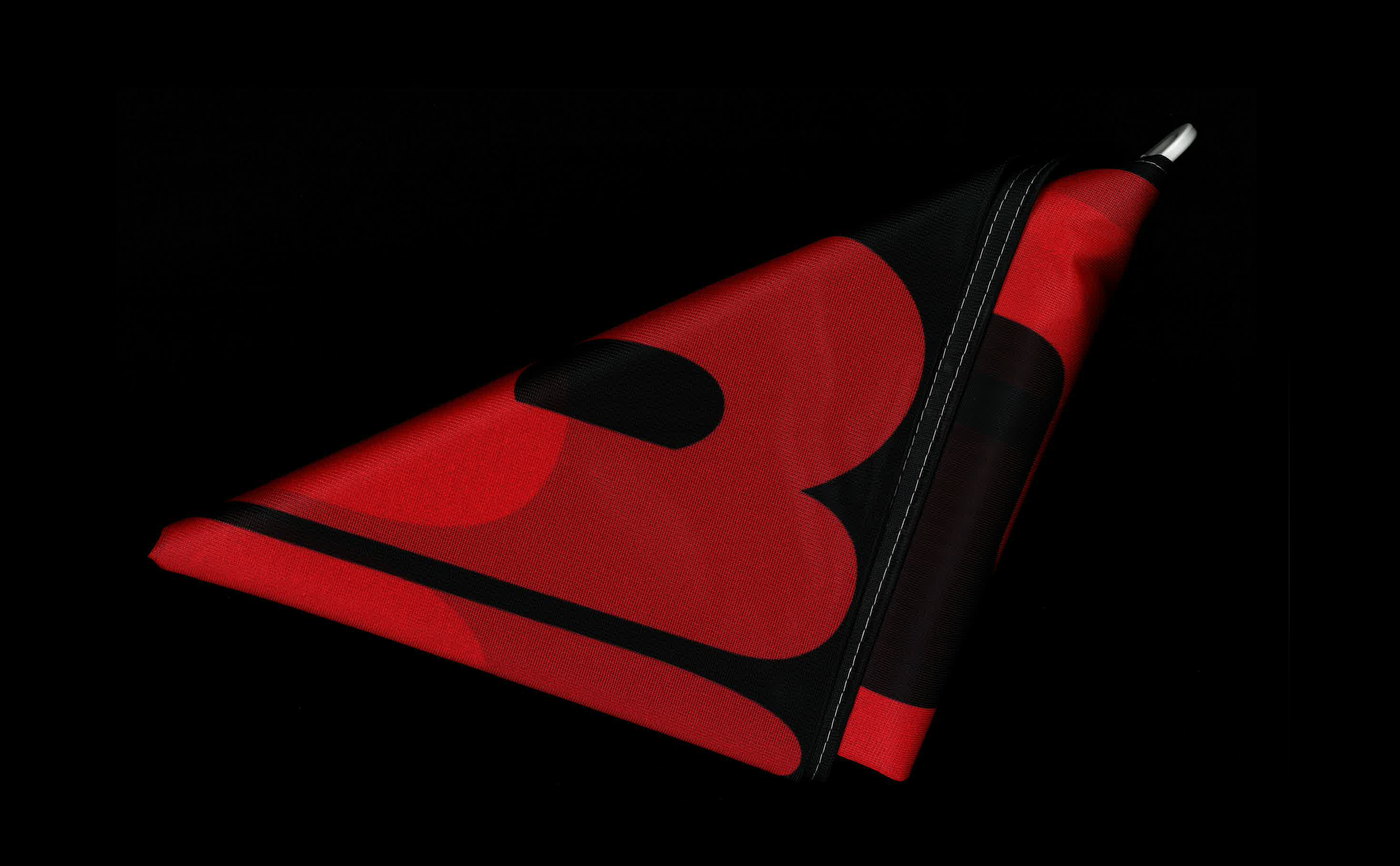
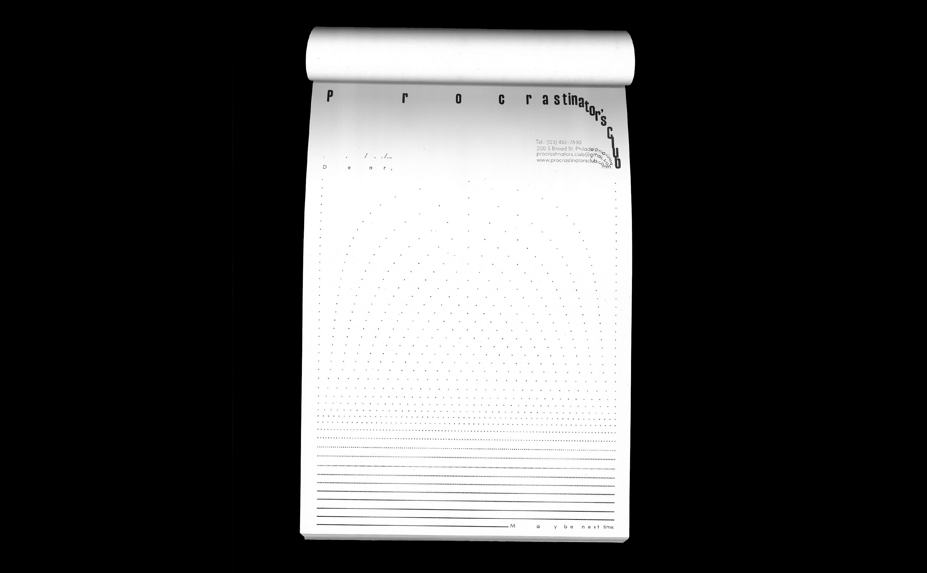
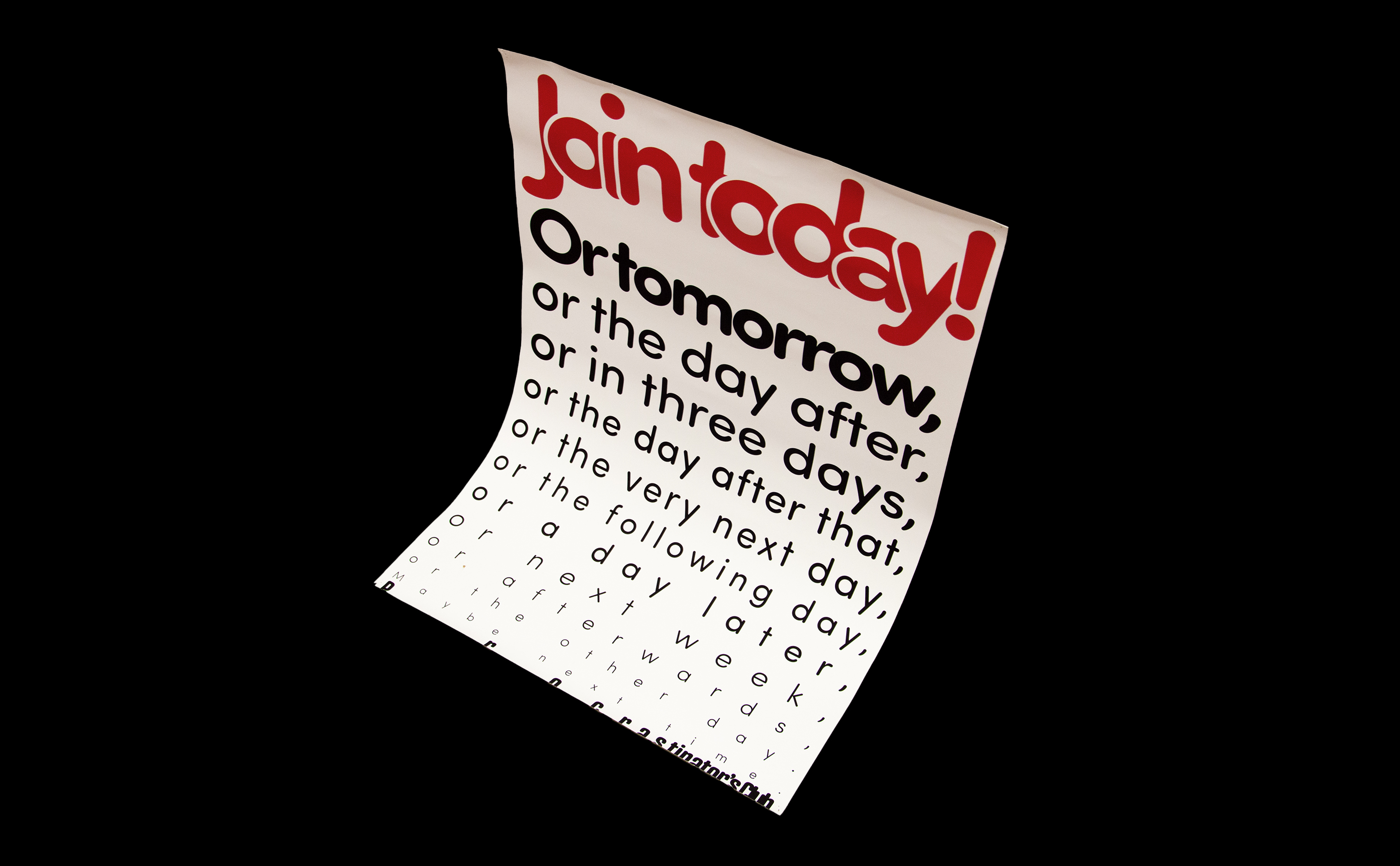
Procrastinator’s club is a visual identity that celebrates the art of procrastinating. At its base is a logo resembling a watch face, where typography is gradually squeezed together. This visual concept adds a hint of humour and is used throughout the identity and graphic material such as a flag, poster, membership card and stationery.
Crappy Chairs
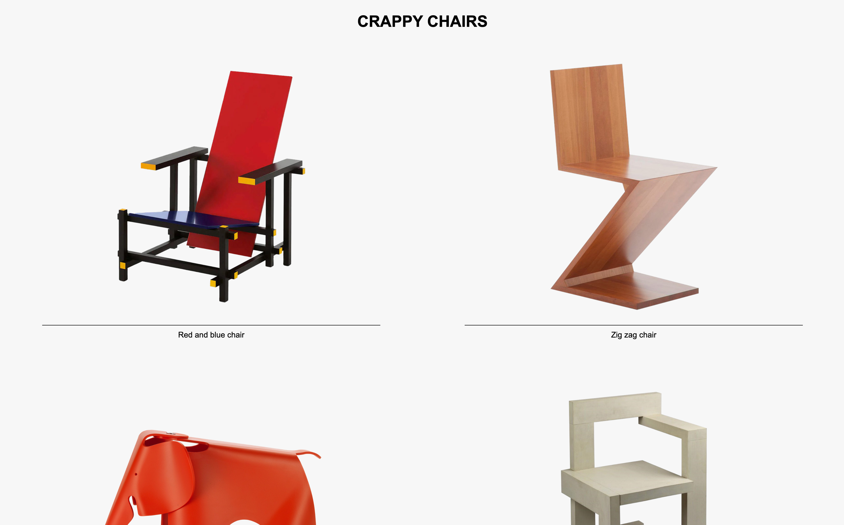
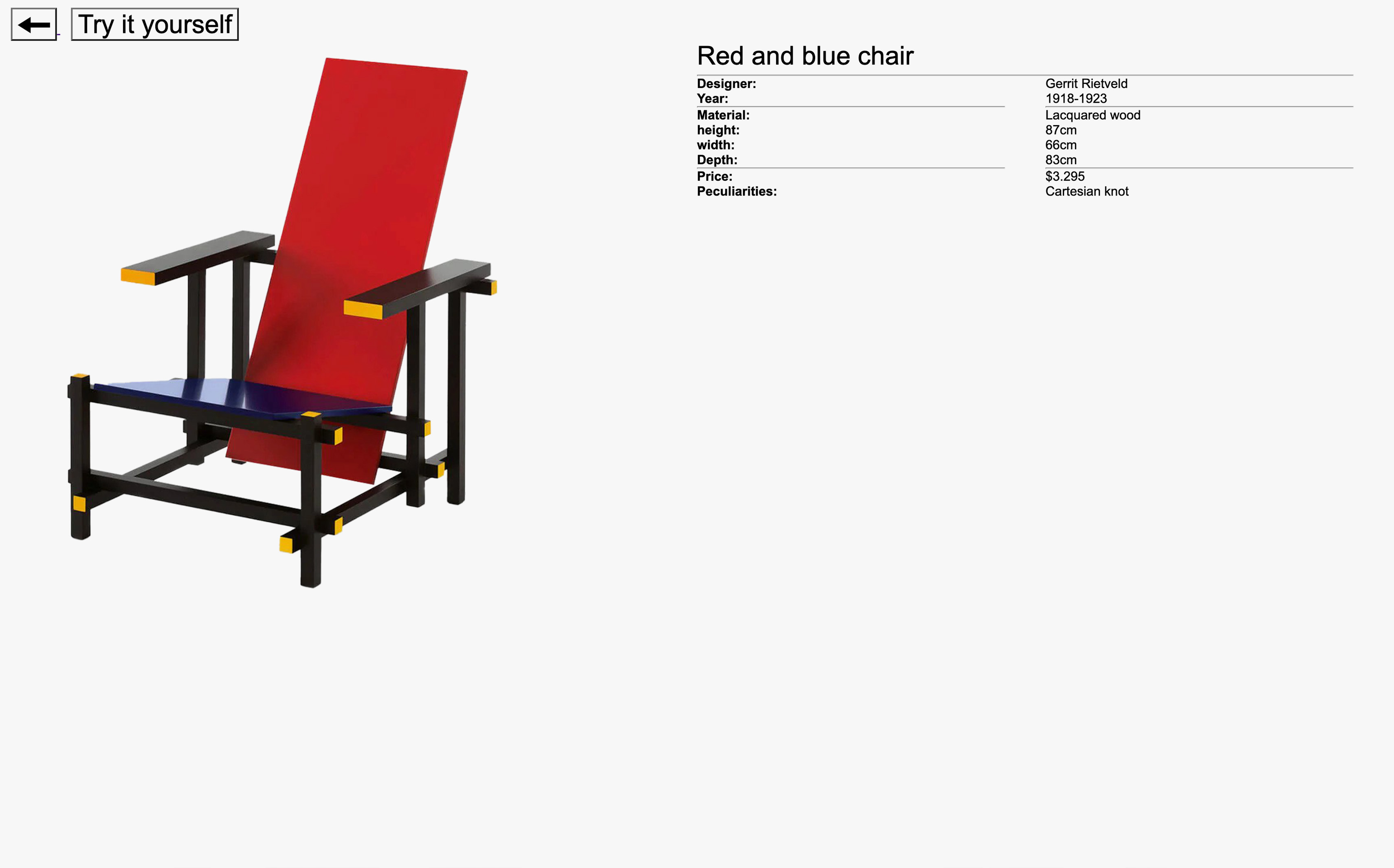
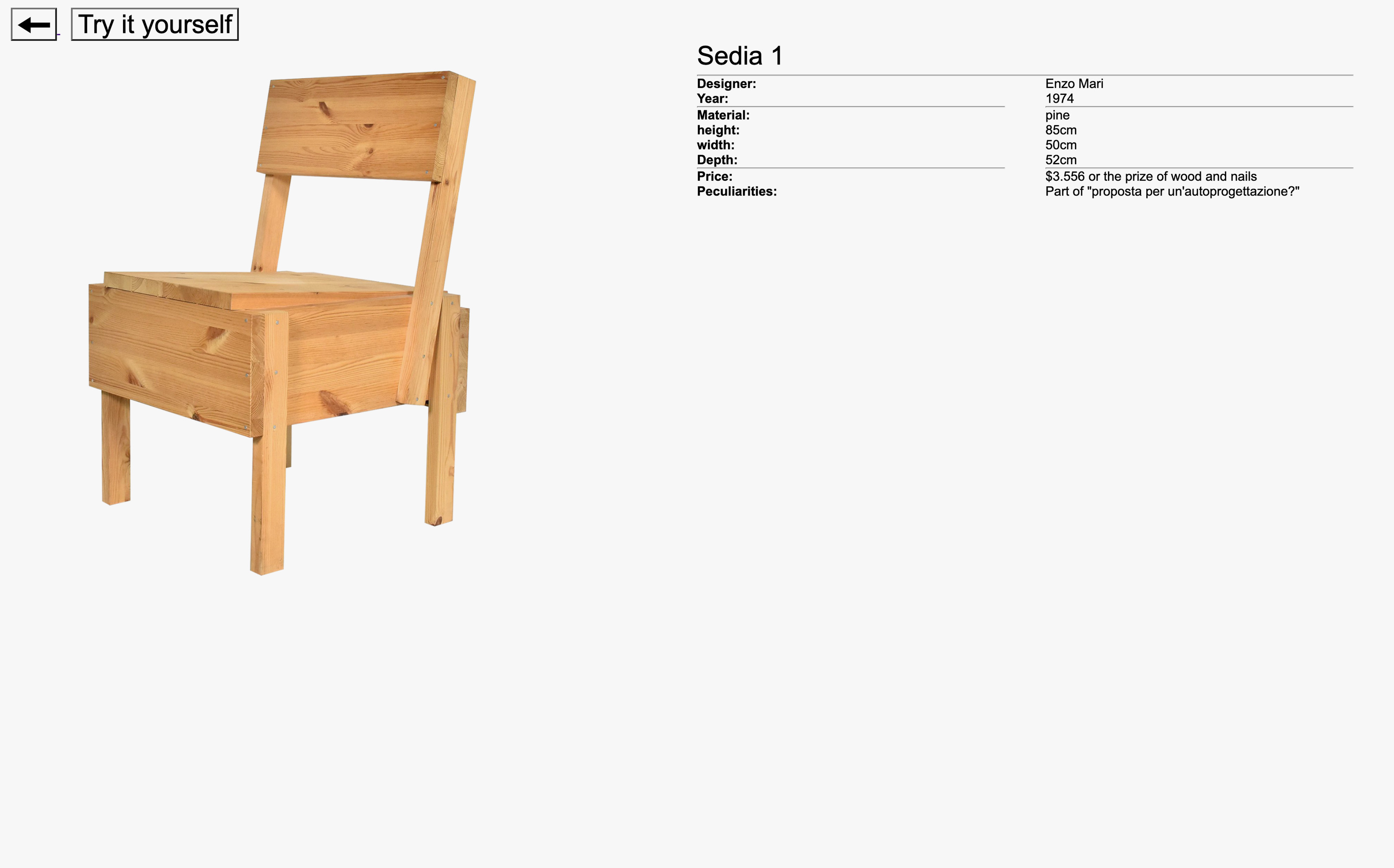
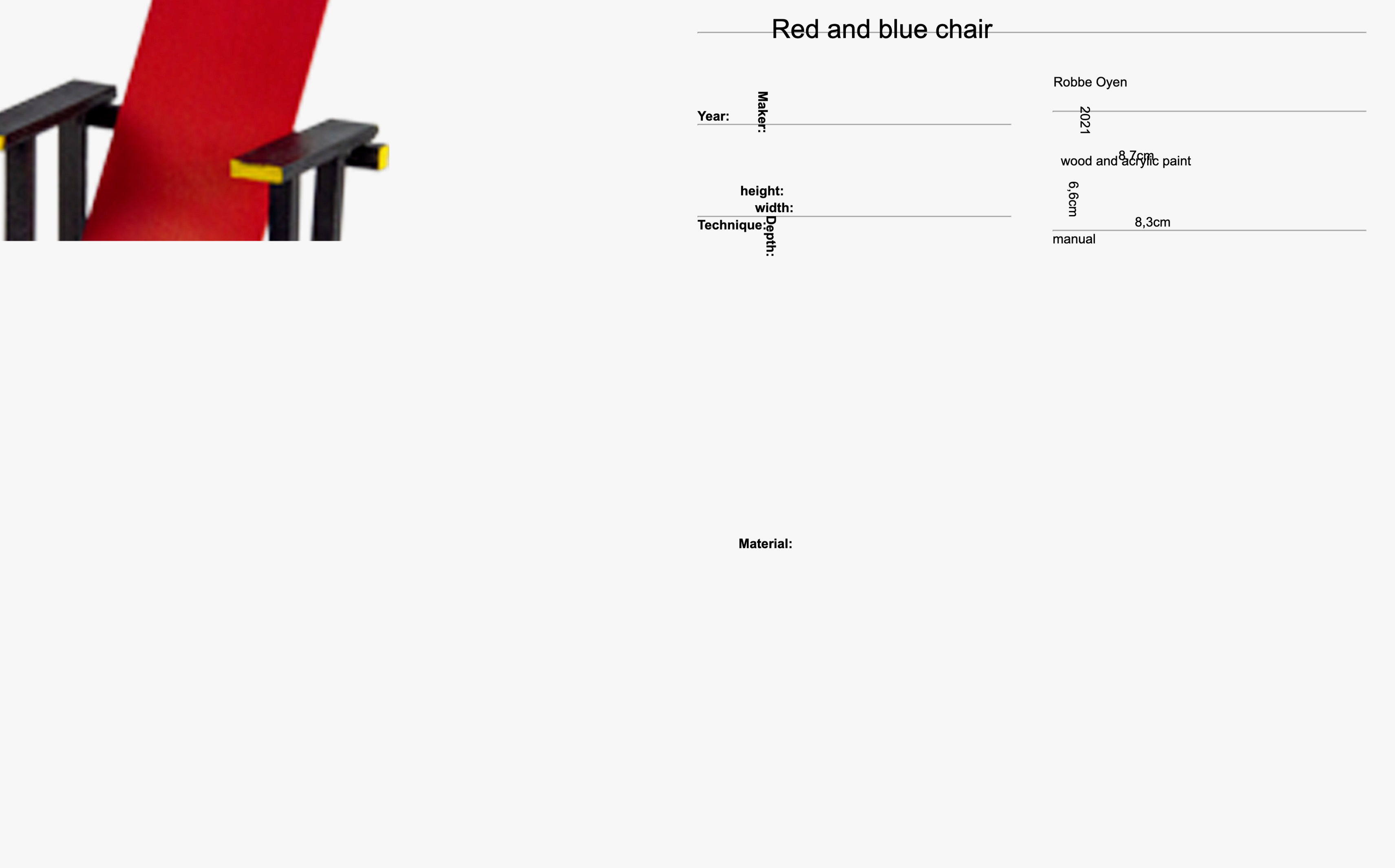
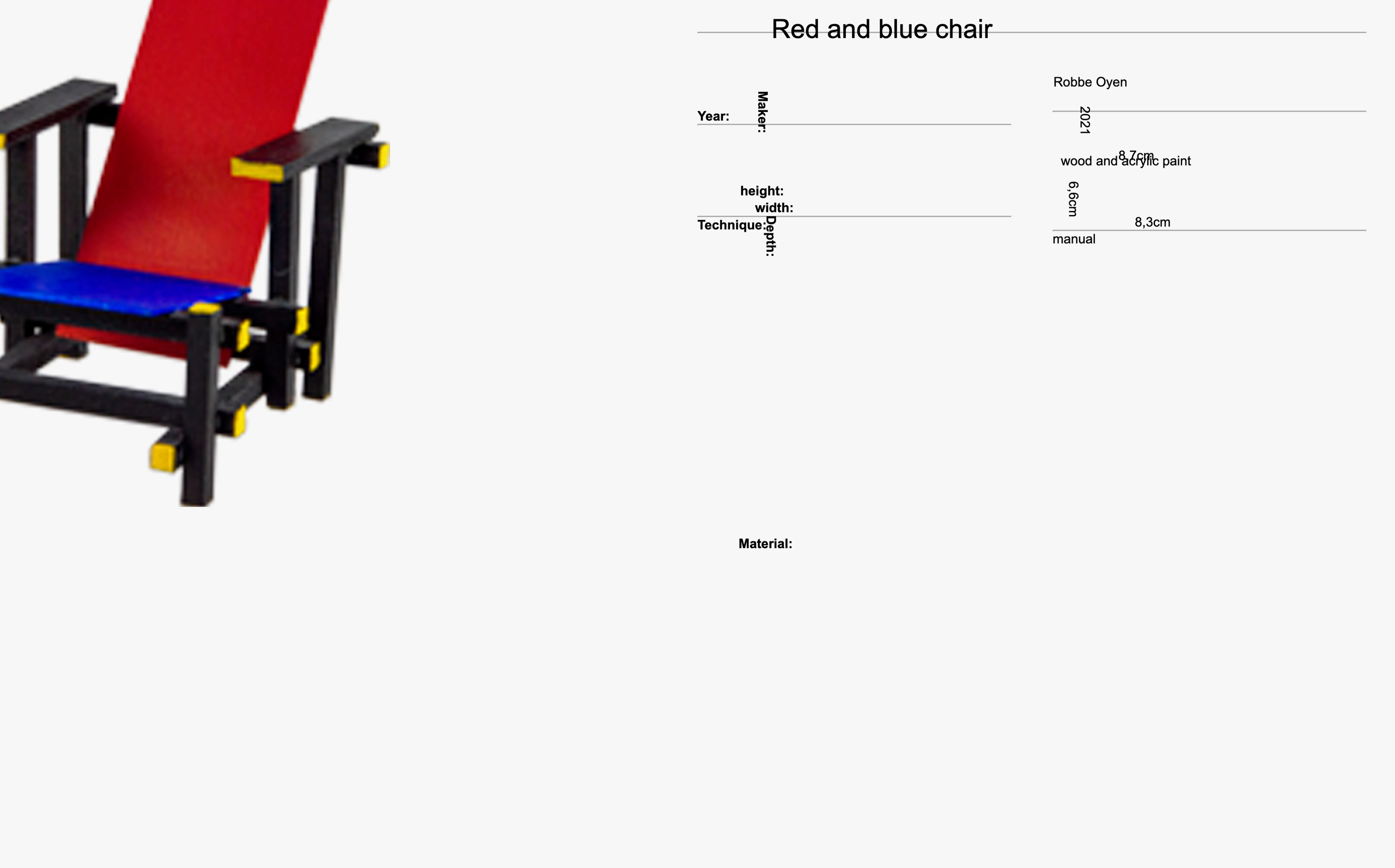
A digital museum featuring my personal collection of eight designer chairs. Except these chairs are self-made miniatures at 1/10th scale and possess a charmingly crappy aesthetic. Each chair takes center stage on the home page, a nod to clean, minimal design catalog books, and each has its own subpage where you’ll find more information alongside a picture of the original chair. What sets “crappy chairs” apart is the “try it yourself” button, leading you to the self-made, crappy version of the chair. Here, the image seems to load painstakingly slow and the text is scrambled. Ones you’re on this page there is no turning back.
Wish you where here
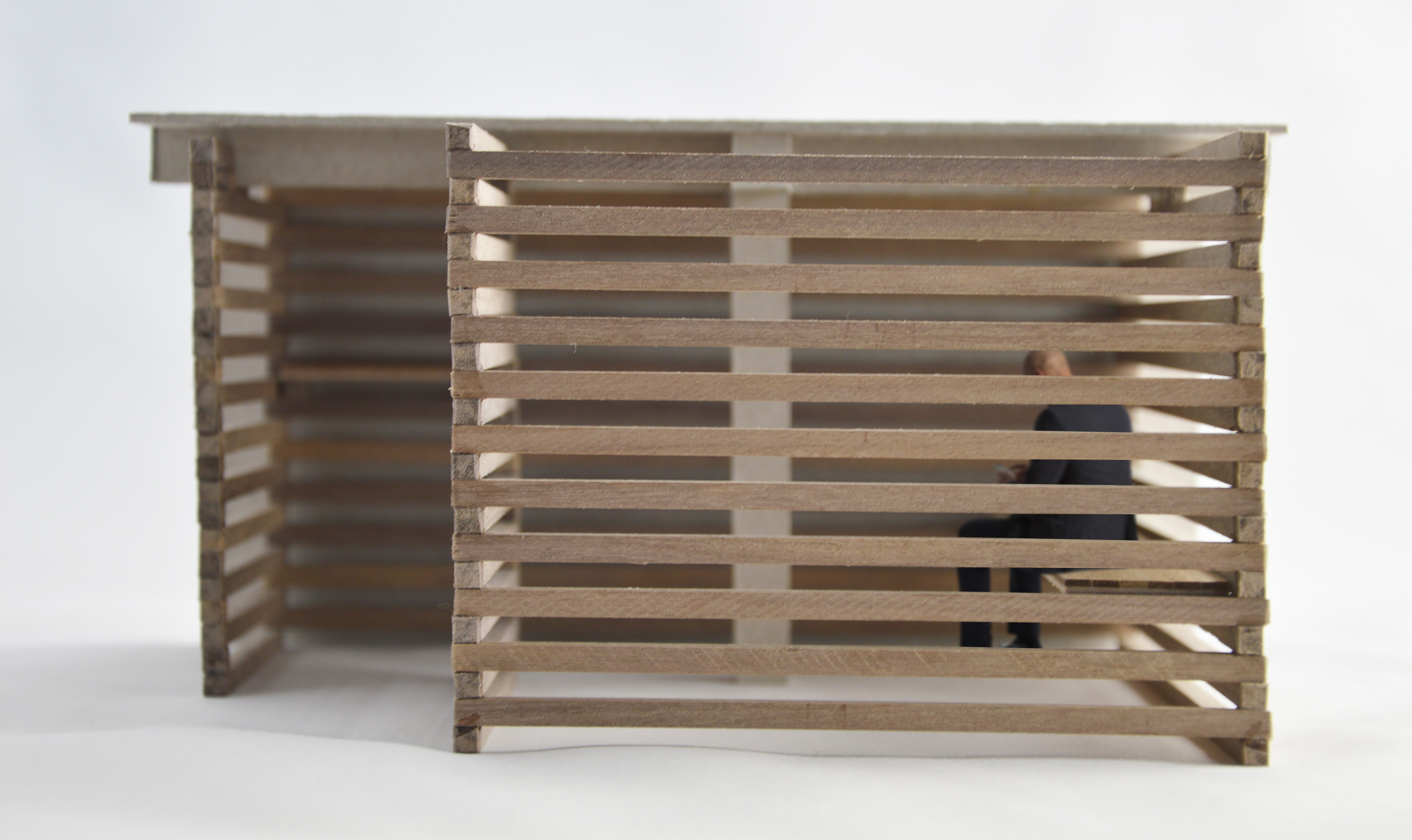
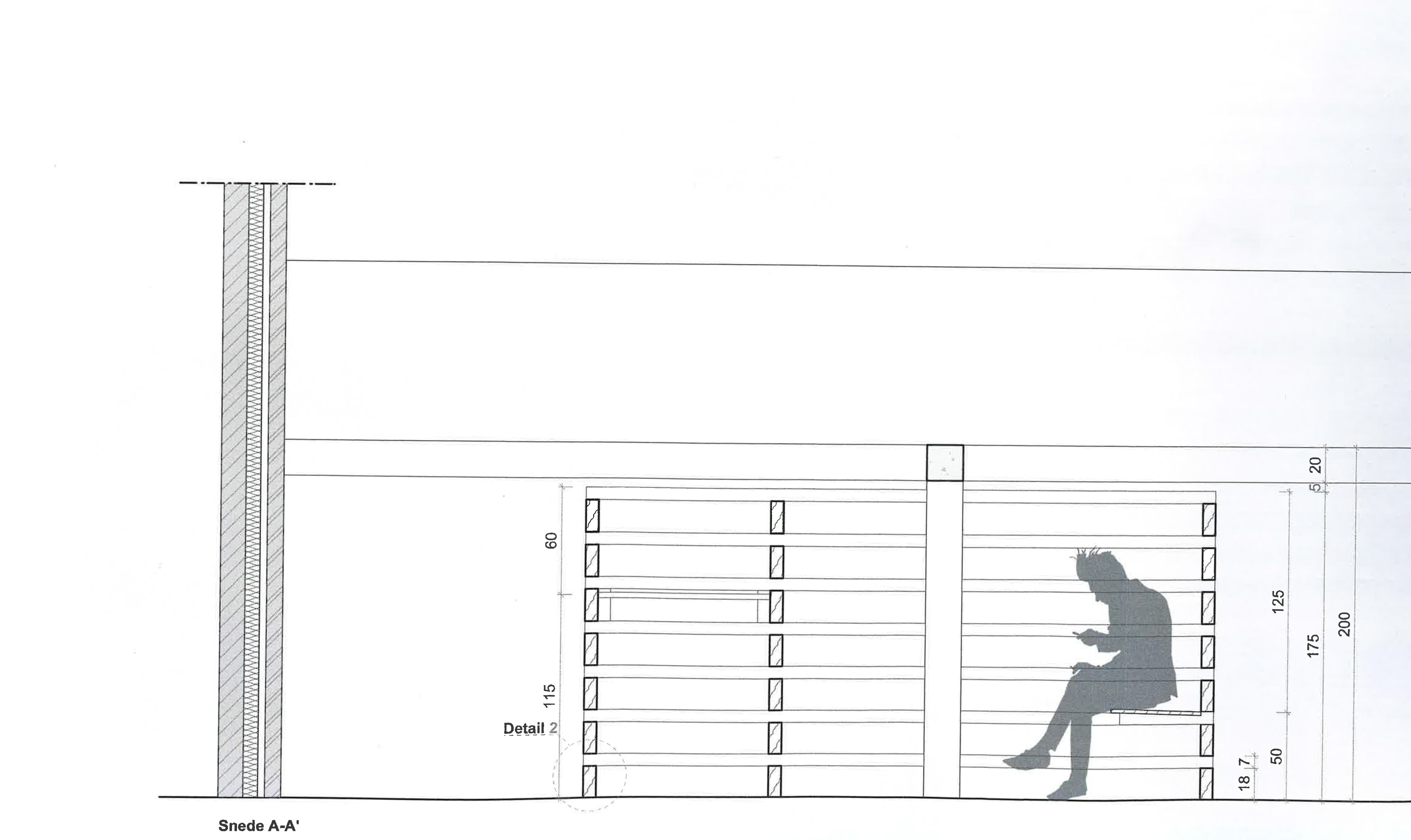
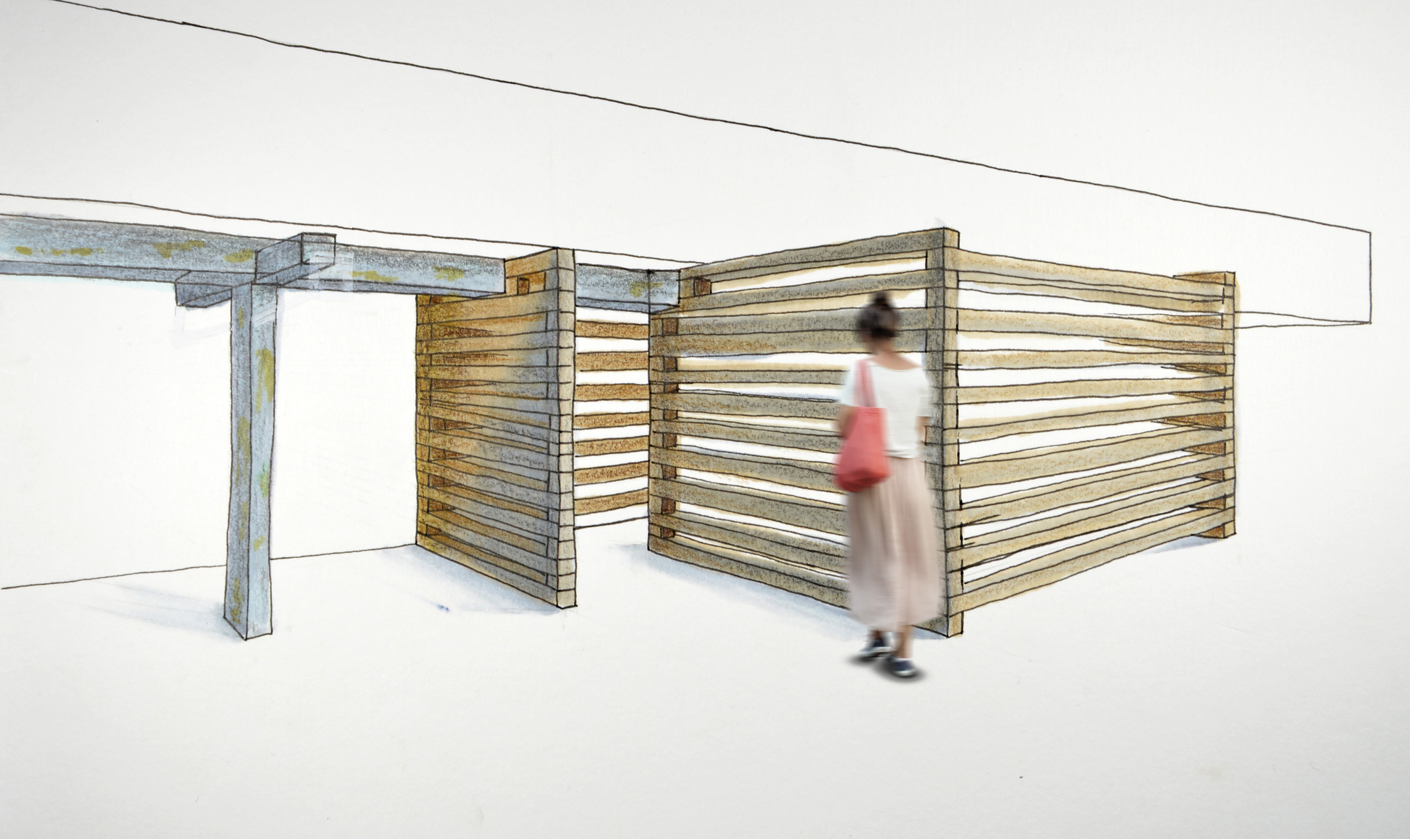
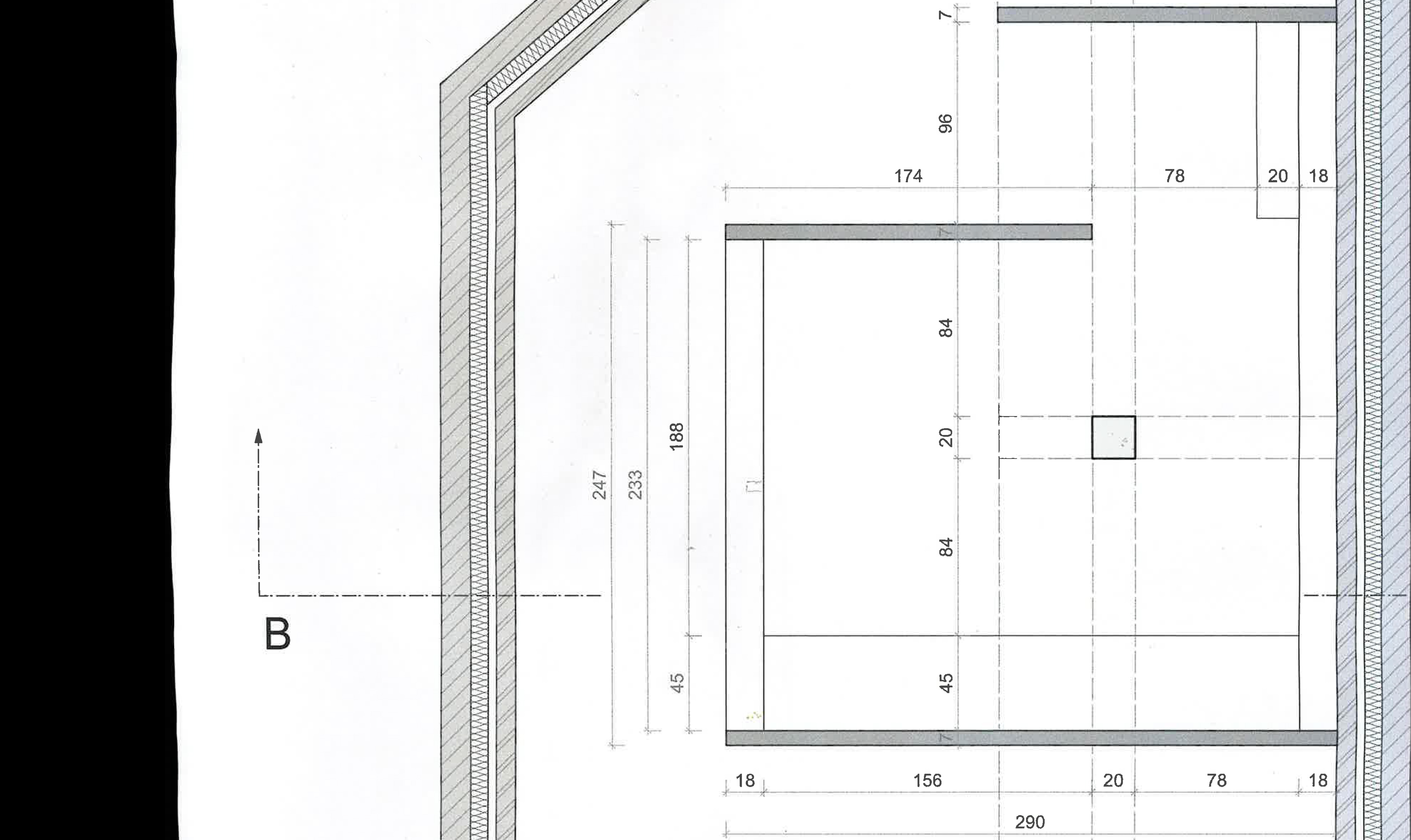
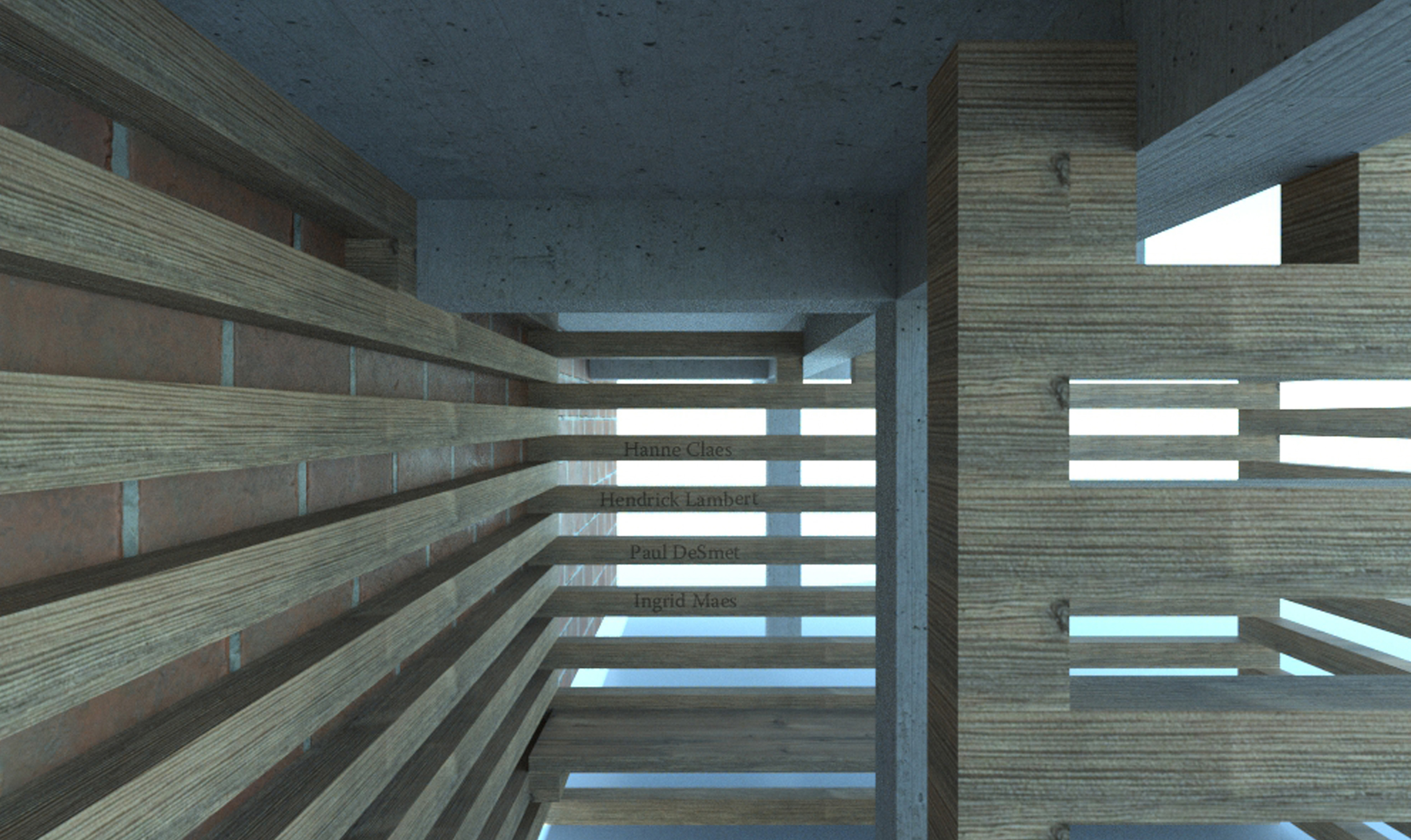
A temporary spatial intervention in the courtyard of campus Faydherbe (Thomas More Hogeschool). The space provides a place for mourning and reflection for those who lost a loved one, colleague or student. The structure consists of repeating wooden beams that creates separation without completely isolating. Throughout the years names and messages will be engraved or scratched in the beams. When the pavilion needs to be demolished, the wooden beams can easily be reused in for example student projects, carrying with them the memories left in the wood.
NASCAR
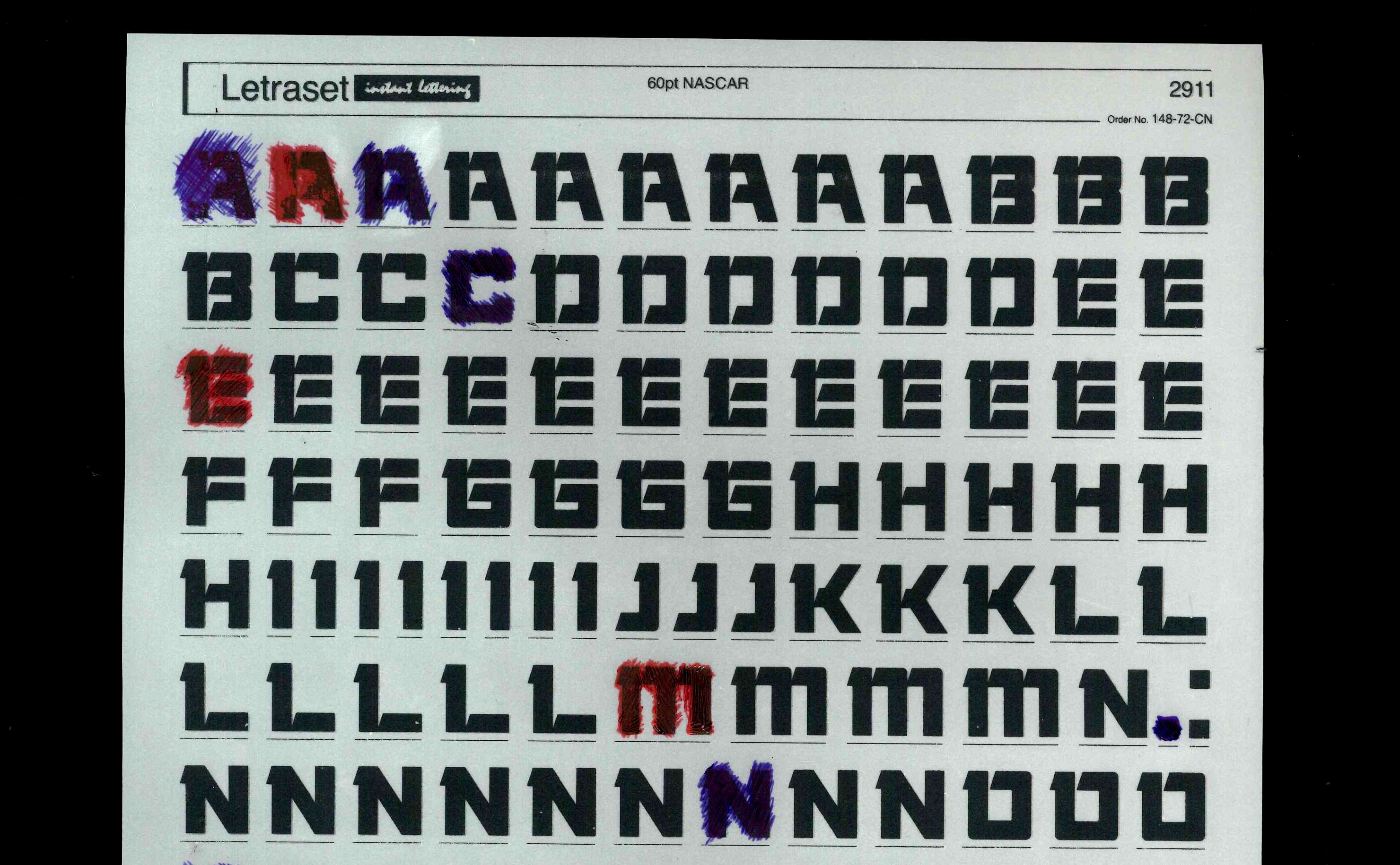
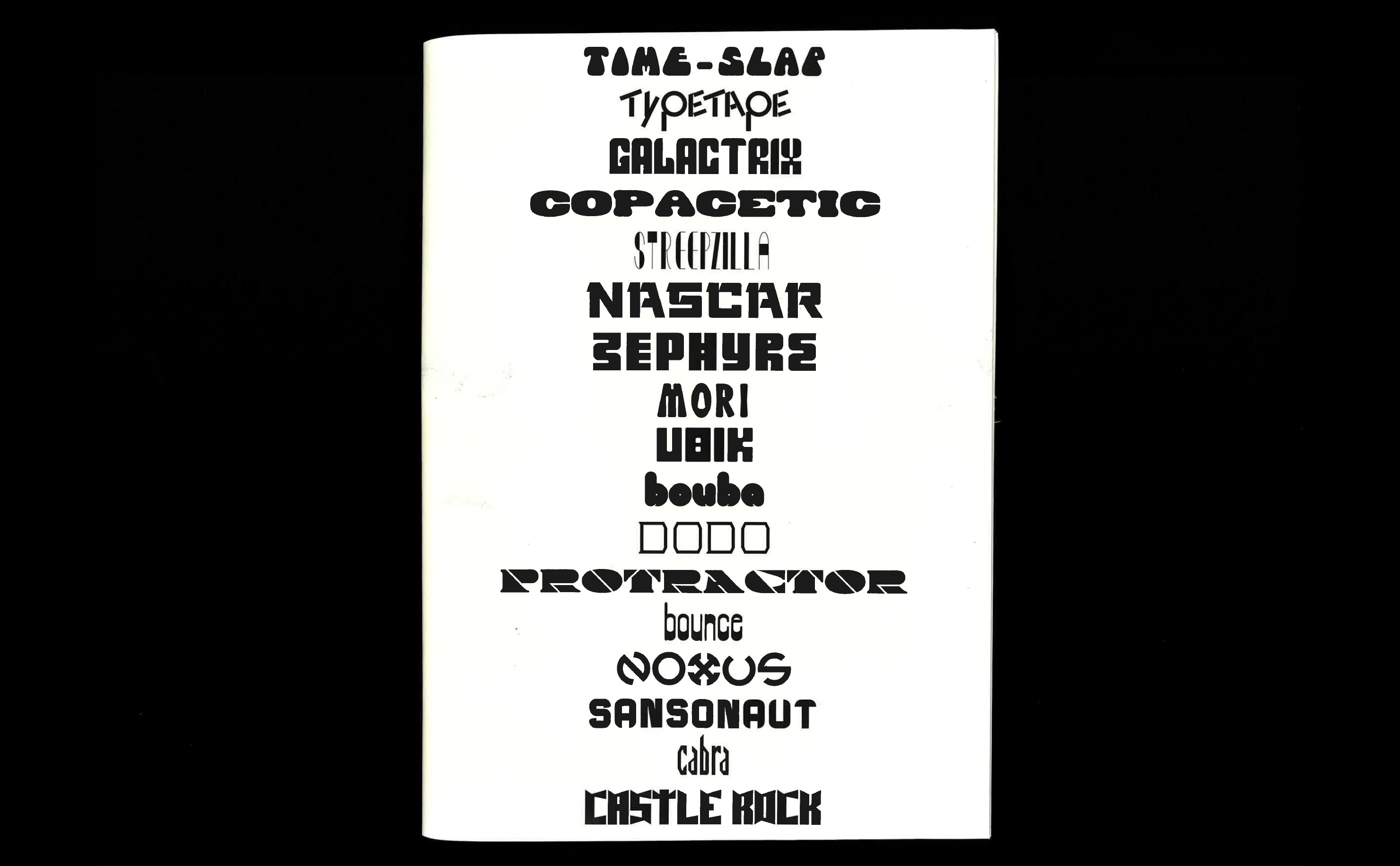
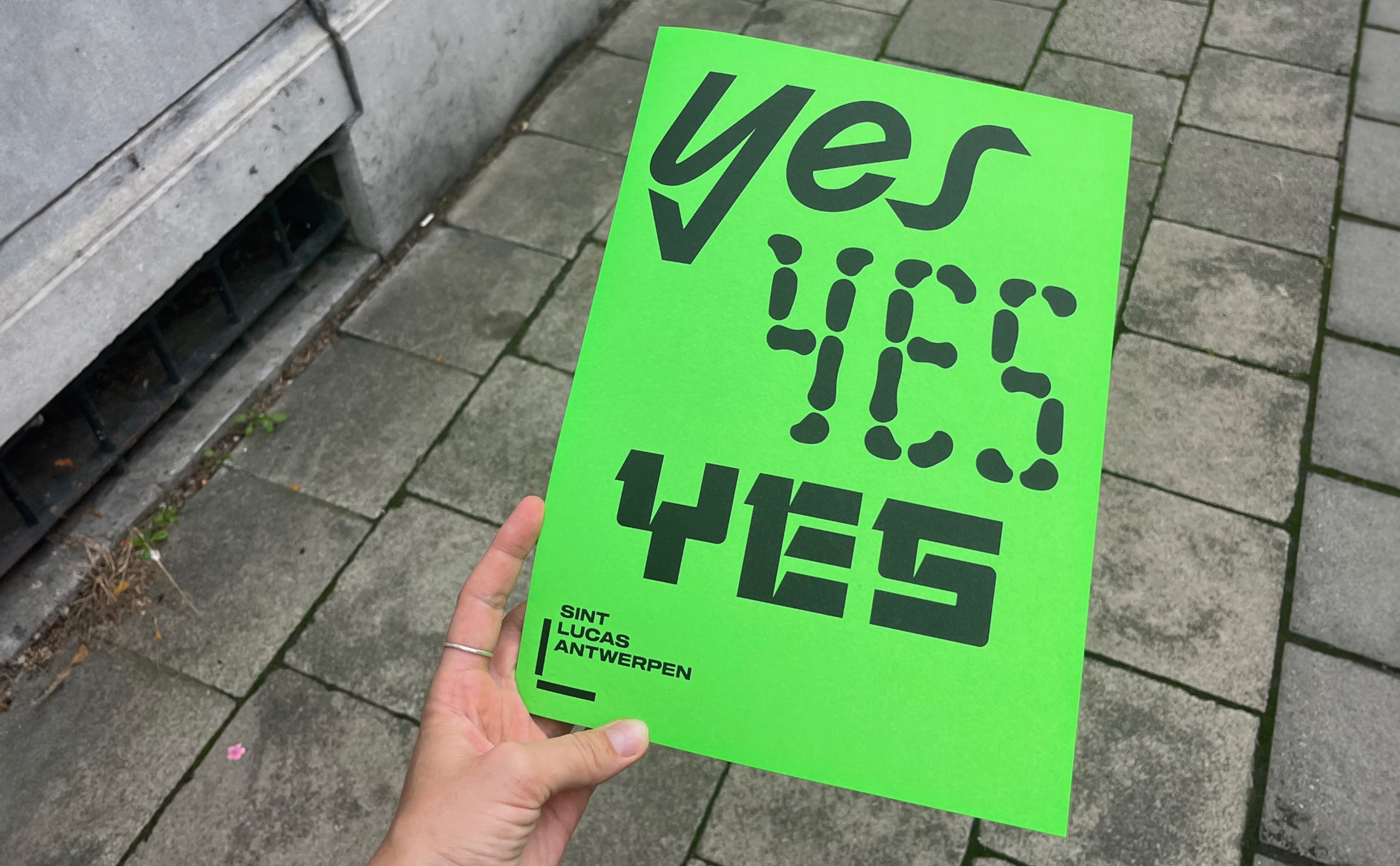
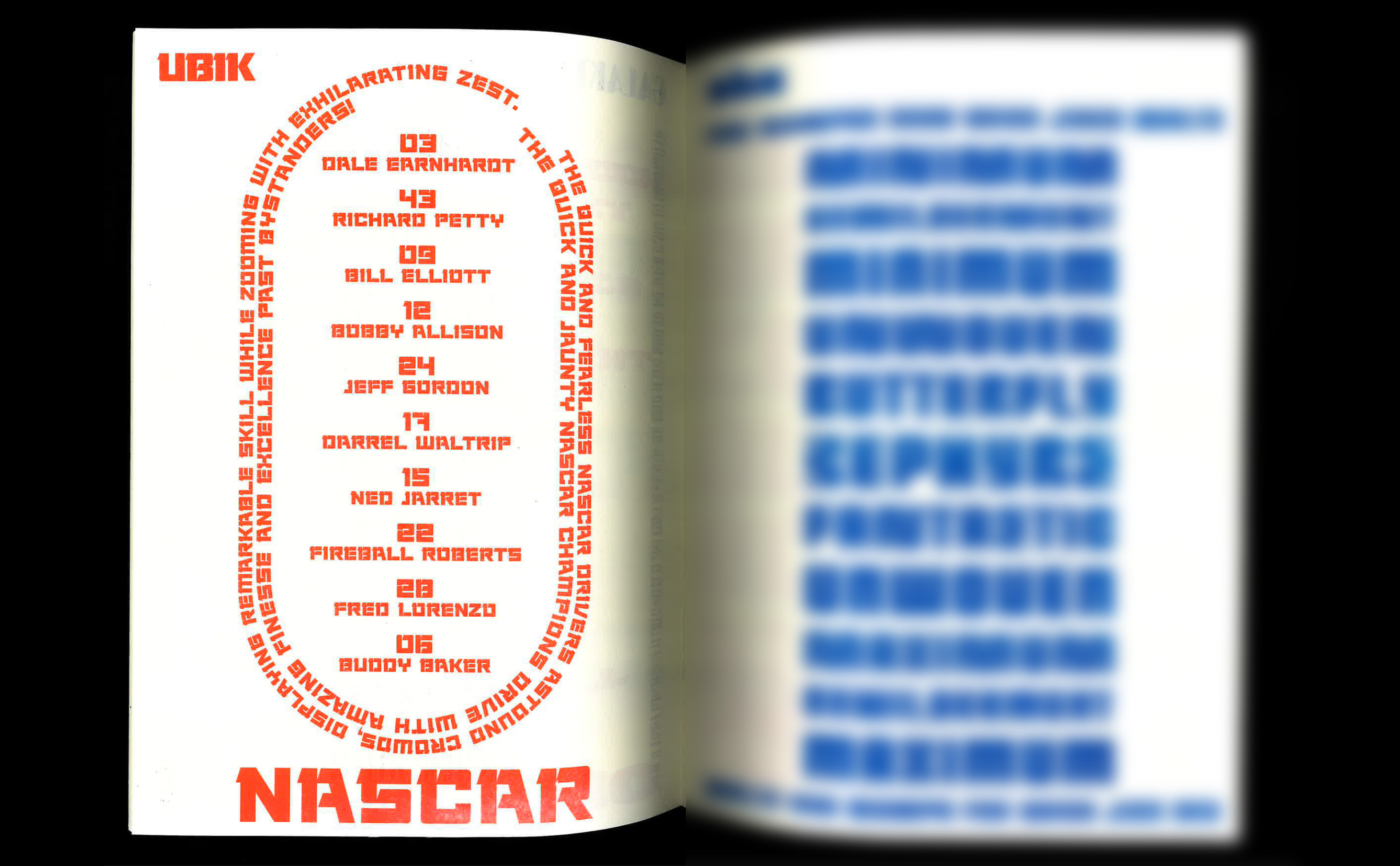
NASCAR is a revival typeface based on the typography on the cover of Philip K. Dick novel. The typeface keeps the distinct square look of the original lettering and uses the serif like element to create a stencil typeface. The typeface consists of uppercase, numbers and punctuation marks. The resulting bold, square stencil letters resemble typography commonly found on NASCAR cars and graphics. The typeface is a display letter and works best at large sizes.
Know-it-all
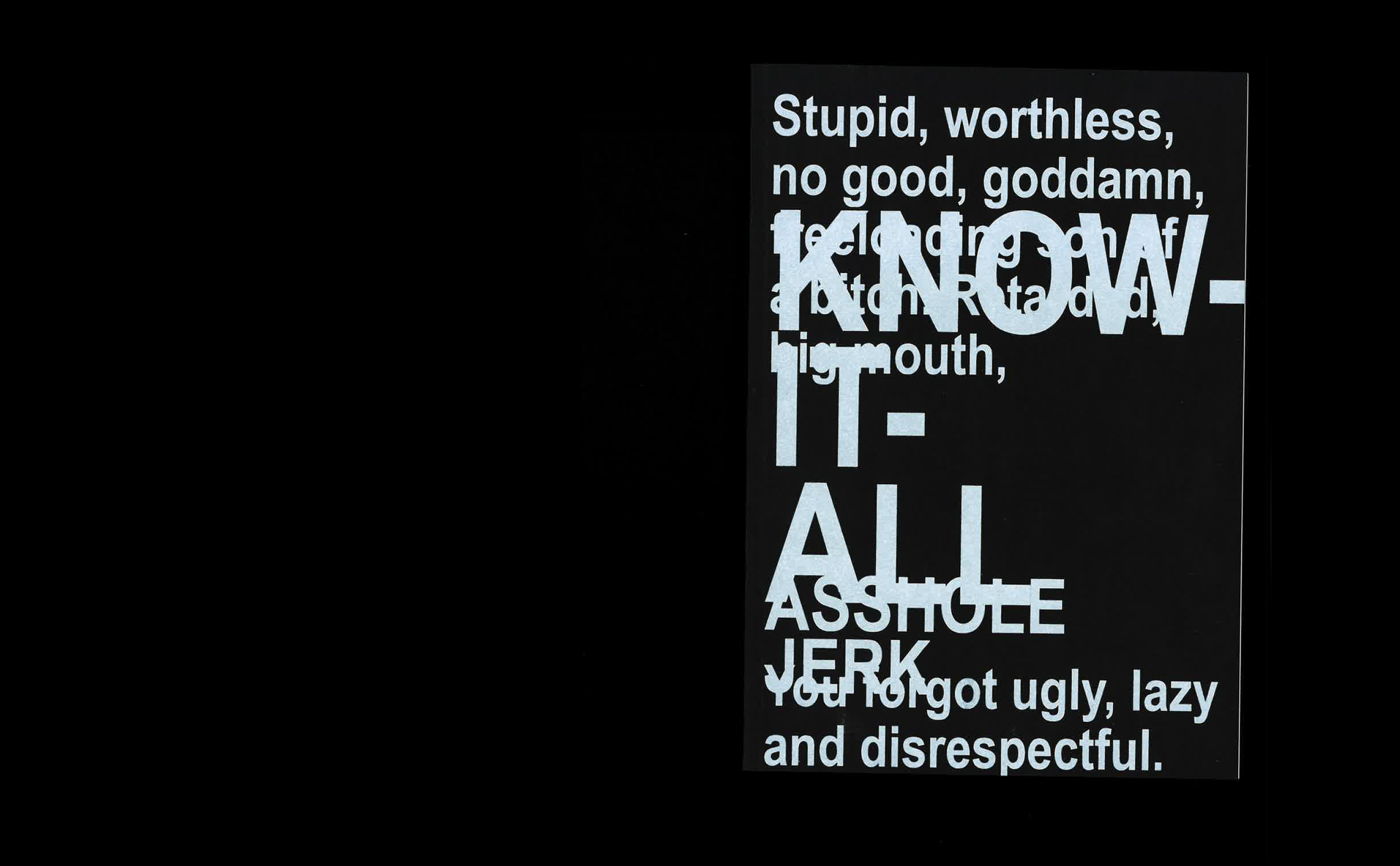
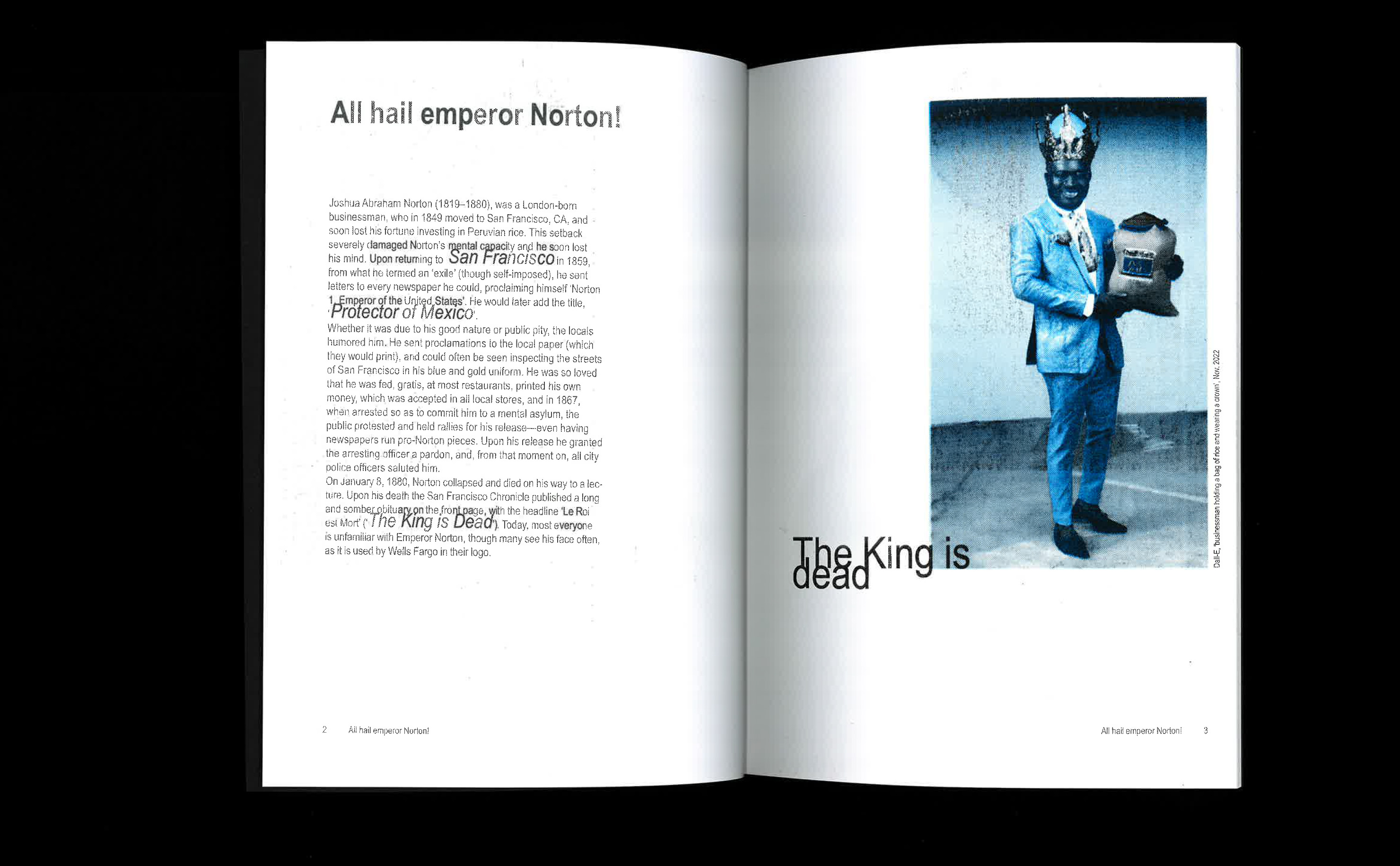
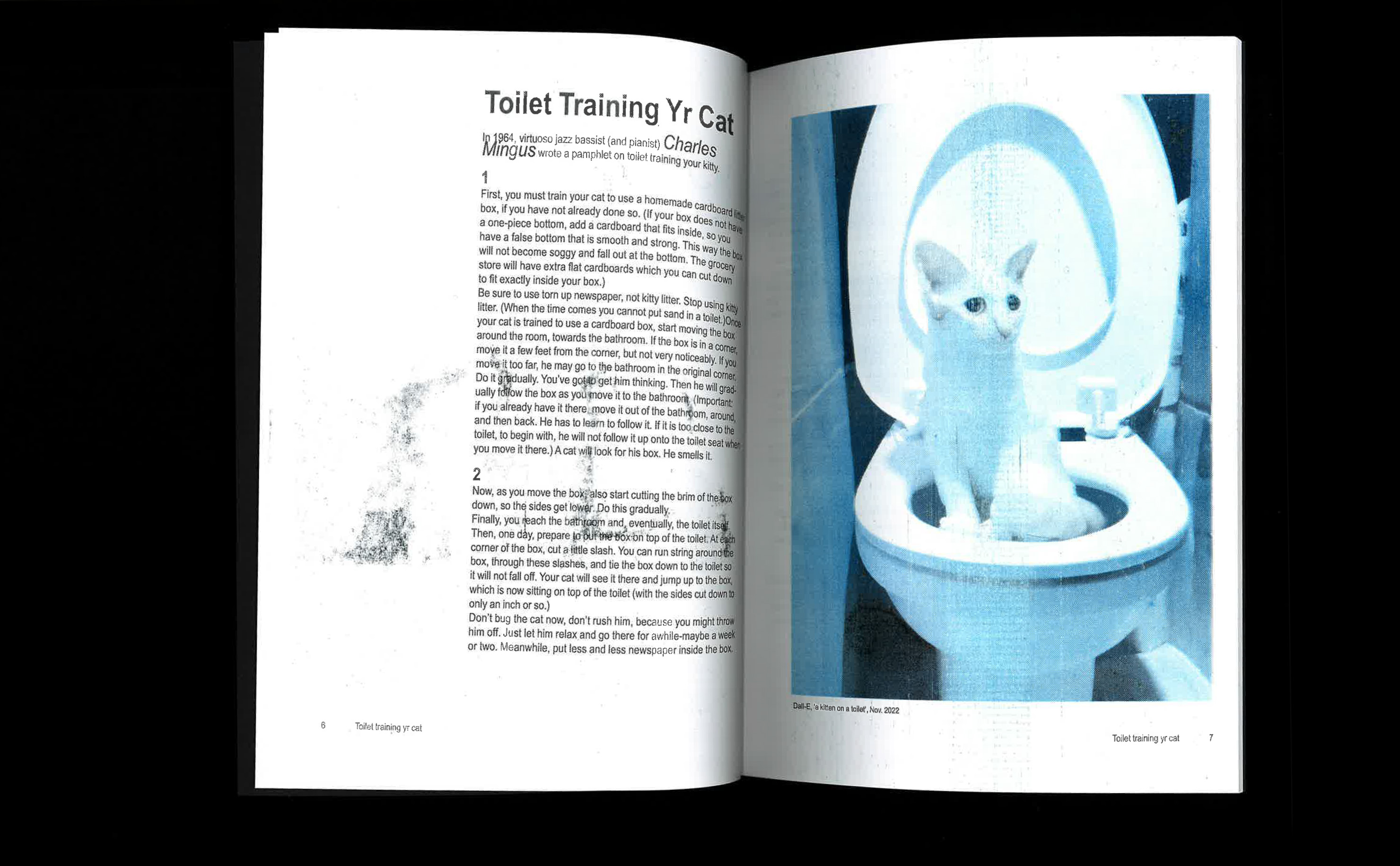
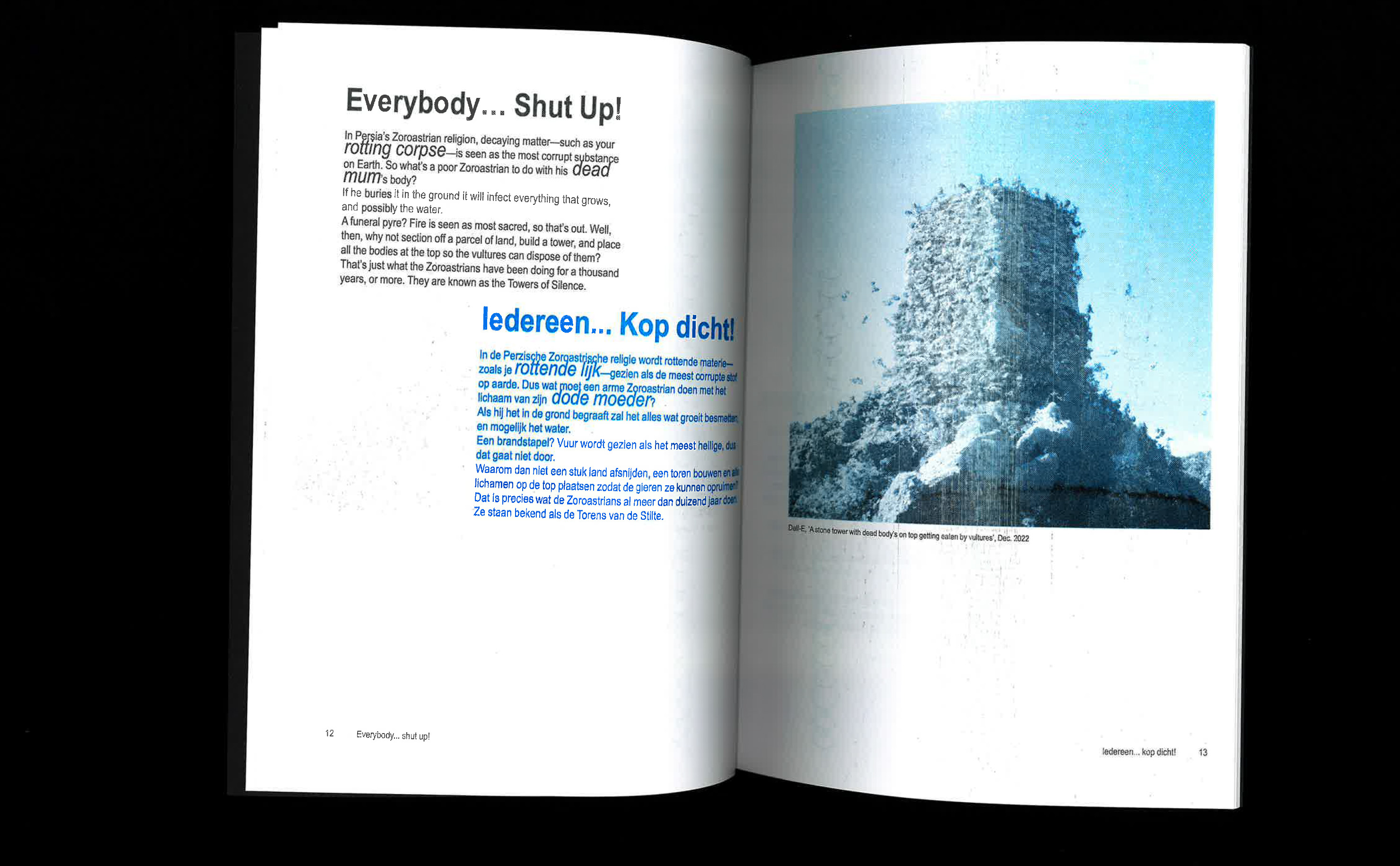
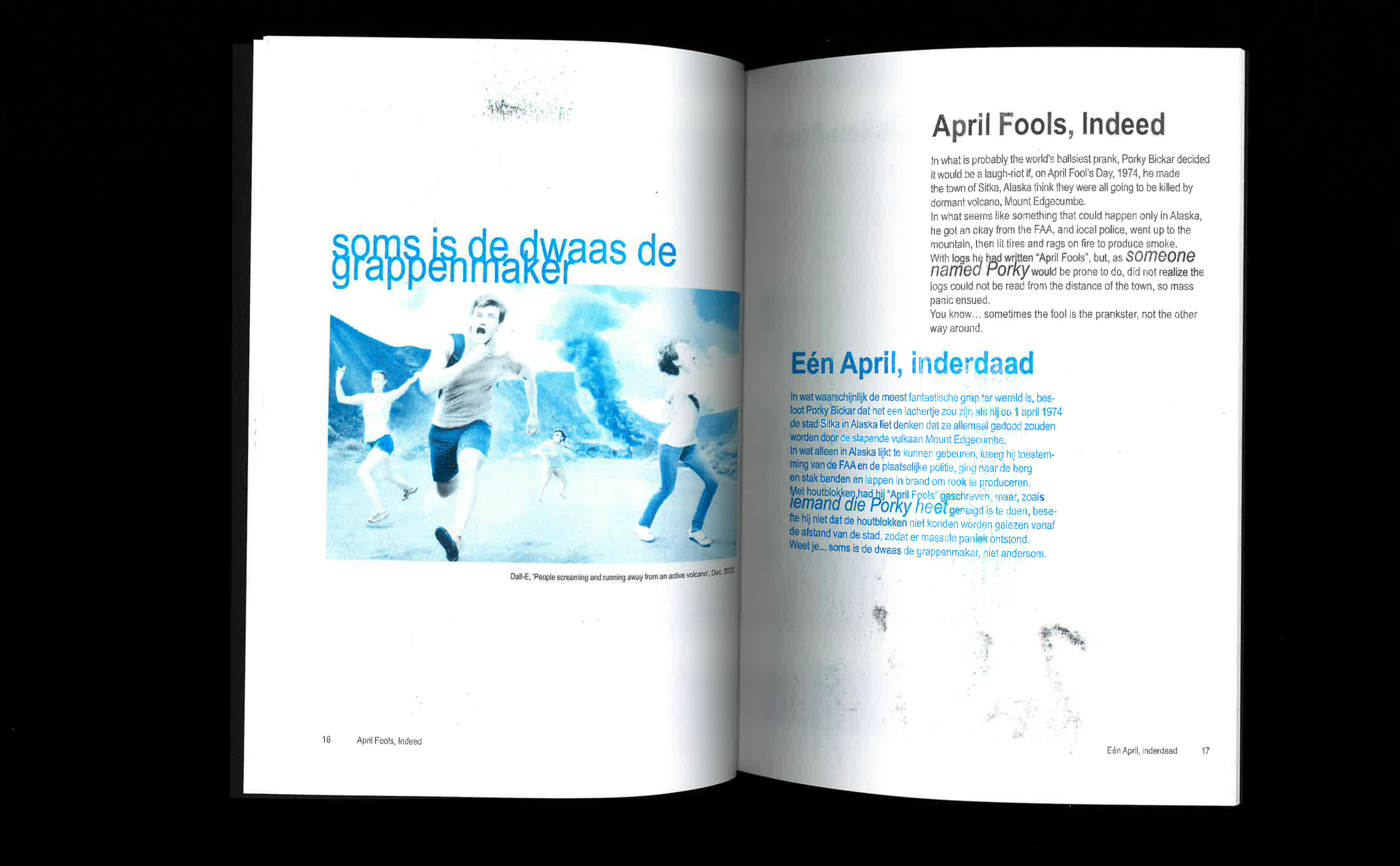
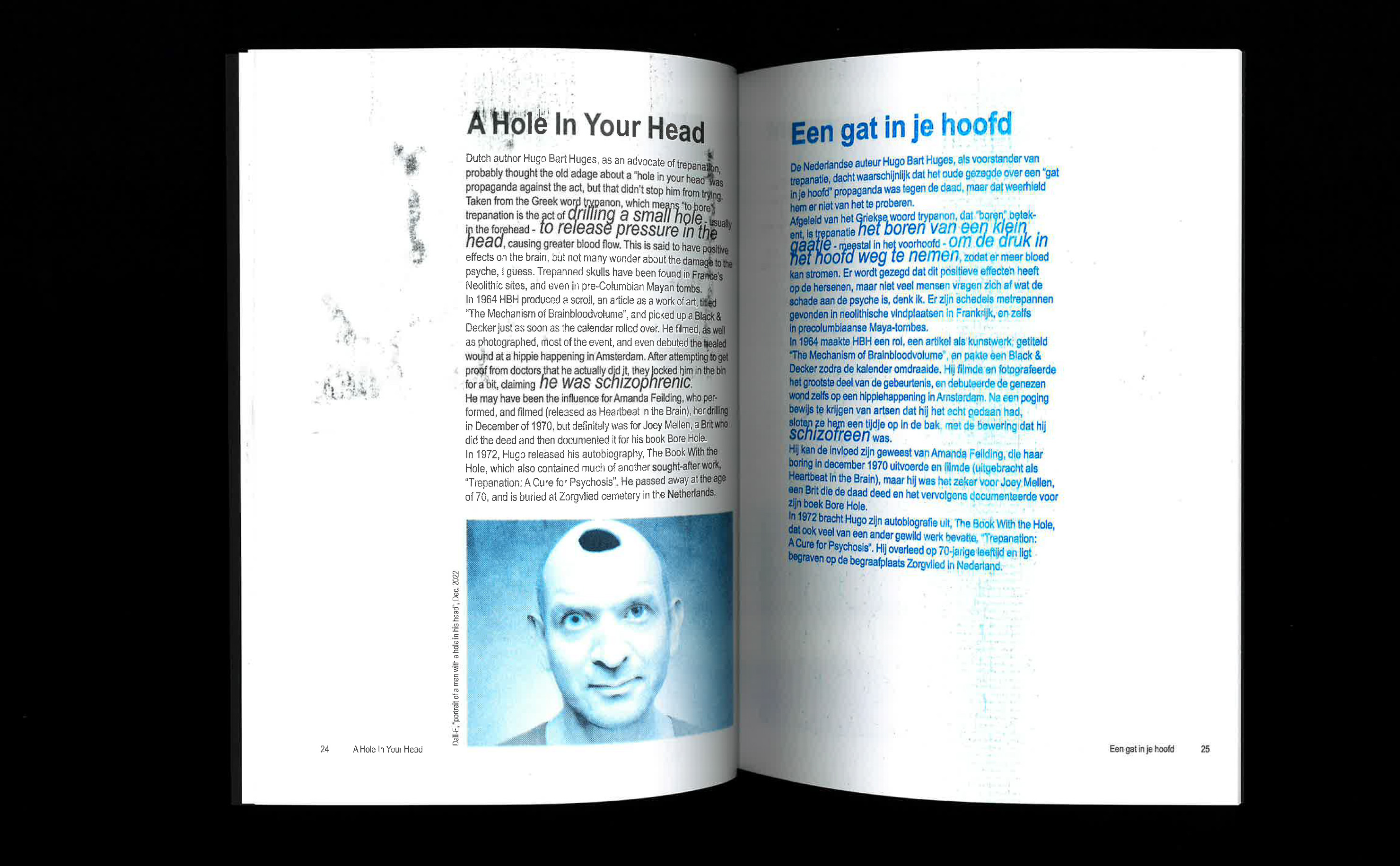
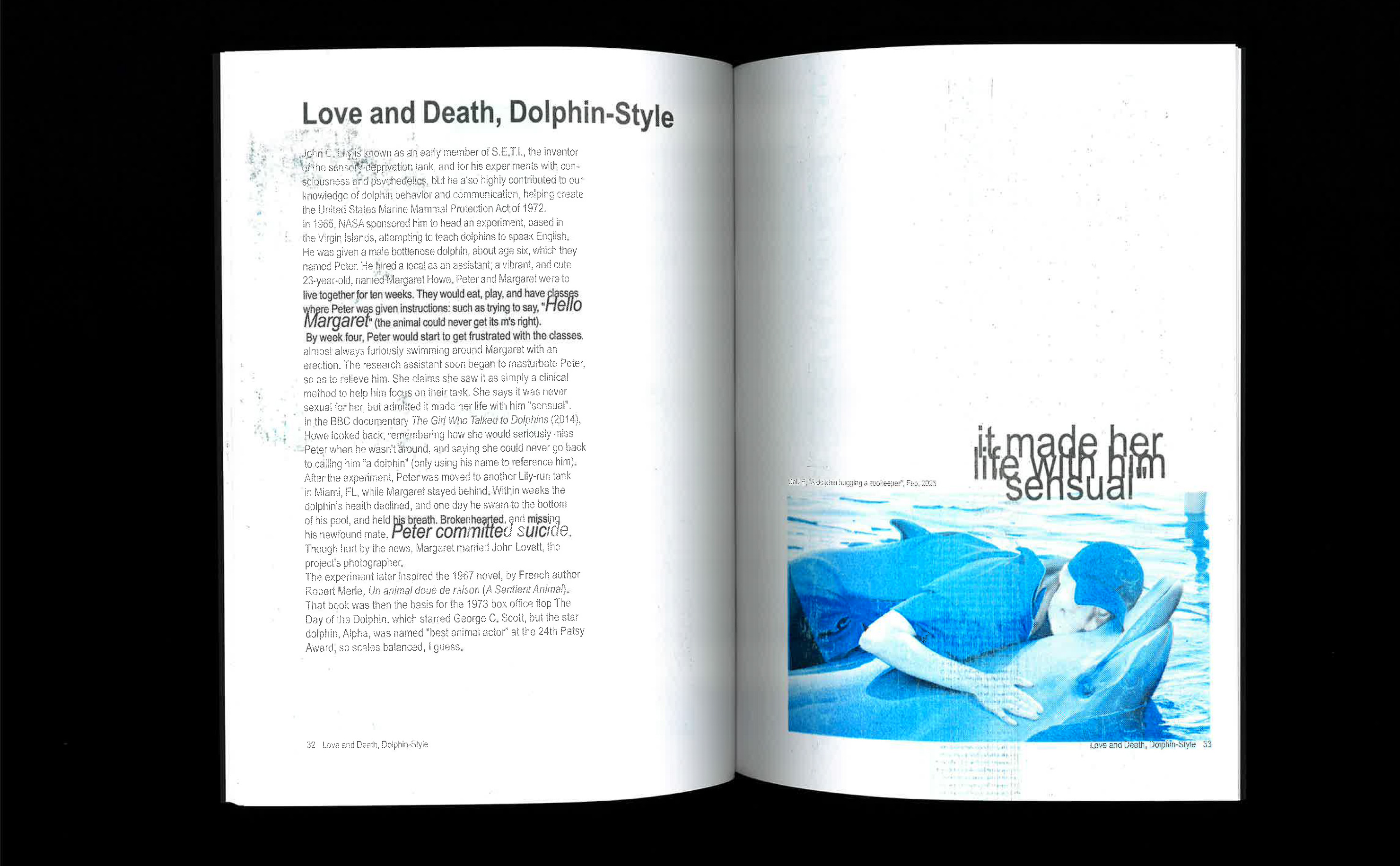
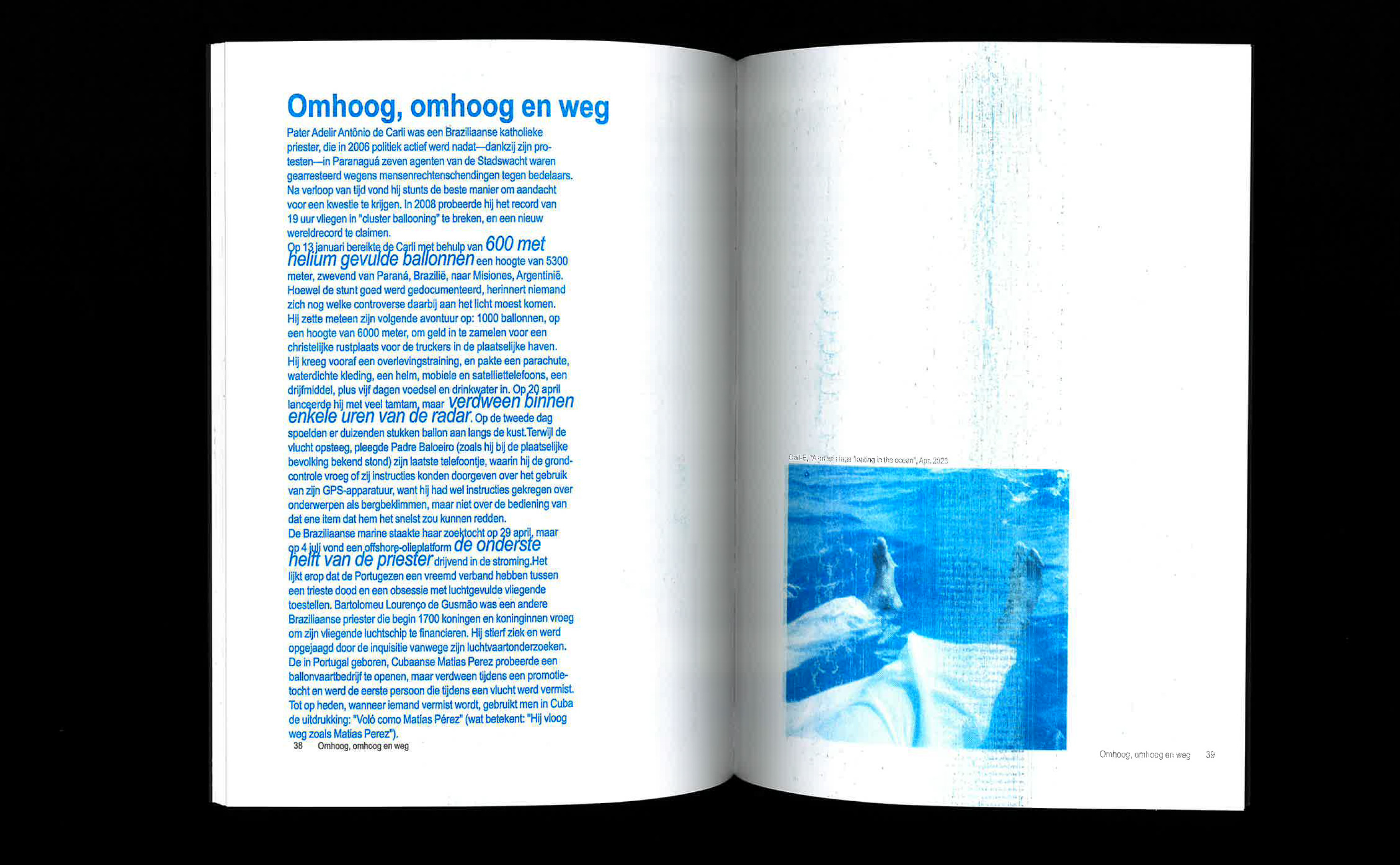
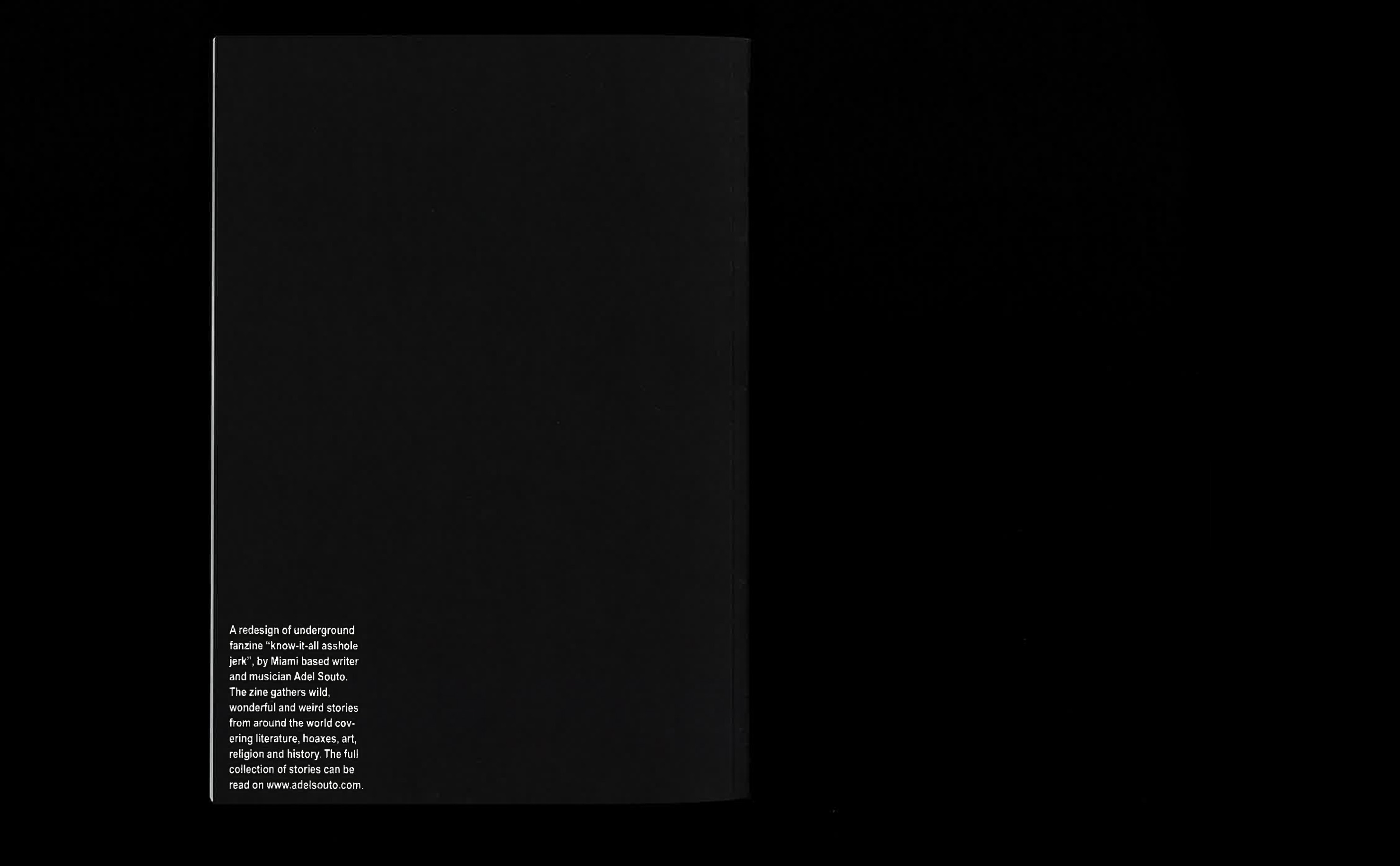
Know-it-all is a redesign of the namesake zine by Adel Souto. The publication is a bilingual anthology of internet born urban legends. The design plays with foul language and internet culture in general. The reader constantly asks the question whether the stories are real or not, using AI generated images further enhances this uncomfortable feeling. The interior pages are Riso printed on extra smooth paper, which causes the ink to smudge and stain the readers hands. The two coloured Risoprint is used in both images and text, black for the English text and blue for the Dutch text.
Predikheren Church
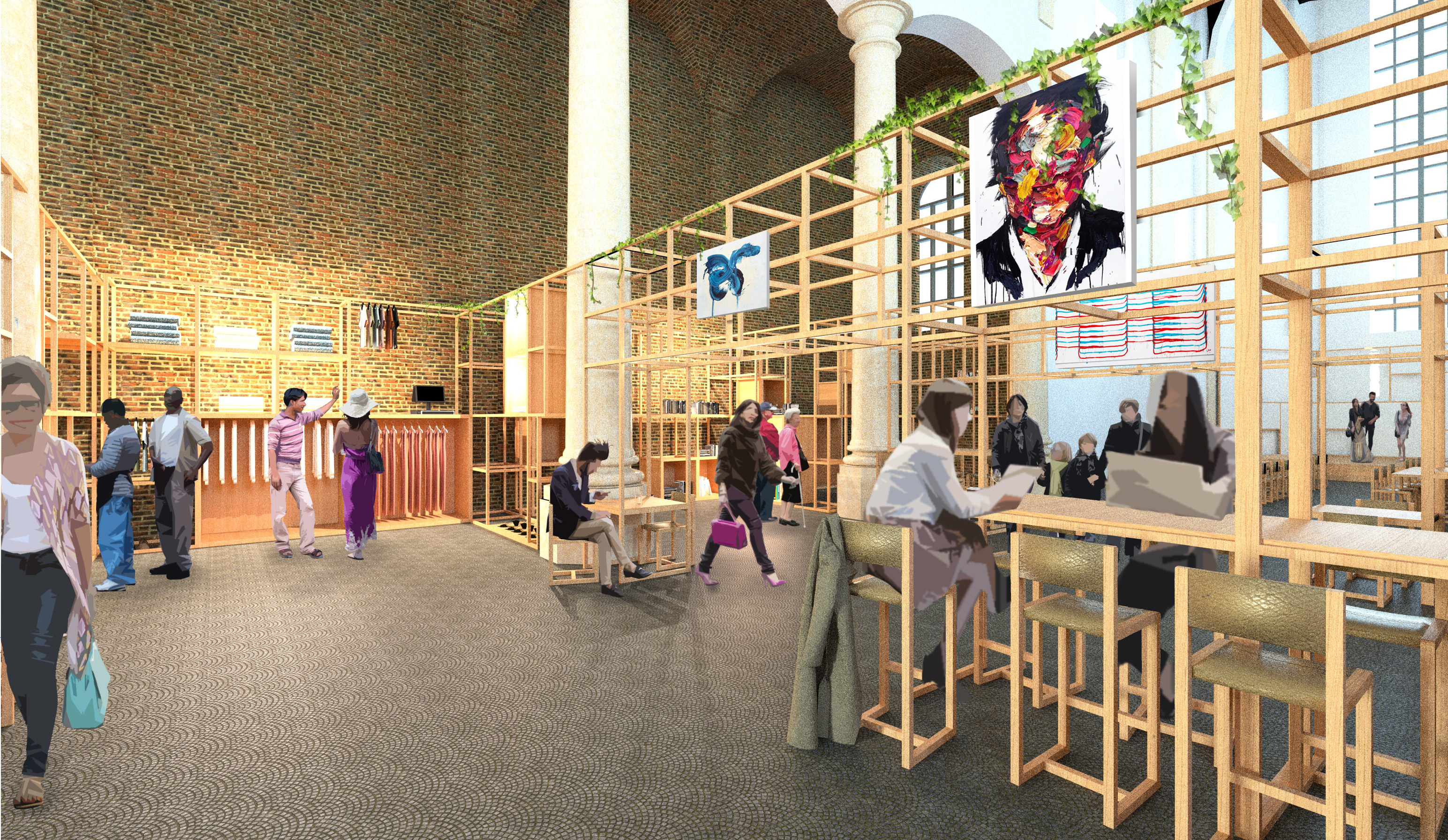
The “Predikheren Church” repurposing project breathes new life into a partially abandoned church in the hearth of Mechelen. The new function is a covered market, supporting and promoting local independent businesses. The church hosts up to ten vendors, each of whom is provided with a flexible and versatile structure. This framework accommodates a range of boxes, racks and furniture, enabling vendors to arrange their stands how they see fit. In addition to being a marketplace, the church also serves as a hub for culture and art. Local artists have a platform to showcase their art, and the church becomes a vibrant center for cultural activities.
Zuiderpershuis stairs
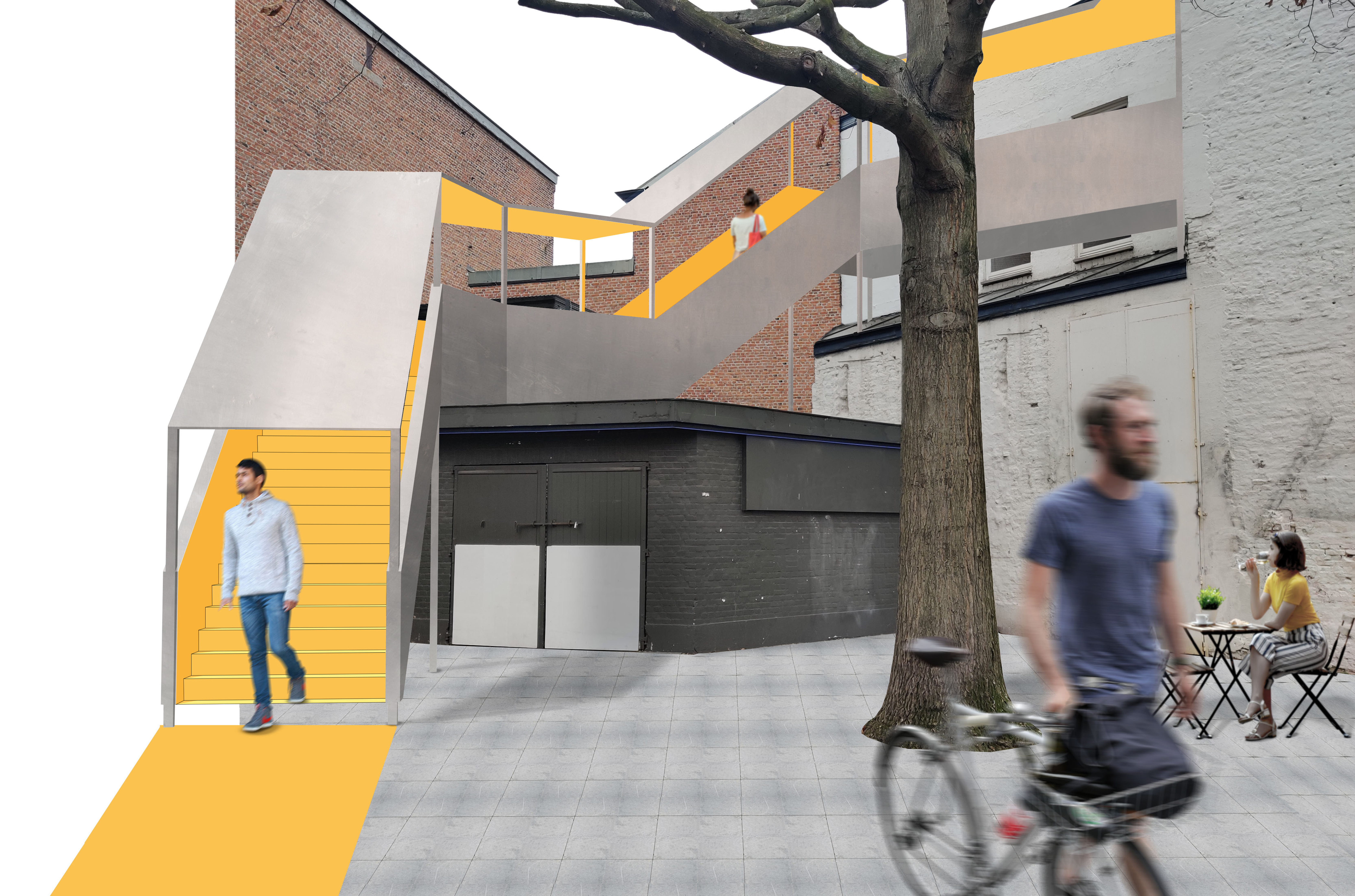
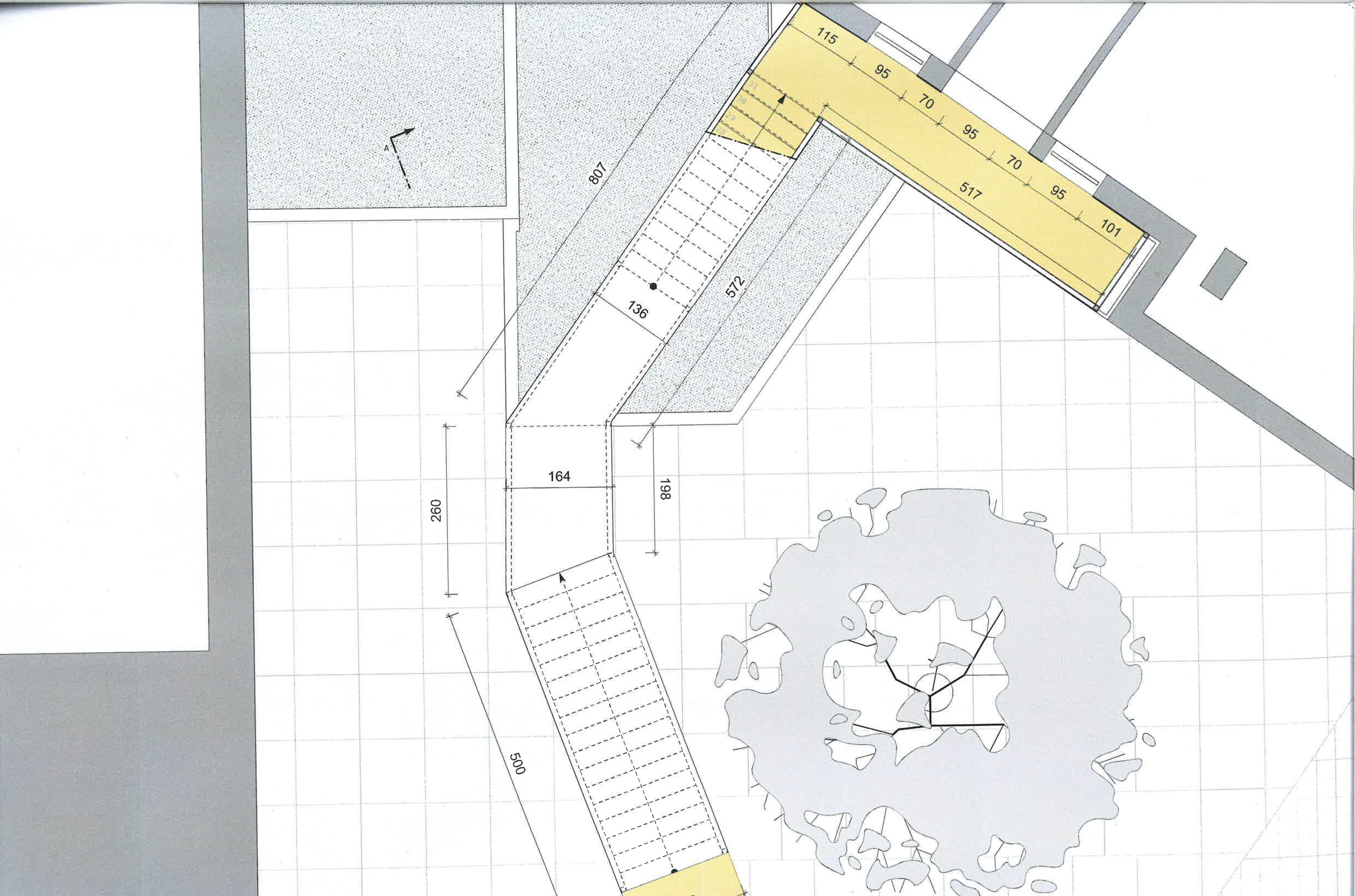
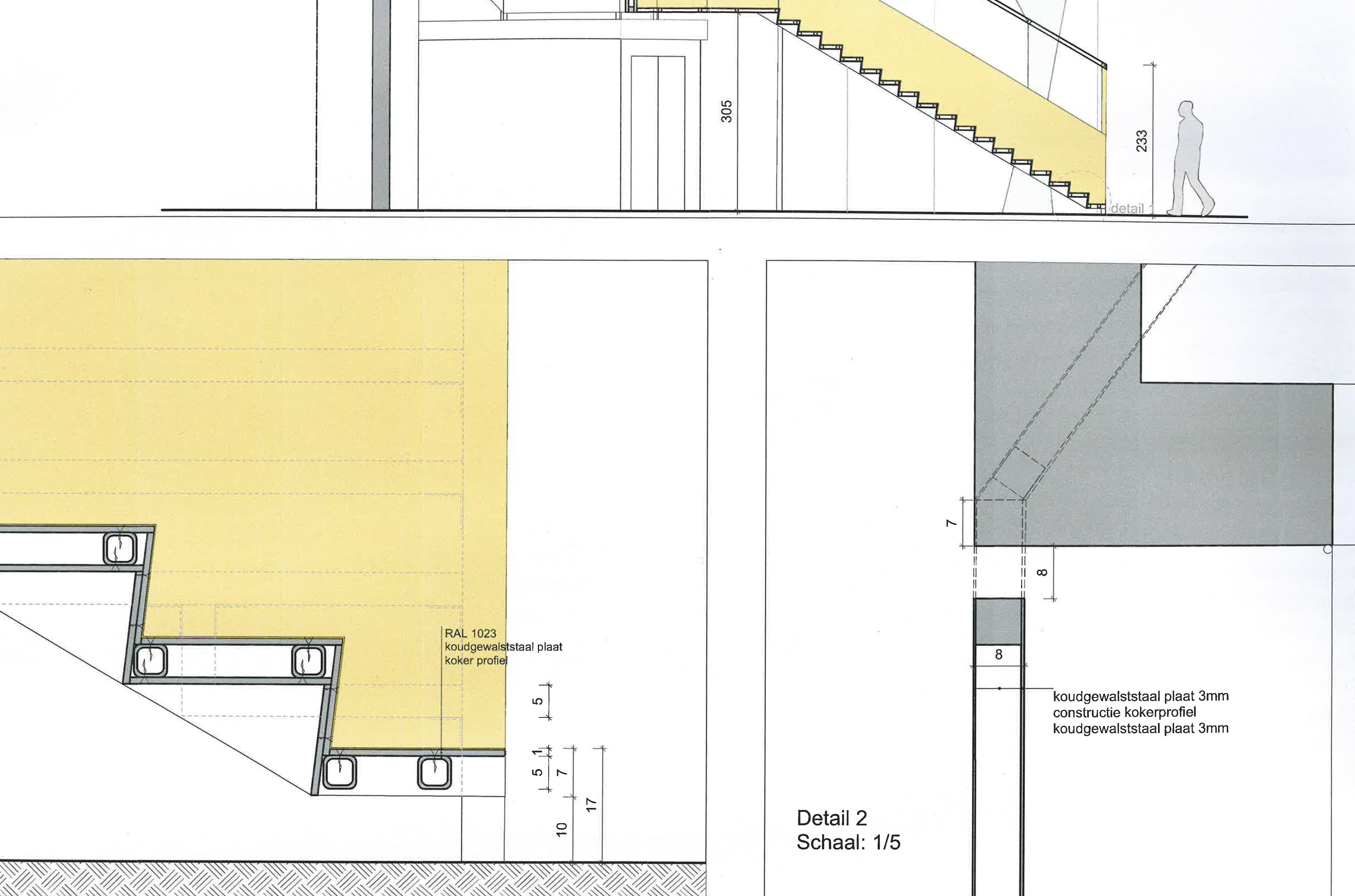
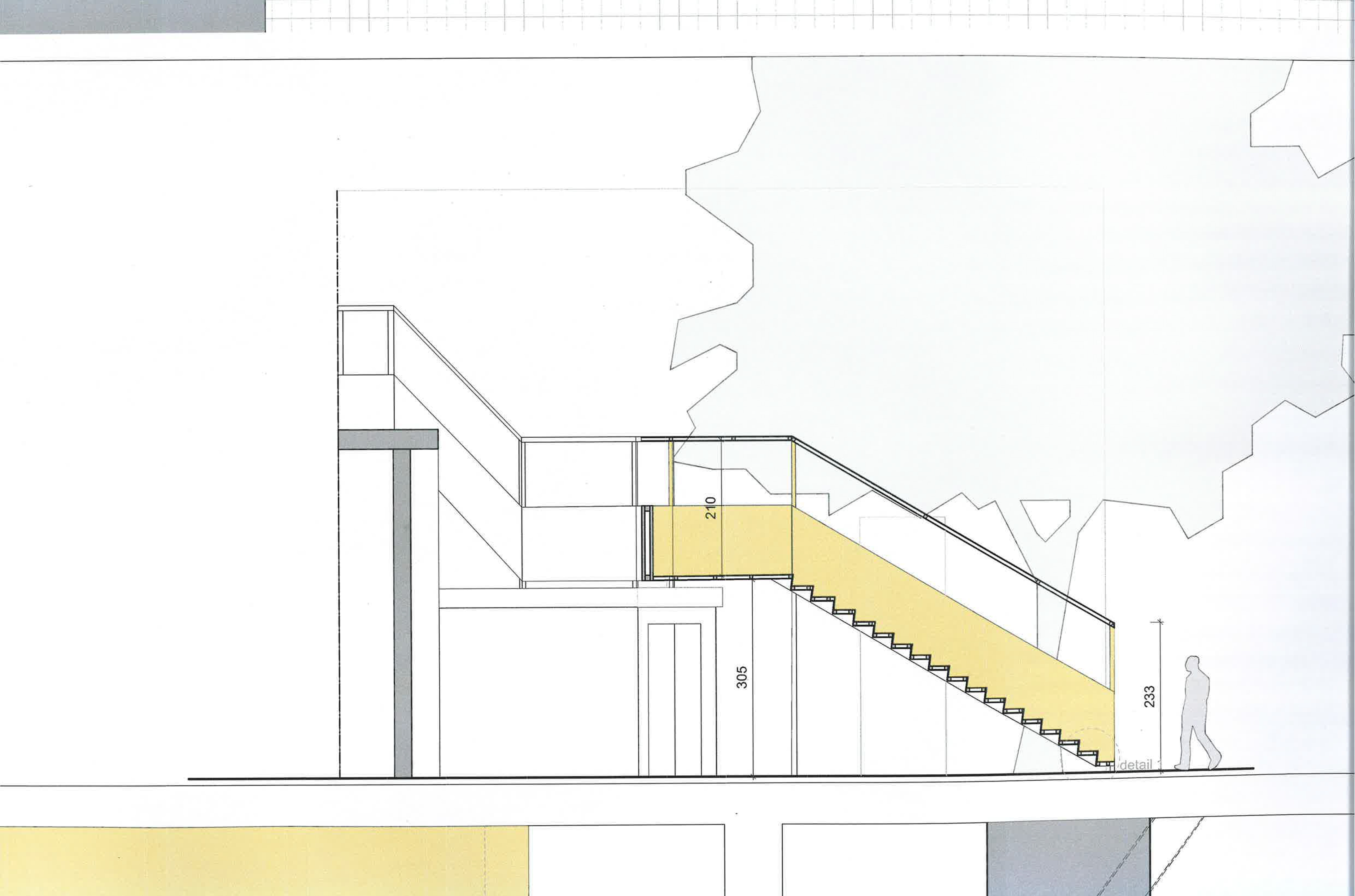
The “Zuiderpershuis stairs” project in Antwerp offers a solution for connecting the ground floor to the first floor while also enticing visitors from the nearby park. The outdoor steel stairway resembles a large beam climbing up the building. Openings are made in the walls to create views to the park and the surroundings. The inside of the stairway is painted bright, welcoming yellow as a signal function to visitors of the nearby park. The project seamlessly integrates a bike rack and conceals a loading dock for small trucks. The stairway is fully deconstructible which means it’s not permanently affixed to the building.
